Start with a brief overview of the core ideas in Codename One. This chapter revisits them in more detail as it goes on.
Components
Every button, label, or other element on the screen in a Codename One application is a Component. This is a simplified version of the class hierarchy:
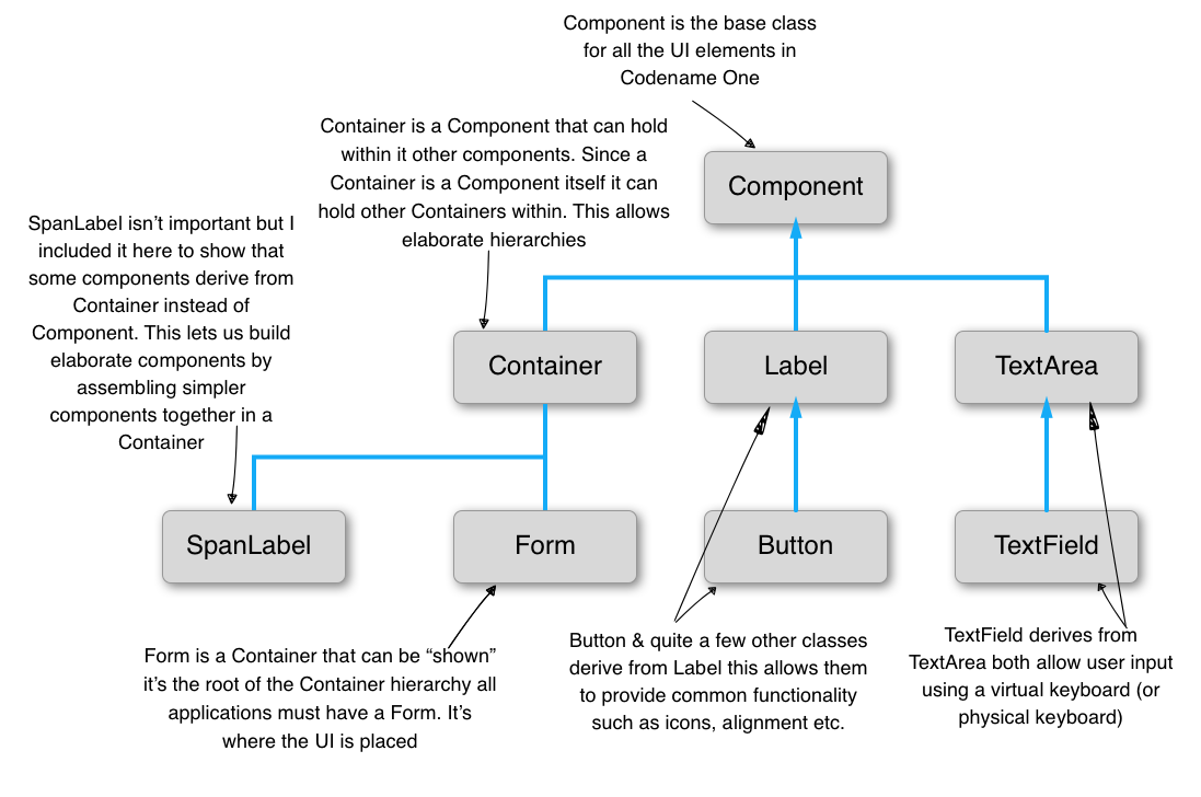
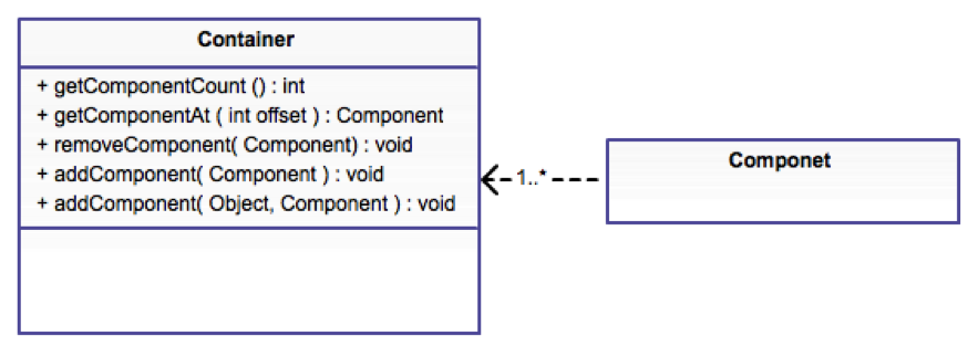
The Form is a special Component. It’s the root component shown to the user. Container is a Component type that can hold other components. That lets you create elaborate hierarchies by nesting Container instances.
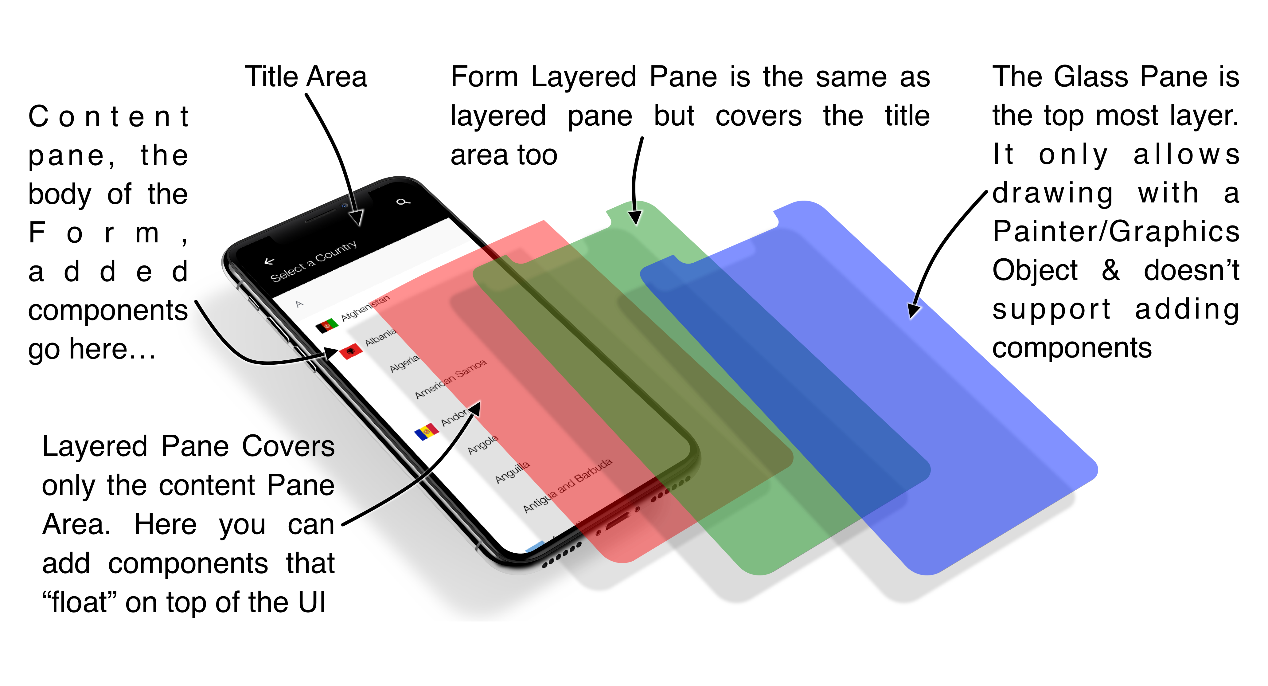
A Codename One application is effectively a series of forms, but one Form can be visible at a time. The form contains everything on the screen. Under the hood, the Form has a few separate parts:
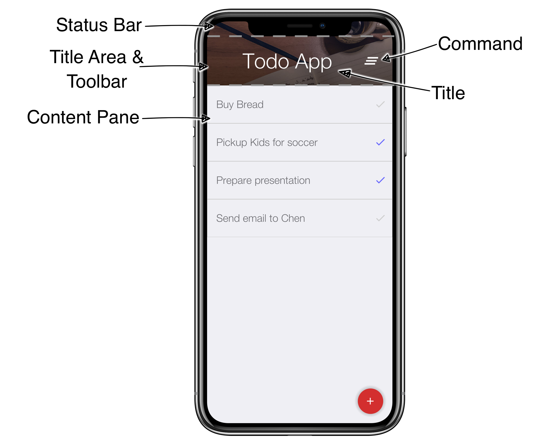
Content Pane - this is the body of the
Form. When you add aComponentto theForm, it goes into the content pane. The content pane scrolls vertically by default.Title Area - you can’t add directly to this area. The title area is managed by the
Toolbarclass.Toolbarsits at the top of the form and handles the title design. The title area has two parts:Title of the
Formand its commands (the buttons on the right and left of the title)Status Bar - on iOS, the top area leaves room for the notch, battery, clock, and similar indicators. Without that space, those elements would overlap the title.
Now that the structure is clear, open the Java file TodoApp.java in the project you created. You should see the lines that set up the UI in the start() method:
Layout managers
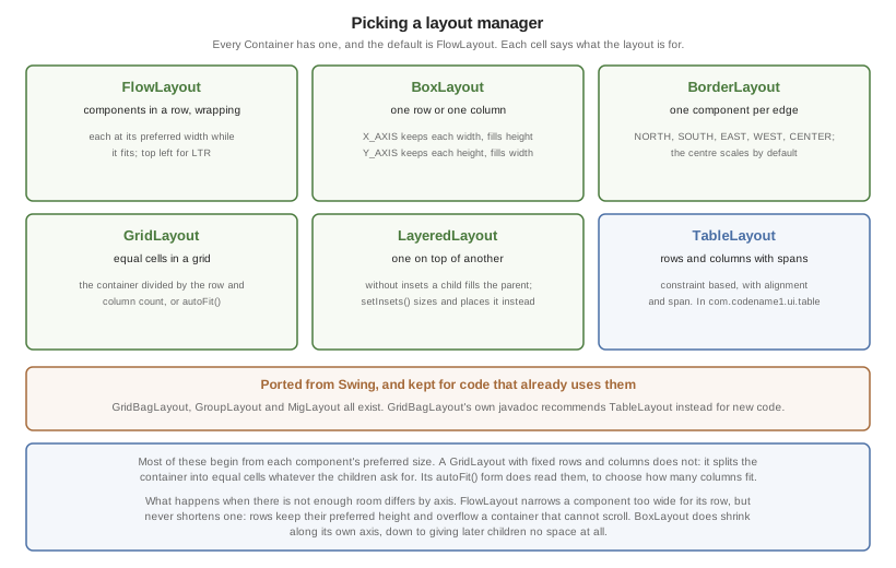
A layout manager decides the size and location of components within a Container. Every Container has a layout manager. The default layout manager is FlowLayout.
To understand layouts, first understand a basic concept about Component: each component has a “preferred size.” That’s the size a component wants to occupy. For example, a Label uses the exact size needed to fit the label text, icon, and padding.
A layout manager places a component based on its own logic and the preferred size, sometimes called the “natural size.” A FlowLayout walks the components in the order they were added and sizes them one after another. When it reaches the end of the row, it moves to the next row.
FlowLayout for simple thingsFlowLayout is great for simple cases, but it has issues when components change size dynamically, such as a text field. In those cases, it can choose bad line breaks and take up too much space.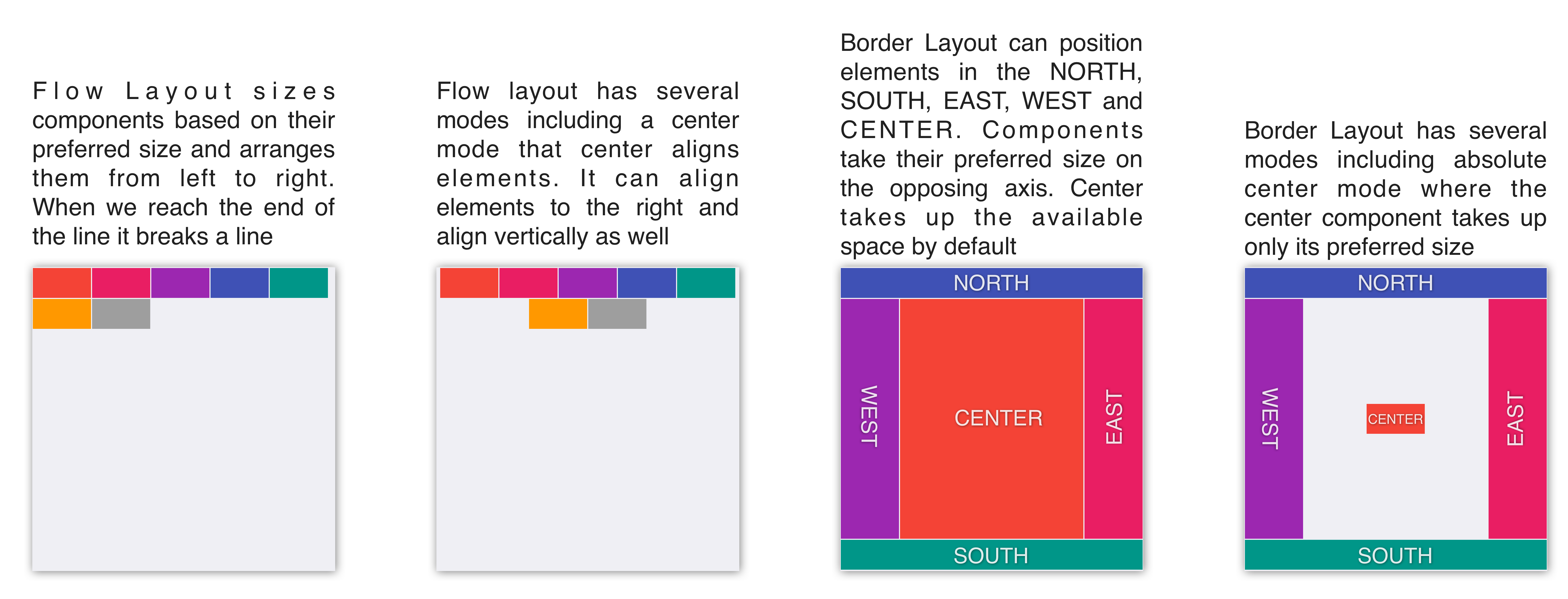
Scrolling doesn’t work well for all layout types because the positioning algorithm within a layout can break. Scrolling on the Y axis works well for BoxLayout Y, which is why it was picked for the TodoForm:
| Layout | Scrollable |
|---|---|
Flow Layout | Possible on Y axis only |
Border Layout | Scrolling is blocked |
Box Layout Y | Scrollable only on the Y axis |
Box Layout X | Scrollable only on the X axis |
Grid Layout | Scrollable |
LayeredLayout | Not scrollable (usually) |
Layouts can be divided into two distinct groups:
Constraint Based -
BorderLayout(and a few others such asGridBagLayout,MigLayout, andTableLayout)Regular - All the other layout managers
When you add a Component to a Container with a regular layout you do so with a simple add method:
Container cnt = new Container(BoxLayout.y());
cnt.add(new Label("Just Added"));
This works great for regular layouts but might not for constraint based layouts. A constraint based layout accepts another argument. For example: BorderLayout needs a location for the Component:
cnt.add(NORTH, new Label("Just Added"));This line assumes you have an import static com.codename1.ui.CN.*; in the top of the file. In BorderLayout (which is a constraint based layout) placing an item in the NORTH places it in the top of the Container.
CN class is a class that contains many static helper methods and functions. It’s specifically designed for static import in this way to help keep your code terseTerse syntax
Almost every layout allows you to add a component using many variants of the add method:
Container cnt = new Container(BoxLayout.y());
cnt.add(new Label("Just Added")); // (1)
cnt.addAll(new Label("Adding Multiple"), // (2)
    new Label("Second One"));

cnt.add(new Label("Chaining")). // (3)
    add(new Label("Value"));
Regular add
addAllaccepts many components and adds them in a batchaddreturns the parentContainerinstance so you can chain calls like that
In the race to make code “tighter” you can make this even shorter. Most layout managers have their own custom terse syntax style for example:
Container boxY = BoxLayout.encloseY(cmp1, cmp2); // (1)
Container boxX = BoxLayout.encloseX(cmp3, cmp4);
Container flowCenter = FlowLayout. // (2)
    encloseCenter(cmp5, cmp6);
Most layouts have a version of enclose to encapsulate components within
FlowLayouthas variants that support aligning the components on various axes
To sum this up, you can use layout managers and nesting to create elaborate UI’s that implicitly adapt to different screen sizes and device orientation.
Flow Layout
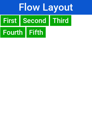
Flow layout lets the components "flow" horizontally and break a line when reaching the edge of the container. It’s the default layout manager for containers. Because it’s so flexible it’s also problematic as it can result in wrong preferred size values for the parent Container. This can create a reflow issue, as a result recommend using flow layout for trivial cases. Avoid it for things such as text input etc. As the size of the text input can vary in runtime:
Form hi = new Form("Flow Layout", new FlowLayout());
hi.add(new Label("First")).
    add(new Label("Second")).
    add(new Label("Third")).
    add(new Label("Fourth")).
    add(new Label("Fifth"));
hi.show();
Flow layout also supports terse syntax shorthand such as:
Container flowLayout = FlowLayout.encloseIn(
        new Label("First"),
        new Label("Second"),
        new Label("Third"),
        new Label("Fourth"),
        new Label("Fifth"));
Flow layout can be aligned to the left (the default), to the center, or to the right. It can also be vertically aligned to the top (the default), middle (center), or bottom.
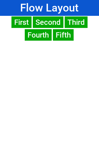
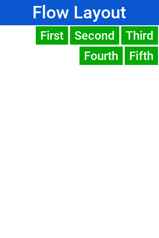
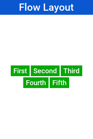
Components within the flow layout get their natural preferred size by default and aren’t stretched in any axis.
parent.add(BorderLayout.SOUTH, FlowLayout.encloseCenter(dontGrowThisComponent)).Box Layout
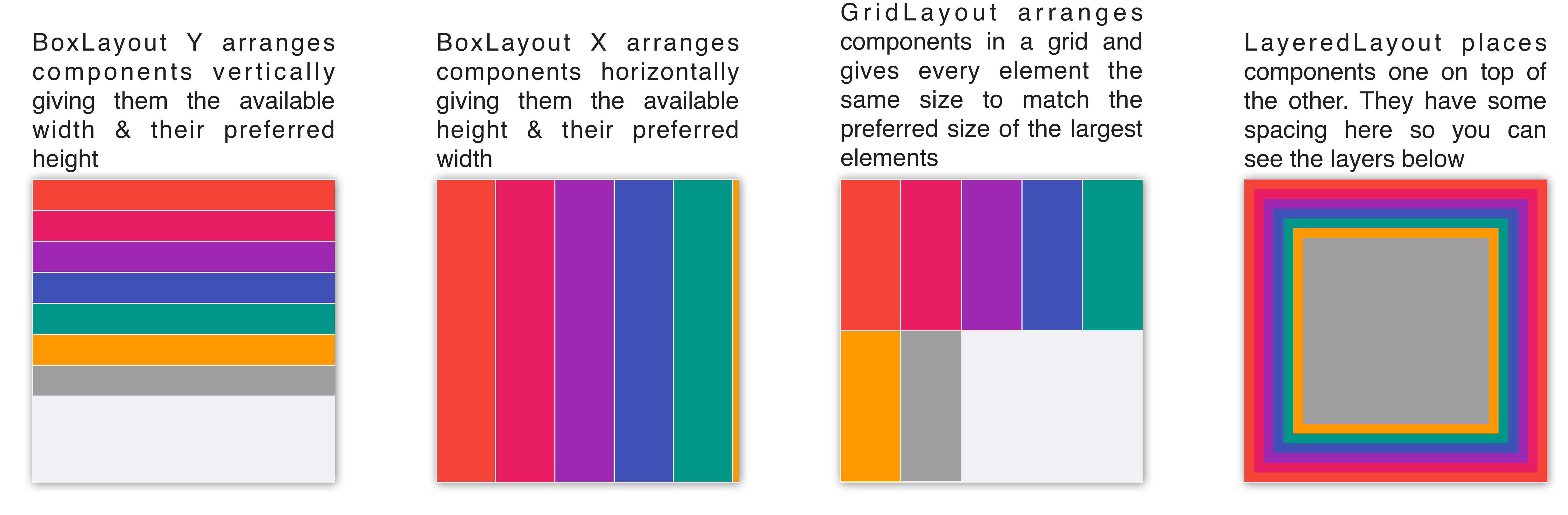
BoxLayout places elements in a row (X_AXIS) or column (Y_AXIS) according to box orientation. Box is a simple and predictable layout that serves as the "workhorse" of component lists in Codename One.
You can create a box layout Y using something like this:
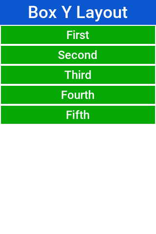
Form hi = new Form("Box Y Layout", new BoxLayout(BoxLayout.Y_AXIS));
hi.add(new Label("First")).
    add(new Label("Second")).
    add(new Label("Third")).
    add(new Label("Fourth")).
    add(new Label("Fifth"));
Which results in this
Box layout also supports a shorter terse notation which you use here to show the X axis box:
Container box = BoxLayout.encloseX(new Label("First"),
        new Label("Second"),
        new Label("Third"),
        new Label("Fourth"),
        new Label("Fifth"));
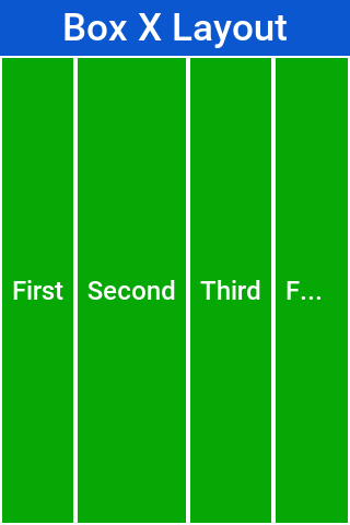
The box layout keeps the preferred size of its destination orientation and scales elements on the other axis. Specifically X_AXIS will keep the preferred width of the component while growing all the components vertically to match in size. Its Y_AXIS counterpart keeps the preferred height
while growing the components horizontally.
This behavior is useful since it allows elements to align as they would all have the same size.
Sometimes the growing behavior in the X axis is undesired, for these cases you can use the X_AXIS_NO_GROW variant.
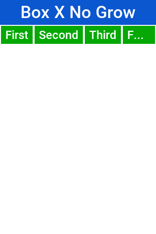
FlowLayout vs. BoxLayout.X_AXISBoxLayout over FlowLayout as it acts more consistently in all situations. Another advantage of BoxLayout is the fact that it grows and thus aligns the components in a consistent column or rowBorder Layout
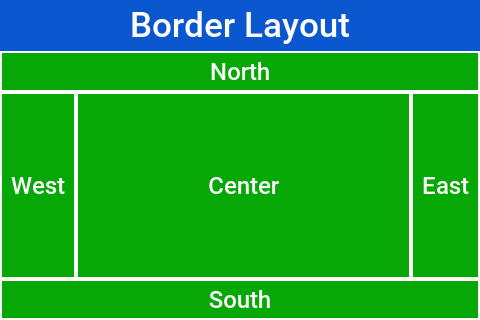
Border layout is unique. BorderLayout is a constraint-based layout that can place up to five components in one of the five positions: NORTH, SOUTH,
EAST, WEST or CENTER:
Form hi = new Form("Border Layout", new BorderLayout());
hi.add(BorderLayout.CENTER, new Label("Center")).
    add(BorderLayout.SOUTH, new Label("South")).
    add(BorderLayout.NORTH, new Label("North")).
    add(BorderLayout.EAST, new Label("East")).
    add(BorderLayout.WEST, new Label("West"));
hi.show();
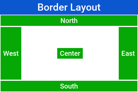
CN classCN class and then the syntax can be add(SOUTH, new Label("South"))The layout always stretches the NORTH/SOUTH components on the X-axis to fill the container and the EAST/WEST components on the Y-axis. The center component is stretched to fill the remaining area by default. For example, the setCenterBehavior allows you to manipulate the behavior of the center component so it’s placed in the center without stretching.
For example:
Form hi = new Form("Border Layout", new BorderLayout());
((BorderLayout)hi.getLayout()).setCenterBehavior(BorderLayout.CENTER_BEHAVIOR_CENTER);
hi.add(BorderLayout.CENTER, new Label("Center")).
    add(BorderLayout.SOUTH, new Label("South")).
    add(BorderLayout.NORTH, new Label("North")).
    add(BorderLayout.EAST, new Label("East")).
    add(BorderLayout.WEST, new Label("West"));
hi.show();
Results in:
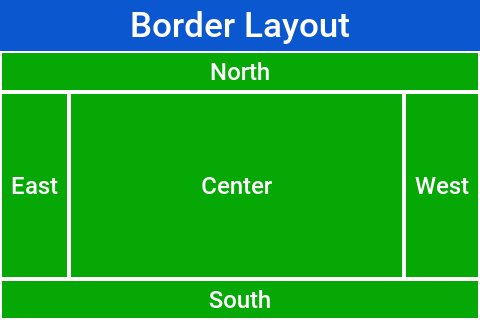
Container implicitly blocks scrolling on a border layout, but it can scroll its parents/childrenFor RTL the EAST and WEST values are implicitly reversed as shown in this image:
SOUTH it will take up the entire screen and won’t leave room for anythingGrid Layout
GridLayout accepts a predefined grid (rows/columns) and grants all components within it equal size based on the dimensions of the largest components.
If the number of rows * columns is smaller than the number of components added a new row is implicitly added to the grid.
For example, if the number of components is smaller than available cells (won’t fill the last row) blank spaces will
be left in place.
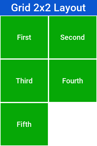
In this example you can see that a 2×2 grid is used to add 5 elements, this results in an additional row that’s implicitly added turning the grid to a 3×2 grid implicitly and leaving one blank cell:
Form hi = new Form("Grid Layout 2×2", new GridLayout(2, 2));
hi.add(new Label("First")).
    add(new Label("Second")).
    add(new Label("Third")).
    add(new Label("Fourth")).
    add(new Label("Fifth"));
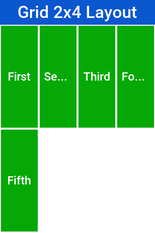
When you use a 2×4 size ratio you would see elements getting cropped as you do here. The grid layout uses the grid size first and doesn’t pay too much attention to the preferred size of the components it holds.
Grid also has an autoFit attribute that can be used to automatically calculate the column count based on available space and preferred width. This is useful for working with UI’s where the device orientation might change.
A terse syntax for working with a grid also exists in two versions, one that uses the "auto-fit" option and another that accepts the number of columns. Here’s a sample of the terse syntax coupled with auto-fit followed by screenshots of the same code in two orientations:
GridLayout.encloseIn(new Label("First"),
    new Label("Second"),
    new Label("Third"),
    new Label("Fourth"),
    new Label("Fifth"));
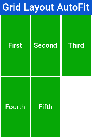
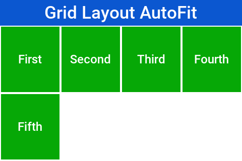
Table Layout
The TableLayout is an elaborate constraint based layout manager that can arrange elements in rows/columns while defining constraints to control complex behavior such as spanning, alignment/weight etc.
TableLayoutTableLayout is in the com.codename1.ui.table package and not in the layouts package.This is because
TableLayout was originally designed for the Table class.Despite being constraint based the TableLayout isn’t strict about constraints and will implicitly add a constraint when one is missing. This is unlike the BorderLayout which will throw an exception in this case.
GridLayout TableLayout won’t implicitly add a row if the row/column count is wrongForm hi = new Form("TableLayout", new TableLayout(2, 2));
hi.add(new Label("First"));
hi.add(new Label("Second"));
hi.add(new Label("Third"));
hi.add(new Label("Fourth"));
hi.add(new Label("Fifth"));
hi.show();
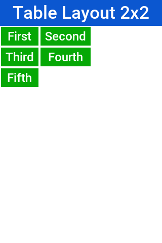
TableLayout supports the ability to grow the last column which can be enabled using the setGrowHorizontally method. You can also use a shortened terse syntax to construct a TableLayout but since the TableLayout is a constraint based layout you won’t be able to use its full power with this syntax.
The default usage of the encloseIn method below uses the setGrowHorizontally flag:
Container table = TableLayout.encloseIn(2,
        new Label("First"),
        new Label("Second"),
        new Label("Third"),
        new Label("Fourth"),
        new Label("Fifth"));
Form hi = new Form("TableLayout Enclose 2", new BorderLayout());
hi.add(BorderLayout.CENTER, table);
hi.show();
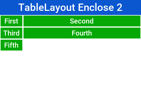
TableLayout.encloseIn() with default behavior of growing the last columnThe full potential
TableLayout is a beast, to truly appreciate it you need to use the constraint syntax which allows you to span, align and set width/height for the rows and columns.
TableLayout works with a Constraint instance that can communicate your intentions into the layout manager. Such constraints can include more than one attribute for example: span and height.
TableLayout constraints can’t be reused for more than one componentThe constraint class supports the following attributes
| The column for the table cell. This defaults to -1 which will place the component in the next available cell |
| Like column, defaults to -1 as well |
| The column width in percentages, -1 will use the preferred size. -2 for width will take up the rest of the available space |
| Like width but doesn’t support the -2 value |
| The cells that should be occupied horizontally defaults to 1 and can’t exceed the column count - current offset. |
| Like spanHorizontal with the same limitations |
| The horizontal alignment of the content within the cell, defaults to the special case -1 value to take up all the cell space can be either |
| Like horizontalAlign can be one of |
width/height to one cell in a column/rowThe table layout constraint sample tries to show some unique things you can do with constraints.
The constraint sample below spans the title across all three columns and spans the notes row across two columns:
TableLayout layout = new TableLayout(4, 3);
layout.setGrowHorizontally(true);
Form hi = new Form("Table Layout", layout);

TableLayout.Constraint title = layout.createConstraint();
title.setHorizontalSpan(3);
title.setHorizontalAlign(Component.CENTER);
hi.add(title, new Label("Invoice"));

hi.add(new Label("Item"));
hi.add(new Label("Qty"));
hi.add(new Label("Total"));
hi.add(new Label("Design"));
hi.add(new Label("2"));
hi.add(new Label("$120"));

TableLayout.Constraint notes = layout.createConstraint();
notes.setHorizontalSpan(2);
notes.setHeightPercentage(40);
hi.add(notes, new SpanLabel("Notes span two columns"));
hi.add(new Button("Pay"));

hi.show();
That sample creates its constraints with a shorthand. Written out in full, a constraint is a separate object you configure and then pass in place of the usual layout argument:
TableLayout.Constraint cn = tl.createConstraint();
cn.setWidthPercentage(20);
hi.add(cn, new Label("AAA"));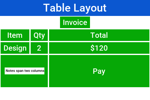
TextMode Layout
TextModeLayout is a unique layout manager. It acts like TableLayout on Android and like BoxLayout.Y_AXIS in other platforms. Internally it delegates to one of these two layout managers so in a sense it doesn’t have as much functionality of its own.
For example: this is a sample usage of TextModeLayout:
TextModeLayout tl = new TextModeLayout(3, 2);
Form f = new Form("Pixel Perfect", tl);
TextComponent title = new TextComponent().label("Title");
TextComponent price = new TextComponent().label("Price");
TextComponent location = new TextComponent().label("Location");
TextComponent description = new TextComponent().label("Description").multiline(true);

f.add(tl.createConstraint().horizontalSpan(2), title);
f.add(tl.createConstraint().widthPercentage(30), price);
f.add(tl.createConstraint().widthPercentage(70), location);
f.add(tl.createConstraint().horizontalSpan(2), description);
f.setEditOnShow(title.getField());
f.show();
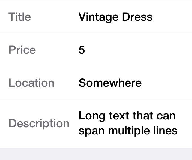
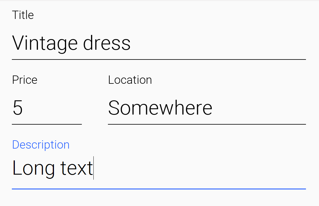
As you can see from the code and samples above there is a lot going on under the hood. On Android you want a layout that’s like TableLayout so you can “pack” the entries. On iOS you want a box layout Y kind of layout but you also want the labels/text to align…
The TextModeLayout isn’t a layout as much as it’s a delegate. When running in the Android mode (which you refer to as the “on top” mode) the layout is almost an exact synonym of TableLayout and in fact delegates to an underlying TableLayout. In fact there is a public final table instance within the layout that you can refer to directly…
One small difference exists between the TextModeLayout and the underlying TableLayout: your choice to default to align entries to TOP with this mode.
TextComponent in Android otherwise the entries “jump”When working in the non-android environment you use a BoxLayout on the Y axis as the delegate. One thing you do here differs from a default box layout: grouping. Grouping allows the labels to align by setting them to the same width, internally it invokes Component.setSameWidth(). Since text components hide the labels there is a special group method there that can be used. For example, this is implicit with the TextModeLayout which is pretty cool.
TextModeLayout was created specifically for the TextComponent and InputComponent so check out the section about them in the components chapter.
Layered Layout
When used without constraints, the LayeredLayout places the components in order one on top of the other and sizes them all to the size of the largest component. This is useful when trying to create an overlay on top of an existing component. For example: an "x" button to allow removing the component.
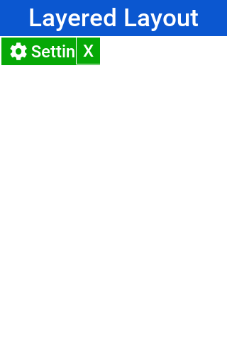
The code to generate this UI is slightly complex and contains few relevant pieces. The truly relevant piece is this block:
hi.add(LayeredLayout.encloseIn(settingsLabel,
        FlowLayout.encloseRight(close)));
You’re doing three distinct things here:
You’re adding a layered layout to the form
You’re creating a layered layout and placing two components within. This would be the equivalent of creating a
LayeredLayoutContainerand invokingaddtwiceYou use
FlowLayoutto position theXclose button in the right position
This is the full source of the example for completeness:
Form hi = new Form("Layered Layout");
int w = Math.min(Display.getInstance().getDisplayWidth(), Display.getInstance().getDisplayHeight());
Button settingsLabel = new Button("");
Style settingsStyle = settingsLabel.getAllStyles();
settingsStyle.setFgColor(0xff);
settingsStyle.setBorder(null);
settingsStyle.setBgColor(0xff00);
settingsStyle.setBgTransparency(255);
settingsStyle.setFont(settingsLabel.getUnselectedStyle().getFont().derive(w / 3, Font.STYLE_PLAIN));
FontImage.setMaterialIcon(settingsLabel, FontImage.MATERIAL_SETTINGS);
Button close = new Button("");
close.setUIID("Container");
close.getAllStyles().setFgColor(0xff0000);
FontImage.setMaterialIcon(close, FontImage.MATERIAL_CLOSE);
hi.add(LayeredLayout.encloseIn(settingsLabel,
        FlowLayout.encloseRight(close)));
Forms have a built in layered layout that you can access through getLayeredPane(), this allows you to overlay elements on top of the content pane.
The layered pane is used internally by components such as InteractionDialog, AutoComplete etc.
Insets and reference components
LayeredLayout supports insets for its children. This effectively allows you to position child components precisely where you want them, relative to their container or siblings. This functionality forms the under-pinnings of the GUI Builder’s Auto layout mode.
As an example, suppose you wanted to position a button in the lower right corner of its container. This can be achieved with LayeredLayout as follows:
Container cnt = new Container(new LayeredLayout());
Button btn = new Button("Submit");
LayeredLayout ll = (LayeredLayout)cnt.getLayout();
cnt.add(btn);
ll.setInsets(btn, "auto 0 0 auto");
The result is:
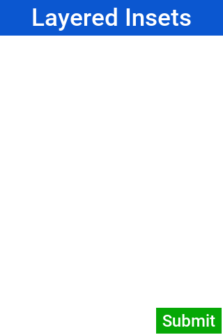
The thing new here is this line:
ll.setInsets(btn, "auto 0 0 auto");
This is called after btn has already been added to the container. It says that you want its insets to be "auto" on the top and left, and 0 on the right and bottom. This insets string follows the CSS notation of top right bottom left (that’s: start on top and go clockwise), and the values of each inset may be provided in pixels (px), millimetres (mm), percent (%), or the special "auto" value. Like CSS, you can also specify the insets using a 1, 2, or 3 values. For example:
"1mm"- Sets 1mm insets on all sides."1mm 2mm"- Sets 1mm insets on top and bottom; 2mm on left and right."1mm 10% 2mm"- Sets 1mm on top, 10% on left and right, and 2mm on bottom."1mm 2mm 1px 50%"- Sets 1mm on top, 2mm on right, 1px on bottom, and 50% on left.
auto insets
The special "auto" inset indicates that it’s a flexible inset. If all insets are set to "auto," then the component will be centered both horizontally and vertically inside its "bounding box."
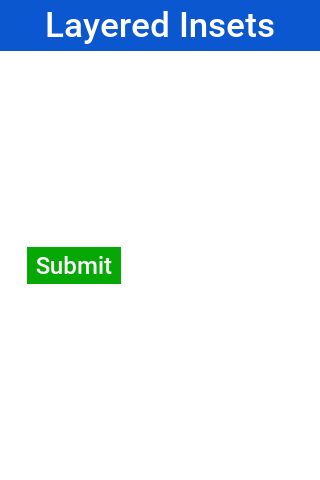
If one inset is fixed (that’s: defined in px, mm, or %), and the opposite inset is "auto," then the "auto" inset will allow the component to be its preferred size. If you want to position a component to be centered vertically, and 5mm from the left edge, you could do:
ll.setInsets(btn, "auto auto auto 5mm");
Resulting in:
Move it to the right edge with:
ll.setInsets(btn, "auto 5mm auto auto");
% insets
Percent (%) insets are calculated about the inset bounding box. A 50% inset is measured as 50% of the length of the bounding box on the inset’s axis. For example: A 50% inset on top would be 50% of the height of the inset bounding box. A 50% inset on the right would be 50% of the width of the inset bounding box.
Insets, margin, and padding
A component’s position in a layered layout is determined as follows: (Assume that cmp is the component that you’re positioning, and cnt is the container (In pseudo-code):
x = cnt.paddingLeft + cmp.calculatedInsetLeft + cmp.marginLeft
y = cnt.paddingTop + cmp.calculatedInsetTop + cmp.marginTop
w = cnt.width - cnt.verticalScroll.width - cnt.paddingRight - cmp.calculatedInsetRight - cmp.marginRight - x
h = cnt.height - cnt.horizontalScroll.height - cnt.paddingBottom - cmp.calculatedInsetBottom - cmp.marginBottom - y
calculatedInsetXXX values here will be the same as the corresponding provided inset if the inset has no reference component. If it does have a reference component, then the calculated inset will depend on the position of the reference component.If no inset is specified, then it’s assumed to be 0. This ensures compatibility with designs that were created before layered layout supported insets.
Component references: Linking components together
If all you need to do is position a component relative to its parent container’s bounds, then mere insets provide you with enough vocabulary to achieve this. But most UIs are more complex than this and require another concept: reference components. Often you will want to position a component relative to another child of the same container. This is also supported.
For example, suppose you want to place a text field in the center of the form (both horizontally and vertically), and have a button placed beside it to the right. Positioning the text field is trivial (setInset(textField, "auto")), but there is no inset that you can provide that would position the button to the right of the text field. To do your goal, you need to set the text field as a reference component of the button’s left inset, which "links" the button’s left inset to the text field. Here is the syntax:
Container cnt = new Container(new LayeredLayout());
LayeredLayout ll = (LayeredLayout)cnt.getLayout();
Button btn = new Button("Submit");
TextField tf = new TextField();
cnt.add(tf).add(btn);
ll.setInsets(tf, "auto")
  .setInsets(btn, "auto auto auto 0")
  .setReferenceComponentLeft(btn, tf, 1f);
This would result in:
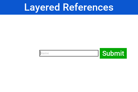
The two active lines here are the last two:
ll.setInsets(tf, "auto")
  .setInsets(btn, "auto auto auto 0")
  .setReferenceComponentLeft(btn, tf, 1f);
The definition above may make reference components and reference position seem more complex than they are. Some examples:
For a top inset:
referencePosition == 0 ⇒ the inset is measured from the top edge of the reference component.
referencePosition == 1 ⇒ the inset is measured from the bottom edge of the reference component.
For a bottom inset:
referencePosition == 0 ⇒ the inset is measured from the bottom edge of the reference component.
referencePosition == 1 ⇒ the inset is measured from the top edge of the reference component.
For a left inset:
referencePosition == 0 ⇒ the inset is measured from the left edge of the reference component.
referencePosition == 1 ⇒ the inset is measured from the right edge of the reference component.
For a right inset:
referencePosition == 0 ⇒ the inset is measured from the right edge of the reference component.
referencePosition == 1 ⇒ the inset is measured from the left edge of the reference component.
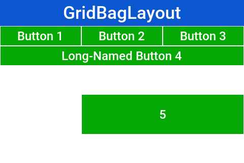
GridBag Layout
GridBagLayout was introduced to simplify the process of porting existing Swing/AWT code with a more familiar API. The API for this layout is problematic as it was designed for AWT/Swing where styles were unavailable. As a result it has its own insets API instead of using elements such as padding/margin.
Prefer TableLayout, which is just as capable and integrates better with Codename One.
The sample below is the Java tutorial’s GridBag example, ported to Codename One:
private static Button gridButton(String text) {
    Button button = new Button(text);
    button.setCapsText(false);
    Style style = button.getAllStyles();
    style.setBgColor(0xf4f8ff);
    style.setBgTransparency(255);
    style.setFgColor(0x0d47a1);
    style.setBorder(Border.createLineBorder(1, 0x2b5c9e));
    style.setPaddingUnit(Style.UNIT_TYPE_DIPS);
    style.setPadding(2, 2, 2, 2);
    return button;
}

public static Form createForm() {
    Form hi = new Form("GridBagLayout", new BorderLayout());
    Container grid = new Container(new GridBagLayout());
    Style gridStyle = grid.getAllStyles();
    gridStyle.setPaddingUnit(Style.UNIT_TYPE_DIPS);
    gridStyle.setPadding(4, 4, 4, 4);
    Button button;
    GridBagConstraints c = new GridBagConstraints();
    //natural height, maximum width
    c.fill = GridBagConstraints.HORIZONTAL;
    button = gridButton("One");
    c.weightx = 0.5;
    c.fill = GridBagConstraints.HORIZONTAL;
    c.gridx = 0;
    c.gridy = 0;
    grid.addComponent(c, button);

    button = gridButton("Two");
    c.fill = GridBagConstraints.HORIZONTAL;
    c.weightx = 0.5;
    c.gridx = 1;
    c.gridy = 0;
    grid.addComponent(c, button);

    button = gridButton("Three");
    c.fill = GridBagConstraints.HORIZONTAL;
    c.weightx = 0.5;
    c.gridx = 2;
    c.gridy = 0;
    grid.addComponent(c, button);

    button = gridButton("Long-Named Button 4");
    c.fill = GridBagConstraints.HORIZONTAL;
    c.ipady = 40;      //make this component tall
    c.weightx = 0.0;
    c.gridwidth = 3;
    c.gridx = 0;
    c.gridy = 1;
    grid.addComponent(c, button);

    button = gridButton("5");
    c.fill = GridBagConstraints.HORIZONTAL;
    c.ipady = 0;       //reset to default
    c.weighty = 1.0;   //request any extra vertical space
    c.anchor = GridBagConstraints.PAGE_END; //bottom of space
    c.insets = new Insets(10,0,0,0);  //top padding
    c.gridx = 1;       //aligned with button 2
    c.gridwidth = 2;   //2 columns wide
    c.gridy = 2;       //third row
    grid.addComponent(c, button);
    hi.add(BorderLayout.NORTH, grid);
    return hi;
}
Because of the way GridBag works there’s no terse syntax for it, although one should be possible.
Group Layout
GroupLayout is a layout that would be familiar to the users of the NetBeans GUI builder (Matisse). Its a layout manager that’s hard to use for manual coding but is powerful for some elaborate use cases. Although MigLayout and LayeredLayout might be superior options.
It was originally added during the LWUIT days as part of an internal try to port Matisse to LWUIT. It’s still useful to this day as developers copy and paste Matisse code into Codename One and produce elaborate layouts with drag.
Since the layout is based on an older version of GroupLayout some things need to be adapted in the code or you should use the special "compatibility" library for Matisse to get better interaction. You also recommend tweaking Matisse to use import statements instead of full package names, that way if you use Label changing the awt import to a Codename One import will make it use work for Codename One’s Label.
Unlike any other layout manager GroupLayout adds the components into the container instead of the standard API. This works for GUI builder code but as you can see from this sample it doesn’t make the code readable:
public static Form createForm() {
    Form hi = new Form("GroupLayout");

    Label label1 = new Label();
    Label label2 = new Label();
    Label label3 = new Label();
    Label label4 = new Label();
    Label label5 = new Label();
    Label label6 = new Label();
    Label label7 = new Label();

    label1.setText("label1");

    label2.setText("label2");

    label3.setText("label3");

    label4.setText("label4");

    label5.setText("label5");

    label6.setText("label6");

    label7.setText("label7");

    GroupLayout layout = new GroupLayout(hi.getContentPane());
    hi.setLayout(layout);
    layout.setHorizontalGroup(
        layout.createParallelGroup(GroupLayout.LEADING)
        .add(layout.createSequentialGroup()
            .addContainerGap()
            .add(layout.createParallelGroup(GroupLayout.LEADING)
                .add(layout.createSequentialGroup()
                    .add(label1, GroupLayout.PREFERRED_SIZE, GroupLayout.DEFAULT_SIZE, GroupLayout.PREFERRED_SIZE)
                    .addPreferredGap(LayoutStyle.RELATED)
                    .add(layout.createParallelGroup(GroupLayout.LEADING)
                        .add(label4, GroupLayout.PREFERRED_SIZE, GroupLayout.DEFAULT_SIZE, GroupLayout.PREFERRED_SIZE)
                        .add(label3, GroupLayout.PREFERRED_SIZE, GroupLayout.DEFAULT_SIZE, GroupLayout.PREFERRED_SIZE)
                        .add(label2, GroupLayout.PREFERRED_SIZE, GroupLayout.DEFAULT_SIZE, GroupLayout.PREFERRED_SIZE)))
                .add(label5, GroupLayout.PREFERRED_SIZE, GroupLayout.DEFAULT_SIZE, GroupLayout.PREFERRED_SIZE)
                .add(layout.createSequentialGroup()
                    .add(label6, GroupLayout.PREFERRED_SIZE, GroupLayout.DEFAULT_SIZE, GroupLayout.PREFERRED_SIZE)
                    .addPreferredGap(LayoutStyle.RELATED)
                    .add(label7, GroupLayout.PREFERRED_SIZE, GroupLayout.DEFAULT_SIZE, GroupLayout.PREFERRED_SIZE)))
            .addContainerGap(296, Short.MAX_VALUE))
    );
    layout.setVerticalGroup(
        layout.createParallelGroup(GroupLayout.LEADING)
        .add(layout.createSequentialGroup()
            .addContainerGap()
            .add(layout.createParallelGroup(GroupLayout.TRAILING)
                .add(label2, GroupLayout.PREFERRED_SIZE, GroupLayout.DEFAULT_SIZE, GroupLayout.PREFERRED_SIZE)
                .add(label1, GroupLayout.PREFERRED_SIZE, GroupLayout.DEFAULT_SIZE, GroupLayout.PREFERRED_SIZE))
            .addPreferredGap(LayoutStyle.RELATED)
            .add(label3, GroupLayout.PREFERRED_SIZE, GroupLayout.DEFAULT_SIZE, GroupLayout.PREFERRED_SIZE)
            .addPreferredGap(LayoutStyle.RELATED)
            .add(label4, GroupLayout.PREFERRED_SIZE, GroupLayout.DEFAULT_SIZE, GroupLayout.PREFERRED_SIZE)
            .addPreferredGap(LayoutStyle.RELATED)
            .add(label5, GroupLayout.PREFERRED_SIZE, GroupLayout.DEFAULT_SIZE, GroupLayout.PREFERRED_SIZE)
            .addPreferredGap(LayoutStyle.RELATED)
            .add(layout.createParallelGroup(GroupLayout.LEADING)
                .add(label6, GroupLayout.PREFERRED_SIZE, GroupLayout.DEFAULT_SIZE, GroupLayout.PREFERRED_SIZE)
                .add(label7, GroupLayout.PREFERRED_SIZE, GroupLayout.DEFAULT_SIZE, GroupLayout.PREFERRED_SIZE))
            .addContainerGap(150, Short.MAX_VALUE))
    );
    return hi;
}
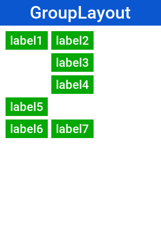
If you’re porting newer Matisse code there are simple changes you can do:
Change
addComponenttoaddChange
addGrouptoaddRemove references to
ComponentPlacementand referenceLayoutStyledirectly
Mig Layout
MigLayout is a popular cross-platform layout manager that was ported to Codename One from Swing.
The API was deprecated to serve as a warning of its experimental status.
The best reference for MiG would probably be its quick start guide (PDF link). The sample below is one of that guide’s examples, ported to Codename One:
public static Form createForm() {
    Form hi = new Form("MigLayout",
            new MigLayout("wrap 2, insets 4mm", "[right]3mm[32mm]", "[]12[]12[]12[]"));
    hi.add(new Label("First name"));
    hi.add("growx, w 32mm", new TextField("", "First name"));
    hi.add(new Label("Last name"));
    hi.add("growx, w 32mm", new TextField("", "Last name"));
    hi.add(new Label("Phone"));
    hi.add("growx, w 32mm", new TextField("", "Phone"));
    Button ok = new Button("OK");
    ok.setCapsText(false);
    Style okStyle = ok.getAllStyles();
    okStyle.setBgColor(0xf4f8ff);
    okStyle.setBgTransparency(255);
    okStyle.setFgColor(0x0d47a1);
    okStyle.setBorder(Border.createLineBorder(1, 0x2b5c9e));
    okStyle.setPaddingUnit(Style.UNIT_TYPE_DIPS);
    okStyle.setPadding(2, 2, 2, 2);
    hi.add("span 2, growx", FlowLayout.encloseCenter(ok));
    return hi;
}
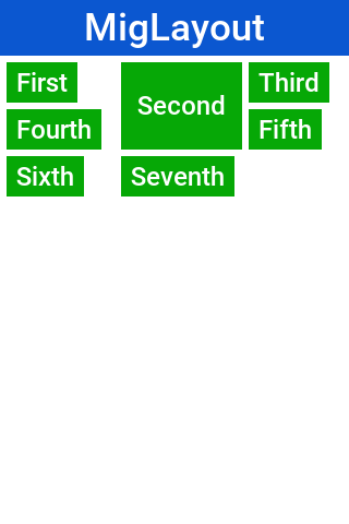
It should be reasonably easy to port MiG code but you should notice the following:
MiG handles a lot of the spacing/padding/margin issues that are missing in Swing/AWT. With Codename One styles you have the padding and margin which are probably a better way to do a lot of the things that MiG does
The
addmethod in Codename One can be changed as shown in the sample above.The constraint argument for Codename One
addcalls appears before theComponentinstance.
Themes and styles
Next you need to introduce you to 3 important terms in Codename One: Theme, Style, and UIID.
Themes are similar conceptually to CSS, in fact they can be created with CSS syntax as this guide covers soon. The various Codename One ports ship with a native theme representing the appearance of the native OS UI elements. Every Codename One application has its own theme that derives the native theme and overrides behavior within it.
If the native theme has a button defined, you can override properties of that button in your theme. This allows you to customize the look while retaining some native appearances. This works by merging the themes to one big theme where your application theme overrides the definitions of the native theme. This is pretty like the cascading aspect of CSS if you’re familiar with that.
Themes consist of a set of UIID definitions. Every component in Codename One has a UIID associated with it. UIID stands for User Interface Identifier. This UIID connects the theme to a specific component. A UIID maps to CSS classes if you’re familiar with that concept. For example, Codename One doesn’t support the complex CSS selector syntax options as those can impact runtime performance.
For example: see this code where:
nameText.setUIID("Label");This is a text field component (user input field) but it will look like a Label.
Effectively you told the text field that it should use the UIID of Label when it’s drawing itself. It’s common to do tricks like that in Codename One. For example: button.setUIID("Label") would make a button appear like a label and allow you to track clicks on a Label.
The UIID’s translate the theme elements into a set of Style objects. These Style objects get their initial values from the theme but can be further manipulated after the fact. To make the text field’s foreground color red you could use this code:
nameText.getAllStyles().setFgColor(0xff0000);The color is in hexadecimal RRGGBB format so 0xff00 would be green and 0xff0000 would be red.
getAllStyles() returns a Style object but why do you need “all” styles?
Each component can have one of 4 states and each state has a Style object. This means you can have 4 style objects per Component:
Unselected: used when a component isn’t touched and doesn’t have focus. You can get that object with
getUnselectedStyle().Selected: used when a component is touched or if focus is drawn for non-touch devices. You can get that object with
getSelectedStyle().Pressed: used when a component is pressed. Notice it’s applicable to buttons and button subclasses. You can get that object with
getPressedStyle().Disabled: used when a component is disabled. You can get that object with
getDisabledStyle().
The getAllStyles() method returns a special case Style object that lets you set the values of all 4 styles from one class so the code before would be equivalent to invoking all 4 setFgColor methods. For example, getAllStyles() works for setting properties not for getting them!
getStyle() for manipulationgetStyle() returns the current Style object which means it will behave inconsistently. The paint method uses getStyle() as it draws the current state of the Component but other code should avoid that method. Use the specific methods instead: getUnselectedStyle(), getSelectedStyle(), getPressedStyle(), getDisabledStyle() and getAllStyles()As you can see, it’s a bit of a hassle to change styles from code which is why the theme is so appealing.
Theme
A theme allows you to define the styles externally through a set of UIID’s (User Interface ID’s). Themes can be authored directly in CSS and then compiled into the Codename One resource file, which keeps styling concerns separate from application logic.
The theme is stored in the theme.res file in the project.
You load the theme file using this line of code in the init(Object) method in the main class of the application:
theme = UIManager.initFirstTheme("/theme");In a CSS project this file is generated automatically from the stylesheet. Legacy applications that still edit the resource file by hand can continue to do so, but new projects should prefer the CSS workflow described below.
This code is shorthand for resource file loading and for the installation of theme. You could technically have more than one theme in a resource file at which point you could use initNamedTheme() instead. The resource file is a special file format that includes inside it many features:
Themes
Images
Localization Bundles
Data files
Working with CSS themes
Modern Codename One projects ship with a src/main/css/theme.css file (or an equivalent stylesheet). Editing this file allows you to define UIIDs using standard CSS syntax together with Codename One–specific extensions such as cn1-derive for inheritance and the #Constants block for theme constants. Each time you build or run the project, the build tool compiles the CSS into the theme.res resource file automatically. Saving the CSS while the simulator is running will also trigger a refresh so you can iterate on styling.
Because the CSS compiler produces the final resource file, you should treat the generated theme.res as an output artifact and keep your changes in the CSS source. Images referenced from CSS rules (for example: background images or multi-images) should be placed alongside the stylesheet so that they’re picked up by the compiler. More details about the supported selectors and properties are covered in the dedicated CSS chapter later in this guide.
GUI builder
The GUI builder arranges components visually: you drag them onto a canvas, position them, and edit their properties in an inspector, without writing the layout code by hand. It’s a desktop application that the Codename One Maven plugin launches, so it works the same way whichever IDE you use for the surrounding Java code. Forms designed in the builder use auto layout mode by default, which positions and resizes components on the canvas using LayeredLayout behind the scenes.
Hello world
Two goals do the work:
cn1:create-gui-formgenerates a new GUI form: the.guiXML file plus the matching Java source.cn1:guibuilderopens the GUI builder on the project.
Both goals accept a className parameter that points at the fully qualified class name of the form. From the root of a multi-module Codename One project, create a new form like this:
mvn cn1:create-gui-form -DclassName=com.example.MyForm
This generates two files inside the common module:
common/src/main/guibuilder/com/example/MyForm.guicommon/src/main/java/com/example/MyForm.java
common submodule the files are written directly under that module’s src/main/… directory. By default the goal creates a Form; pass -DguiType=Dialog or -DguiType=Container to generate one of the other types, and pass -DautoLayout=false to opt out of auto layout mode.To open the form in the GUI builder:
mvn cn1:guibuilder -DclassName=com.example.MyForm
Projects generated from the archetype also carry a ready-made shortcut for this: a CN1 GUI Builder run configuration in IntelliJ IDEA, an Open in GUI Builder action in NetBeans, a GUI Builder launch configuration in Eclipse, and a Tools > GUI Builder entry in the Visual Studio Code Maven favorites. They all run the same goal.
The full goal reference, including every parameter, lives in the cn1:create-gui-form goal and
the cn1:guibuilder goal in the Maven goals appendix.
The workspace
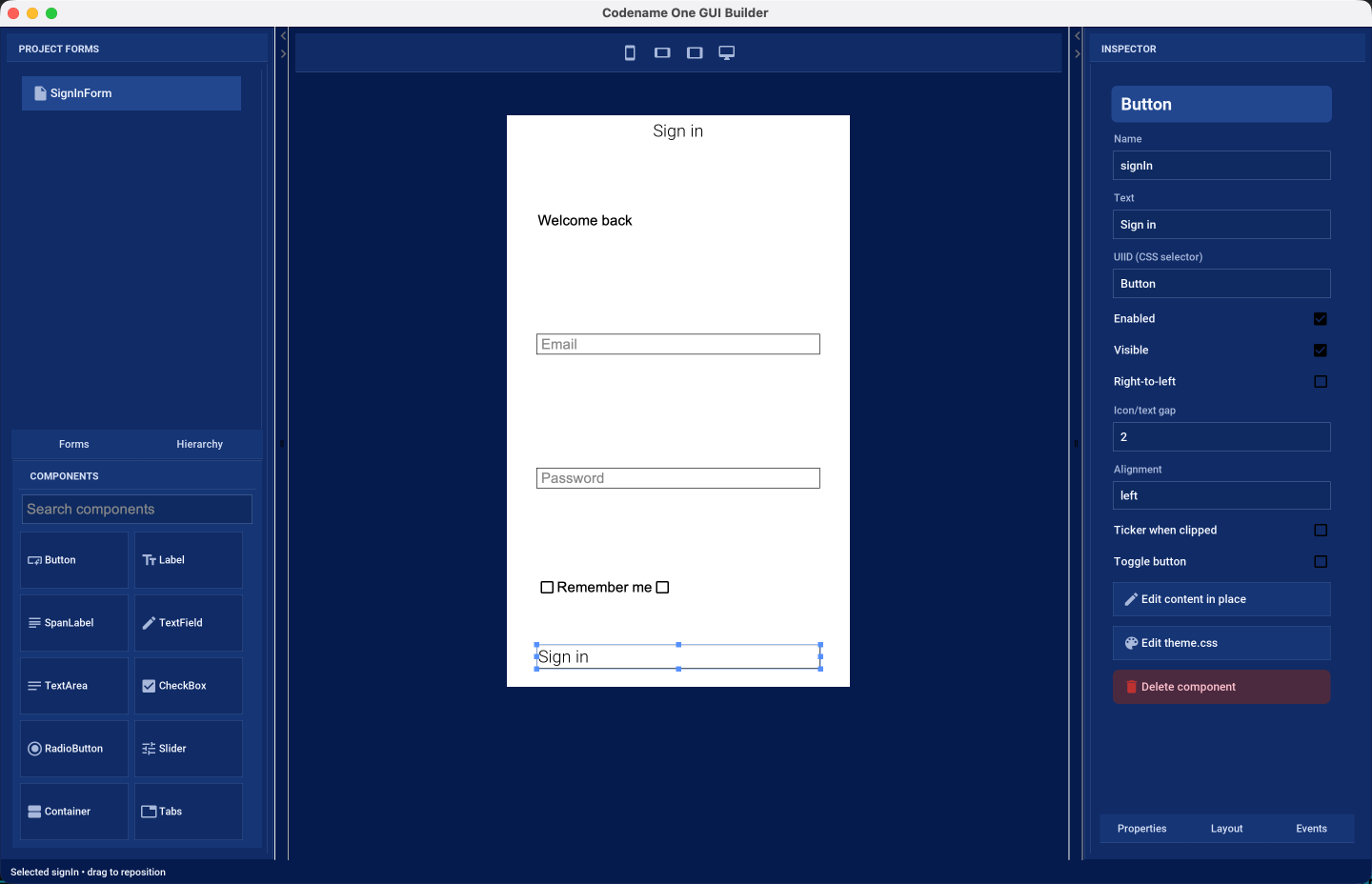
cn1:create-gui-formThe window has three columns:
Project forms and palette — on the left. The upper half lists every
.guifile in the project under the Forms tab, and the component tree of the form you are editing under the Hierarchy tab. Picking a component from the tree is often easier than hitting it on the canvas, particularly when it’s behind something else. The lower half is the component palette, with a search field for finding a component by name.Design canvas — in the middle. This is a live Codename One rendering of your form, styled by the project’s own
theme.css, so what you see is what the application draws. The buttons above the canvas switch it between phone portrait, phone landscape, tablet, and a full-width desktop canvas.Inspector — on the right. It shows the selected component under three tabs: Properties, Layout, and Events.
The toolbar carries Save, Undo, Redo and Refresh on the left, and CSS and Code on the right. Changes are written to the .gui file when you press Save.
The two dividers between the columns can be dragged, so you can give the canvas more room while positioning components and give the inspector more room while filling in properties.
Designing a form
Drag a component from the palette onto the canvas to add it. As you drag, the builder highlights where the component would land: the container that would receive it, and, in auto layout mode, guides showing the edges it would line up with. Dropping outside a valid target leaves the form unchanged.
Select a component by clicking it on the canvas or by picking it in the Hierarchy tab. A selected component shows resize handles; drag its body to move it, or a handle to resize it. Hold Shift while clicking to select several components at once, which is what the alignment actions in the top-left corner of the canvas operate on: they align edges, centers or baselines, match widths or heights, or disconnect a component from the relationships it has picked up.
Double-click a component that displays text — or long-press it — to edit that text in place, without going to the inspector.
The Properties tab holds what the component is: its name, its text, the UIID that connects it to a CSS selector, and the settings that belong to its type, such as the input constraint of a text field or the range of a slider. The Layout tab holds where it sits: its position in its parent, the layout manager of a container, and, for auto layout, its alignment reference and its horizontal and vertical size policies. The Events tab binds an event, such as a button press, to a method in the companion Java source.
Auto layout mode
New forms use auto layout mode. In this mode you place components where you want them rather than accepting the positions a layout manager dictates.
LayeredLayoutLayeredLayout. Component positioning uses insets and reference components, not absolute coordinates.An inset can be fixed (stated in millimetres, pixels or a percentage) or flexible, and it can be measured from the parent or from a sibling component. That’s what makes a form designed on one canvas size still work on another: a component pinned to the bottom of the form stays there on a taller screen, and a component pinned below its neighbor follows that neighbor when it moves.
The builder chooses insets for you as you drag, and it prefers a relationship with a nearby component over a distance from the edge of the form. The Layout tab shows the choice it made and lets you change it:
Alignment reference — the component this one is positioned against, or the nearest component if you haven’t chosen one.
Horizontal size policy and Vertical size policy — whether the component keeps its preferred size, keeps a fixed size, fills its parent, or matches the size of its reference component.
Resize the canvas with the device buttons above it after every few changes. A form that looks right on one canvas can fall apart on another, and switching between phone portrait and desktop is the quickest way to find out before a device does.
Nested containers and other layouts
A form doesn’t have to be one flat surface. Drag a Container from the palette to group components together, then use the Container layout picker in the Layout tab to give it whichever layout manager suits that part of the form: box, border, flow, grid, table, or layered again. Components dragged into that container are then arranged by it, and the drop guides change to match — a box layout shows where in the sequence the component would go, a border layout shows which region would receive it, and a table layout shows the cell.
Containers can be nested as far as you need, and a component can be dragged out of one container and into another; the builder rewrites its constraints for the layout it lands in.
The theme and the companion source
The CSS button opens the project stylesheet inside the builder.
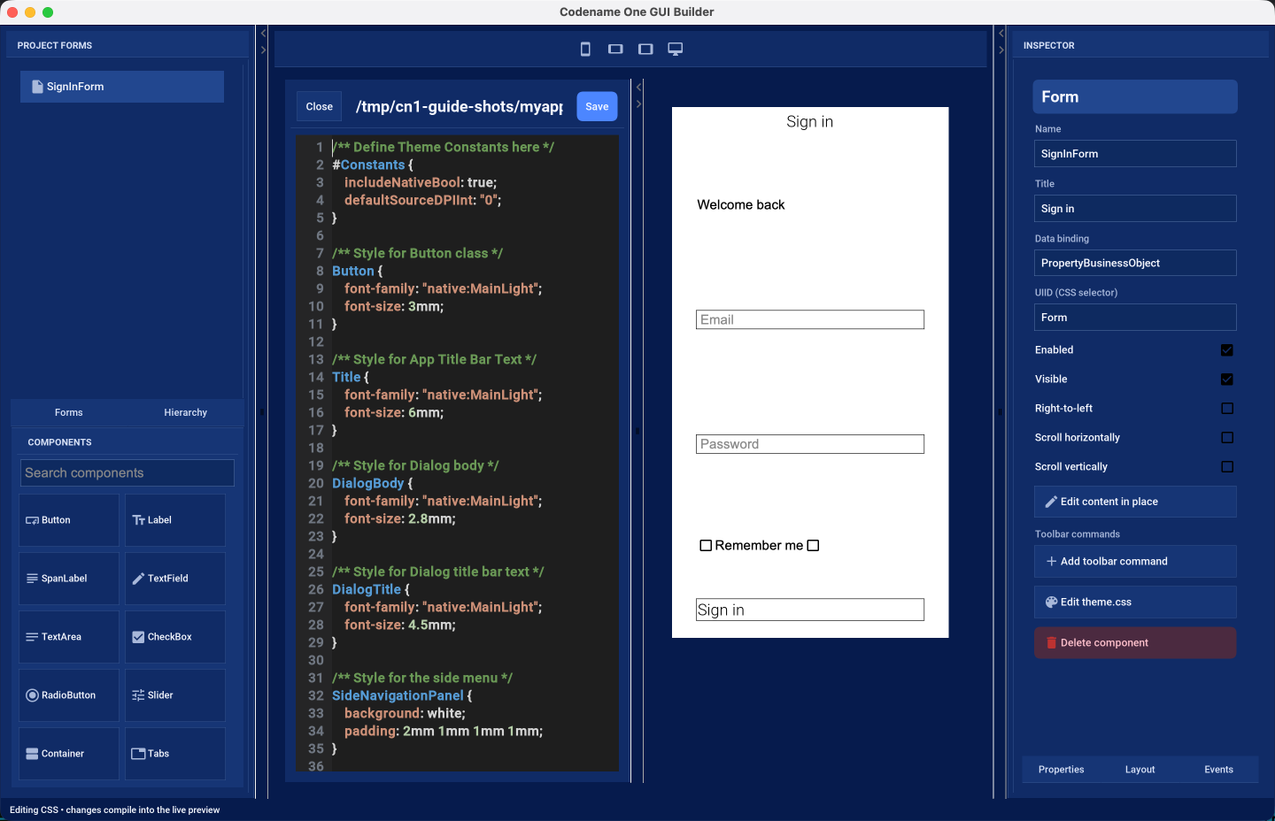
The stylesheet is compiled and applied to the canvas as you edit it, so a color or a font change is visible immediately on the form you are designing. This is the same src/main/css/theme.css the application builds with, described in Working with CSS themes.
The Code button opens the companion Java source.
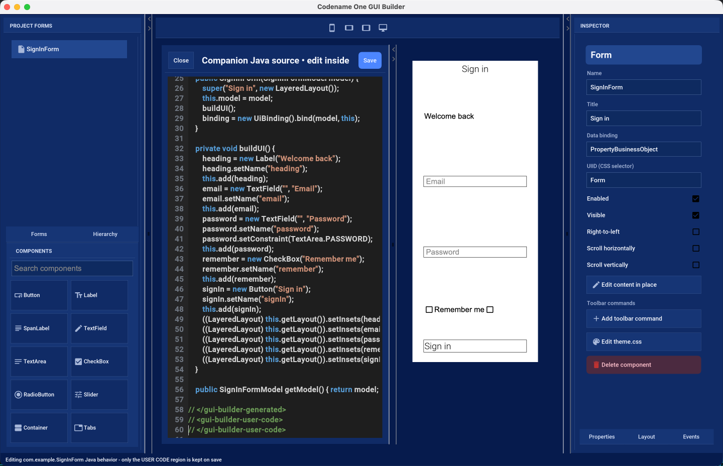
Everything between the // <gui-builder-generated> and // </gui-builder-generated> markers is written by the builder from the .gui file and is replaced whenever the form is saved. The region between the // <gui-builder-user-code> markers is yours: event handlers and anything else you add there is preserved across saves. The editor makes the distinction visible, and the status line reminds you which region takes your changes.
Forms scaffolded by older versions of cn1:create-gui-form used a different marker style. Opening such a form in the builder converts the file to the format above and keeps the methods you had written.
What’s stored on disk
A form is two files that belong together:
common/src/main/guibuilder/<package>/<Name>.gui— the XML description of the component tree. This is the file the builder reads and writes, and the one to keep under version control.common/src/main/java/<package>/<Name>.java— the companion Java source.
The .gui file is plain XML and readable enough to review in a diff:
<?xml version="1.0" encoding="UTF-8"?>

<component type="Form" name="SignInForm" title="Sign in" layout="LayeredLayout" autoLayout="true">
    <component type="Label" name="heading" text="Welcome back" layeredInsets="12% auto auto 8%" />
    <component type="TextField" name="email" hint="Email" layeredInsets="26% 8% auto 8%"
        guidedReferences="heading|-|-|-" />
    <component type="Button" name="signIn" text="Sign in" actionEvent="onSignIn"
        layeredInsets="62% 8% auto 8%" guidedReferences="email|-|-|-" />
</component>
You can edit it by hand, but reopen the form afterward: the builder doesn’t watch the file while it’s running.