Basics - where and how to draw manually
The Graphics class handles drawing basics, shapes, images, and text. Developers never instantiate it directly; the Codename One API passes it in.
You can gain access to a Graphics object using one of the following methods:
Derive Component or a subclass of
Component-Componentincludes many methods that let developers change drawing behavior. Override them to change how the component is drawn:paint(Graphics)- invoked to draw the component, this can be overridden to draw the component from scratch.paintBackground(Graphics)/paintBackgrounds(Graphics)- these allow overriding the way the component background is painted although you would probably be better off implementing a painter (see below).paintBorder(Graphics)- allows overriding the process of drawing a border, notice that border drawing might differ based on the style of the component.paintComponent(Graphics)- allows painting the components contents while leaving the default paint behavior to the style.paintScrollbars(Graphics),paintScrollbarX(Graphics),paintScrollbarY(Graphics)allows overriding the behavior of scrollbar painting.
Implement the painter interface; this interface can be used as a
GlassPaneor a background painter.The painter interface is simple and includes one paint method. It lets developers perform custom painting without subclassing
Component. Painters can be chained together to create elaborate paint behavior with the PainterChain class.Glass pane - a glass pane allows developers to paint on top of the form painting. This allows an overlay effect on top of a form.
At first, a glass pane may seem like overriding the Form’s paint method and drawing after
super.paint(g)completes. It isn’t the same. When a component repaints by invokingrepaint(), that component is drawn, and Form’spaint()method isn’t invoked. The glass pane painter is invoked in those cases and behaves as expected.Background painter - the background painter is installed through the style. By default, Codename One installs its own custom background painter. Installing a custom painter lets a developer define how the component background is drawn.
Many background-style behaviors can also be achieved using styles alone.
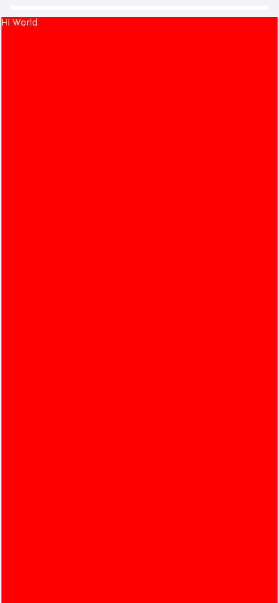
paint(Graphics) method of Form. The problem is that a form has child components that may request a repaint. To avoid that, place a paintable component in the center of the Form, or override the glass pane or background painter.A paint method can be implemented as such:
// hide the title
Form hi = new Form("", new BorderLayout());
hi.add(BorderLayout.CENTER, new Component() {
@Override
public void paint(Graphics g) {
// red color
g.setColor(0xff0000);

// paint the screen in red
g.fillRect(getX(), getY(), getWidth(), getHeight());

// draw hi world in white text in the top left corner of the screen
g.setColor(0xffffff);
g.drawString("Hi World", getX(), getY());
}
});
hi.show();
Painting with gradients
Solid colors are the starting point. Graphics also understands "paint" objects
that describe gradients and other patterns. You can pass an instance of
Paint
to setColor(Paint) in place of an integer color value to activate a gradient for
later fill and draw operations. The
LinearGradientPaint
class is the most common option and accepts a list of color stops along a line:
LinearGradientPaint gradient = new LinearGradientPaint(
        getX(), getY(), getX() + getWidth(), getY(),  // horizontal gradient
        new float[] {0f, 0.5f, 1f},
        new int[] {0xff4285f4, 0xff34a853, 0xfffbbc05},
        MultipleGradientPaint.CycleMethod.NO_CYCLE,
        MultipleGradientPaint.ColorSpaceType.SRGB,
        null
);
g.setColor(gradient);
// a Paint is consulted by fillShape; fillRect still uses the integer colour
g.fillShape(new Rectangle(getX(), getY(), getWidth(), getHeight()));
The fillLinearGradient() convenience methods (with optional repeat flag)
provide a shorthand when you need a two-color gradient without constructing
your own Paint object.
Radial gradients are equally straightforward using
fillRadialGradient() or fillRectRadialGradient(), which can render circular
and rectangular radial transitions respectively. These APIs accept the
inner/outer colors, focal point, and spread so you can combine them with linear
gradients to build sophisticated backgrounds and lighting effects.
For the full CSS gradient range, Graphics exposes a single fillGradient
method that consumes a Gradient value object. Gradient is a Paint
subclass with three concrete forms - LinearGradient, RadialGradient,
ConicGradient - following the same pattern as the Shape hierarchy:
int[] colors  = { 0xffff0080, 0xffff8c00, 0xff40e0d0 };
float[] stops = { 0f, 0.5f, 1f };

// one band each, so all three are visible at once
int band = getHeight() / 3;
g.fillGradient(new LinearGradient(45f, colors, stops),
        getX(), getY(), getWidth(), band);

RadialGradient circle = new RadialGradient(colors, stops);
circle.setShape(RadialGradient.SHAPE_CIRCLE)
      .setExtent(RadialGradient.EXTENT_FARTHEST_CORNER);
g.fillGradient(circle, getX(), getY() + band, getWidth(), band);

g.fillGradient(new ConicGradient(colors, stops),
        getX(), getY() + band * 2, getWidth(), band);
Gradient carries the cycle method (CYCLE_NONE / CYCLE_REPEAT /
CYCLE_REFLECT) for repeating / reflected fills. Each port implements
fillGradient via the fastest native shader available - Java2D
LinearGradientPaint / RadialGradientPaint on the simulator,
LinearGradient / RadialGradient / SweepGradient shaders on Android - and
falls back to a software rasterizer that calls Gradient#sampleArgb per
pixel where no native shader exists.
Image blur
Graphics.gaussianBlur(Image, float radius) returns a blurred copy of an image
using the platform’s fastest path (Core Image on iOS, RenderScript /
RenderEffect on Android, JHLabs GaussianFilter in the simulator). The same
blur is reachable from CSS via the filter: blur(<length>) and
backdrop-filter: blur(<length>) properties, which are stored on the
component’s Style as filterBlurRadius and backdropFilterBlurRadius.
Glass pane
The GlassPane `in Codename One is inspired by the Swing `GlassPane & LayeredPane with a few twists.
You tried to imagine how Swing developers would have implemented the glass pane knowing what they do now about painters and Swings learning curve. But first: what’s the glass pane?
A typical Codename One application is essentially composed of 3 layers (this is a gross simplification though), the background painters are responsible for drawing the background of all components including the main form. The component draws its own content (which might overrule the painter) and the glass pane paints last…
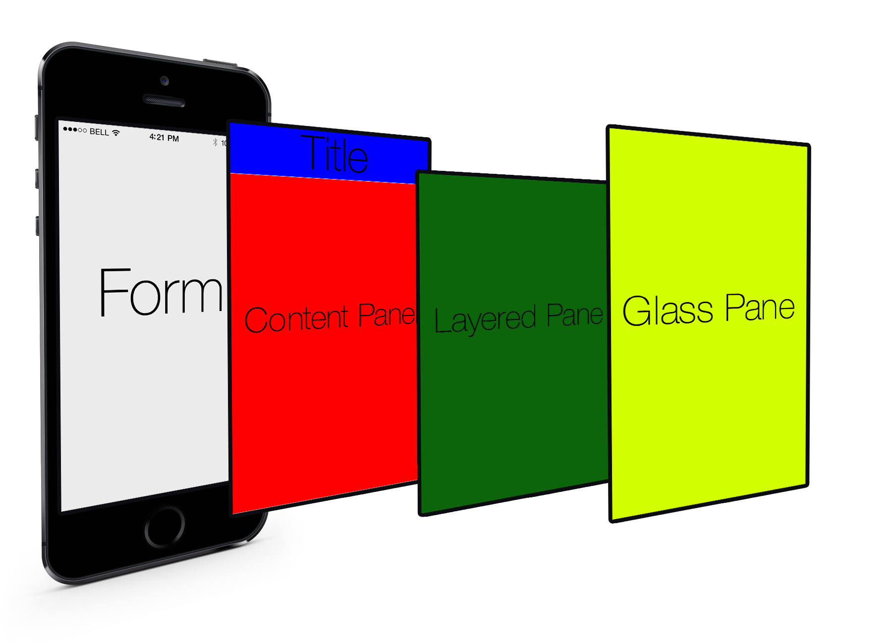
Essentially the glass pane is a painter that allows you to draw an overlay on top of the Codename One application.
Overriding the paint method of a form isn’t a substitute for glasspane as it would appear to work initially, when you enter a Form. For example, when modifying an element within the form that element gets repainted not the entire
Form!
If you have a form with a Button and text drawn on top using the Form’s paint method it would get erased whenever the button gets focus.
The glass pane is called whenever a component gets painted,
it paints within the clipping region of the component hence it won’t break the rest of the components on the Form which weren’t modified.
You can set a painter on a form using code like this:
hi.setGlassPane(new Painter() {
    @Override
    public void paint(Graphics g, Rectangle rect) {
    }
});
Or you can use Java 8 lambdas to tighten the code a bit:
hi.setGlassPane((g, rect) -> {
});
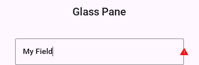
PainterChain allows you to chain many painters together to perform different logical tasks such as a validation painter coupled with a fade out painter. The sample below shows a crude validation panel that allows you to draw error icons next to components while exceeding their physical bounds as is common in many user interfaces
Form hi = new Form("Glass Pane", new BoxLayout(BoxLayout.Y_AXIS));
Style s = UIManager.getInstance().getComponentStyle("Label");
s.setFgColor(0xff0000);
s.setBgTransparency(0);
Image warningImage = FontImage.createMaterial(FontImage.MATERIAL_WARNING, s).toImage();
TextField tf1 = new TextField("My Field");
tf1.getAllStyles().setMarginUnit(Style.UNIT_TYPE_DIPS);
tf1.getAllStyles().setMargin(5, 5, 5, 5);
hi.add(tf1);
hi.setGlassPane((g, rect) -> {
int x = tf1.getAbsoluteX() + tf1.getWidth();
int y = tf1.getAbsoluteY();
x -= warningImage.getWidth() / 2;
y += (tf1.getHeight() / 2 - warningImage.getHeight() / 2);
g.drawImage(warningImage, x, y);
});
hi.show();
Shapes & transforms
The graphics API provides a high performance shape API that allows drawing arbitrary shapes by defining paths and curves and caching the shape drawn in the GPU.
Device support
Shapes and transforms ship with all Codename One’s actively maintained ports (Android, iOS, JavaScript, and desktop/Simulator). Older platforms that have reached end of life may lack these APIs, so keep the guard code shown below if you still target them with legacy builds.
Notice that perspective transform is missing from the desktop/simulator port. No real equivalent to perspective transform in Java SE that you could use.
A 2D drawing app
You can show shape drawing with a simple example of a drawing app, that allows the user to tap the screen to draw a contour picture.
The app works by keeping a GeneralPath in memory, and adding points as Bézier curves. Whenever a point is added, the path is redrawn to the screen.
The center of the app is the DrawingCanvas class, which extends Component:
public class DrawingCanvas extends Component {
    GeneralPath p = new GeneralPath();
    int strokeColor = 0x0000ff;
    int strokeWidth = 10;

    public void addPoint(float x, float y){
        // To be written
    }

    @Override
    protected void paintBackground(Graphics g) {
        super.paintBackground(g);
            Stroke stroke = new Stroke(
                strokeWidth,
                Stroke.CAP_BUTT,
                Stroke.JOIN_ROUND, 1f
            );
            g.setColor(strokeColor);

            // Draw the shape
            g.drawShape(p, stroke);

    }

    @Override
    public void pointerPressed(int x, int y) {
        addPoint(x-getParent().getAbsoluteX(), y-getParent().getAbsoluteY());
    }
}
Conceptually this is basic component. You will be overriding the
paintBackground()
method to draw the path. You keep a reference to a
GeneralPath
object (which is the concrete implementation of the Shape interface in Codename One) to store each successive
point in the drawing. You also parametrize the stroke width and color.
The implementation of the paintBackground() method (shown above) should be straight forward. It creates
a stroke of the appropriate width, and sets the color on the graphics context. Then it calls drawShape() to render the path of points.
Implementing addpoint()
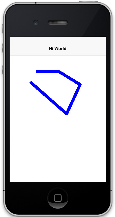
The addPoint method is designed to allow you to add points to the drawing. A simple implementation that uses straight lines rather than curves might look like this:
private float lastX = -1;
private float lastY = -1;

public void addPoint(float x, float y) {
    if (lastX == -1) {
        // this is the first point... Don't draw a line yet
        p.moveTo(x, y);
    } else {
        p.lineTo(x, y);
    }
    lastX = x;
    lastY = y;

    repaint();
}
The sample introduces a couple of house-keeping member vars (lastX and lastY) to store the last point that was added
that you know whether this is the first tap or a later tap. The first tap triggers a moveTo() call, whereas
later taps trigger lineTo() calls, which draw lines from the last point to the current point.
A drawing might look like this:
Using Bézier curves
Your previous implementation of addPoint() used lines for each segment of the drawing. Now make a change to allow for smoother edges by using quadratic curves instead of lines.
Codename One’s GeneralPath class includes two methods for drawing curves:
See the General Path javadocs for the full API.
You will make use of the quadTo()
method to append curves to the drawing as follows:
private boolean odd=true;
public void addPoint(float x, float y){
    if ( lastX == -1 ){
        p.moveTo(x, y);

    } else {
        float controlX = odd ? lastX : x;
        float controlY = odd ? y : lastY;
        p.quadTo(controlX, controlY, x, y);
    }
    odd = !odd;
    lastX = x;
    lastY = y;
    repaint();
}
This change should be straight forward except, perhaps, the business with the odd variable. Since
quadratic curves require two points (also to the implied starting point), you can’t take the last tap
point and the current tap point. You need a point between them to act as a control point. This is where you get
the curve from. The control point works by exerting a sort of "gravity" on the line segment, to pull the line towards
it. This results in the line being curved. The example uses the odd marker to alternate the control point between positions
above the line and below the line.
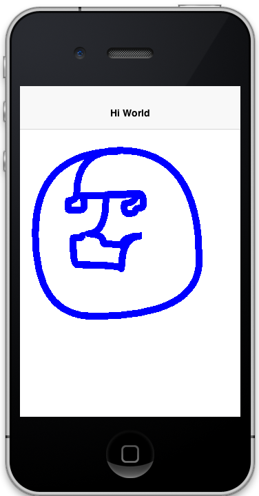
A drawing from the resulting app looks like:
Detecting platform support
The DrawingCanvas example is a bit naive in that it assumes that the device supports the shape API. Running this code on a device that doesn’t support the Shape API would draw a blank canvas where the shape was
expected to be drawn. You can fall back gracefully if you make use of the
Graphics.isShapeSupported() method. For example:
@Override
protected void paintBackground(Graphics g) {
    super.paintBackground(g);
    if ( g.isShapeSupported() ){
       // do my shape drawing code here
    } else {
        // draw an alternate representation for device
        // that doesn't support shapes.
        // E.g. You could defer to the Pisces
        // library in this case
    }

}
Transforms
The Graphics class has included limited support for 2D transformations for some time now including scaling, rotation, and translation:
scale(x,y): Scales drawing operations by a factor in each direction.translate(x,y): Translates drawing operations by an offset in each direction.rotate(angle): Rotates about the origin.rotate(angle, px, py): Rotates about a pivot point.
scale() and rotate() methods are available on platforms that support Affine transforms. See table X for a compatibility list.Device support
All current Codename One ports expose affine transforms (that’s: scale() and
rotate()). Use the following table as a quick reference when deciding whether
you need a fallback path.
Platform | Affine Supported |
Simulator/Desktop | Yes |
iOS | Yes |
Android | Yes |
JavaScript | Yes |
You can check if a particular Graphics context supports rotation and scaling using the isAffineSupported() method.
For example:
public void paint(Graphics g){
    if ( g.isAffineSupported() ){
        // Do something that requires rotation and scaling

    } else {
        // Fallback behavior here
    }
}
Example: Drawing an analog clock
The following sections implement an analog clock component. This will show three key concepts in Codename One’s graphics:
Using the
GeneralPathclass for drawing arbitrary shapes.Using
Graphics.translate()to translate your drawing position by an offset.Using
Graphics.rotate()to rotate your drawing position.
There are three separate things that need to be drawn in a clock:
The tick marks. For example: most clocks will have a tick mark for each second, larger tick marks for each hour, and sometimes even larger tick marks for each quarter-hour.
The numbers. You will draw the clock numbers (1 through 12) in the appropriate positions.
The hands. You will draw the clock hands to point at the appropriate points to display the current time.
The AnalogClock Component
Your clock will extend the Component class, and override the paintBackground() method to draw the clock as follows:
public class AnalogClock extends Component {
    Date currentTime = new Date();

    @Override
    public void paintBackground(Graphics g) {
        // Draw the clock in this method
    }
}
Setting up the parameters
Before you actually draw anything, take a moment to figure out what values you need to know to draw an effective clock. Minimally, you need two values:
The center point of the clock.
The radius of the clock.
The clock also exposes the following parameters to help customize how it’s rendered:
The padding (that’s: the space between the edge of the component and the edge of the clock circle.
The tick lengths. The example uses 3 different lengths of tick marks on this clock. The longest ticks will be displayed at quarter points (that’s: 12, 3, 6, and 9). Slightly shorter ticks will be displayed at the five-minute marks (that’s: where the numbers appear), and the remaining marks (corresponding with seconds) will be short:
// Hard code the padding at 10 pixels for now
double padding = 10;

// Clock radius
double r = Math.min(getWidth(), getHeight())/2-padding;

// Center point.
double cX = getX()+getWidth()/2;
double cY = getY()+getHeight()/2;

//Tick Styles
int tickLen = 10;  // short tick
int medTickLen = 30;  // at 5-minute intervals
int longTickLen = 50; // at the quarters
int tickColor = 0xCCCCCC;
Stroke tickStroke = new Stroke(2f, Stroke.CAP_BUTT, Stroke.JOIN_ROUND, 1f);
Drawing the tick marks
For the tick marks, you will use a single GeneralPath object, making use of the moveTo() and lineTo() methods
to draw each individual tick:
// a fresh path each repaint, otherwise the segments accumulate
GeneralPath ticksPath = new GeneralPath();
        // Draw a tick for each "second" (1 through 60)
for ( int i=1; i<= 60; i++){
    // default tick length is short
    int len = tickLen;
    if ( i % 15 == 0 ){
        // Longest tick on quarters (every 15 ticks)
        len = longTickLen;
    } else if ( i % 5 == 0 ){
        // Medium ticks on the '5's (every 5 ticks)
        len = medTickLen;
    }

    double di = (double)i; // tick num as double for easier math

    // Get the angle from 12 O'Clock to this tick (radians)
    double angleFrom12 = di/60.0*2.0*Math.PI;

    // Get the angle from 3 O'Clock to this tick
        // Note: 3 O'Clock corresponds with zero angle in unit circle
        // Makes it easier to do the math.
    double angleFrom3 = Math.PI/2.0-angleFrom12;

    // Move to the outer edge of the circle at correct position
    // for this tick.
    ticksPath.moveTo(
            (float)(cX+Math.cos(angleFrom3)*r),
            (float)(cY-Math.sin(angleFrom3)*r)
    );

    // Draw line inward along radius for length of tick mark
    ticksPath.lineTo(
            (float)(cX+Math.cos(angleFrom3)*(r-len)),
            (float)(cY-Math.sin(angleFrom3)*(r-len))
    );
}

// Draw the full shape onto the graphics context.
g.setColor(tickColor);
g.drawShape(ticksPath, tickStroke);
(x,y) coordinates of the tick marks based on
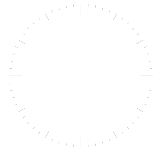
the angle and the radius. If math isn’t your thing, don’t worry. This example makes use of the identities: x=r*cosθ and y=r*sinθ.At this point your clock should include a series of tick marks orbiting a blank center as shown below:
Drawing the numbers
The Graphics.drawString(str, x, y) method allows you to draw text at any point of a component. The tricky part
here is calculating the correct x and y values for each string so that the number appears in the correct location.
For the purposes of this tutorial, you will use the following strategy. For each number (1 through 12):
Use the
Graphics.translate(x,y)method to apply a translation from the clock’s center point to the point where the number should appear.Draw number (using
drawString()) at the clock’s center. It should be rendered at the correct point due to your translation.Invert the translation performed in step 1:
for ( int i=1; i<=12; i++){
    // Calculate the string width and height so we can center it properly
    String numStr = ""+i;
    int charWidth = g.getFont().stringWidth(numStr);
    int charHeight = g.getFont().getHeight();

    double di = (double)i;  // number as double for easier math

    // Calculate the position along the edge of the clock where the number should
    // be drawn
     // Get the angle from 12 O'Clock to this tick (radians)
    double angleFrom12 = di/12.0*2.0*Math.PI;

    // Get the angle from 3 O'Clock to this tick
        // Note: 3 O'Clock corresponds with zero angle in unit circle
        // Makes it easier to do the math.
    double angleFrom3 = Math.PI/2.0-angleFrom12;

    // Get diff between number position and clock center
    int tx = (int)(Math.cos(angleFrom3)*(r-longTickLen));
    int ty = (int)(-Math.sin(angleFrom3)*(r-longTickLen));

    // For 6 and 12 we will shift number slightly so they're more even
    if ( i == 6 ){
        ty -= charHeight/2;
    } else if ( i == 12 ){
        ty += charHeight/2;
    }

    // Translate the graphics context by delta between clock center and
    // number position
    g.translate(
            tx,
            ty
    );


    // Draw number at clock center.
    g.drawString(numStr, (int)cX-charWidth/2, (int)cY-charHeight/2);

    // Undo translation
    g.translate(-tx, -ty);

}
Graphics.translate() method.
You could have as passed the exact location of the number to drawString() rather than draw at the clock
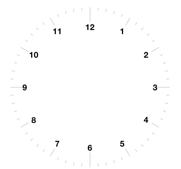
center and translate to the correct location.Now, you should have a clock with tick marks and numbers as shown below:
Drawing the hands
The clock will include three hands: Hour, Minute, and Second. You will use a separate GeneralPath object for each hand. For the positioning/angle of each, use the following strategy:
Draw the hand at the clock center pointing toward
12(straight up).Translate the hand slightly down so that it overlaps the center.
Rotate the hand at the appropriate angle for the current time, using the clock center as a pivot point.
Drawing the Second Hand:
For the "second" hand, you will use a simple line from the clock center to the inside edge of the medium tick mark at the 12 o’clock position:
GeneralPath secondHand = new GeneralPath();
secondHand.moveTo((float)cX, (float)cY);
secondHand.lineTo((float)cX, (float)(cY-(r-medTickLen)));
And you will translate it down slightly so that it overlaps the center. This translation will be performed on the GeneralPath object directly rather than through the Graphics context:
Shape translatedSecondHand = secondHand.createTransformedShape(
    Transform.makeTranslation(0f, 5)
);
Rotating the Second Hand::
The rotation of the second hand will be performed in the Graphics context through the rotate(angle, px, py) method.
This requires you to calculate the angle. The px and py arguments constitute the pivot point of the rotation,
which, in your case will be the clock center.
// Calculate the angle of the second hand
Calendar calendar = Calendar.getInstance(TimeZone.getDefault());
double second = (double)(calendar.get(Calendar.SECOND));
double secondAngle = second/60.0*2.0*Math.PI;

// Get absolute center position of the clock
double absCX = getAbsoluteX()+cX-getX();
double absCY = getAbsoluteY()+cY-getY();

// keep whatever transform the caller had, rather than resetting to none
Transform originalTransform = g.getTransform();
g.rotate((float)secondAngle, (int)absCX, (int)absCY);
g.setColor(0xff0000);
g.drawShape(
        translatedSecondHand,
        new Stroke(2f, Stroke.CAP_BUTT, Stroke.JOIN_BEVEL, 1f)
);
g.setTransform(originalTransform);
getTransform()
first and restore it with setTransform(), as the sample above does.
resetAffine() looks like the way to do this and isn’t: it clears the transform
entirely, including one a parent set before your component was painted.Drawing the Minute And Hour Hands:
The mechanism for drawing the hour and minute hands is largely the same as for the minute hand, with a couple of added complexities though:
You will make these hands trapezoidal, and almost triangular rather than using a simple line, which means the
GeneralPathconstruction will be slightly more complex.Calculation of the angles will be slightly more complex because they need to consider many parameters. For example: The hour hand angle is informed by both the hour of the day and the minute of the hour.
The remaining drawing code is as follows:
// Draw the minute hand
GeneralPath minuteHand = new GeneralPath();
minuteHand.moveTo((float)cX, (float)cY);
minuteHand.lineTo((float)cX+6, (float)cY);
minuteHand.lineTo((float)cX+2, (float)(cY-(r-tickLen)));
minuteHand.lineTo((float)cX-2, (float)(cY-(r-tickLen)));
minuteHand.lineTo((float)cX-6, (float)cY);
minuteHand.closePath();

// Translate the minute hand slightly down so it overlaps the center
Shape translatedMinuteHand = minuteHand.createTransformedShape(
    Transform.makeTranslation(0f, 5)
);

double minute = (double)(calendar.get(Calendar.MINUTE)) +
        (double)(calendar.get(Calendar.SECOND))/60.0;

double minuteAngle = minute/60.0*2.0*Math.PI;

// Rotate and draw the minute hand, keeping the caller's transform
Transform beforeMinuteHand = g.getTransform();
g.rotate((float)minuteAngle, (int)absCX, (int)absCY);
g.setColor(0x000000);
g.fillShape(translatedMinuteHand);
g.setTransform(beforeMinuteHand);


// Draw the hour hand
GeneralPath hourHand = new GeneralPath();
hourHand.moveTo((float)cX, (float)cY);
hourHand.lineTo((float)cX+4, (float)cY);
hourHand.lineTo((float)cX+1, (float)(cY-(r-longTickLen)*0.75));
hourHand.lineTo((float)cX-1, (float)(cY-(r-longTickLen)*0.75));
hourHand.lineTo((float)cX-4, (float)cY);
hourHand.closePath();

Shape translatedHourHand = hourHand.createTransformedShape(
    Transform.makeTranslation(0f, 5)
);

//Calendar cal = Calendar.getInstance().get
double hour = (double)(calendar.get(Calendar.HOUR_OF_DAY)%12) +
        (double)(calendar.get(Calendar.MINUTE))/60.0;

double angle = hour/12.0*2.0*Math.PI;
Transform beforeHourHand = g.getTransform();
g.rotate((float)angle, (int)absCX, (int)absCY);
g.setColor(0x000000);
g.fillShape(translatedHourHand);
g.setTransform(beforeHourHand);
The final result
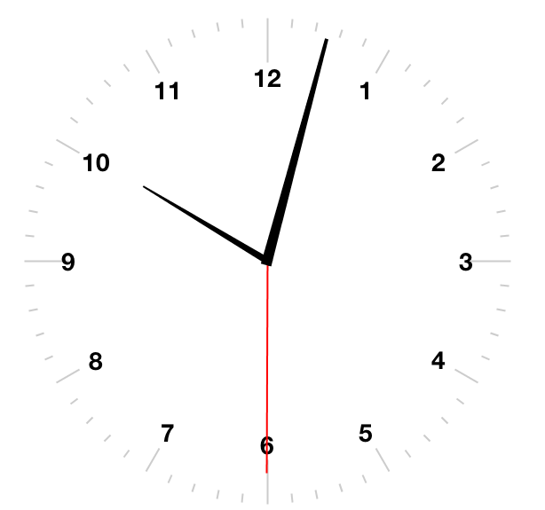
At this point, you have a complete clock as shown below:
Animating the clock
The current clock component is cool, but it’s static. It displays the time at the point the clock was created. You discussed low-level animations in the animation section of the guide, here you will show a somewhat more elaborate example.
To animate your clock so that it updates once per second, you need to do two things:
Implement the
animate()method to show when the clock needs to be updated/re-drawn.Register the component with the form so that it will receive animation "pulses."
The animate() method in the AnalogClock class:
long lastRenderedTime = 0;

@Override
public boolean animate() {
    long now = System.currentTimeMillis();
    if ( now/1000 != lastRenderedTime/1000){
        currentTime.setTime(now);
        lastRenderedTime = now;
        return true;
    }
    return false;
}
This method will be invoked on each "pulse" of the EDT. It checks the last time the clock was rendered and returns
true if the clock hasn’t been rendered in the current "time second" interval. Otherwise it returns false. This
ensures that the clock will be redrawn when the time changes.
Starting and stopping the animation
Animations can be started and stopped through the Form.registerAnimated(component) and
Form.deregisterAnimated(component) methods. The sample encapsulates these calls in start() and stop()
methods in the component as follows:
public void start(){
    getComponentForm().registerAnimated(this);
}

public void stop(){
    getComponentForm().deregisterAnimated(this);
}
The code to instantiate the clock, and start the animation would be something like:
AnalogClock clock = new AnalogClock();
// the clock draws to its own bounds and declares no preferred size, so it
// needs a region that stretches -- in a flow or box layout it would be 0x0
Form hi = new Form("Clock", new BorderLayout());
hi.add(BorderLayout.CENTER, clock);
hi.show();
clock.start();
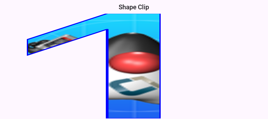
Shape clipping
Clipping is one of the core tenants of graphics programming, you define the boundaries for drawing and when you exceed said boundaries things aren’t drawn. Shape clipping allows you to clip based on any arbitrary Shape and not a rectangle, this allows some unique effects generated in runtime.
For example: this code allows you to draw a rather complex image of duke:
Image duke = null;
try {
    // duke.png is just the default Codename One icon copied into place
    duke = Image.createImage("/duke.png");
} catch(IOException err) {
    Log.e(err);
}
final Image finalDuke = duke;

Form hi = new Form("Shape Clip");

// We create a 50 x 100 shape, this is arbitrary since we can scale it easily
GeneralPath path = new GeneralPath();
path.moveTo(20,0);
path.lineTo(30, 0);
path.lineTo(30, 100);
path.lineTo(20, 100);
path.lineTo(20, 15);
path.lineTo(5, 40);
path.lineTo(5, 25);
path.lineTo(20,0);

Stroke stroke = new Stroke(0.5f, Stroke.CAP_ROUND, Stroke.JOIN_ROUND, 4);
hi.getContentPane().getUnselectedStyle().setBgPainter((Graphics g, Rectangle rect) -> {
    g.setColor(0xff);
    float widthRatio = ((float)rect.getWidth()) / 50f;
    float heightRatio = ((float)rect.getHeight()) / 100f;
    g.scale(widthRatio, heightRatio);
    g.translate((int)(((float)rect.getX()) / widthRatio), (int)(((float)rect.getY()) / heightRatio));
    g.setClip(path);
    g.setAntiAliased(true);
    g.drawImage(finalDuke, 0, 0, 50, 100);
    g.setClip(path.getBounds());
    g.drawShape(path, stroke);
    g.translate(-(int)(((float)rect.getX()) / widthRatio), -(int)(((float)rect.getY()) / heightRatio));
    g.resetAffine();
});

hi.show();
The coordinate system
The Codename One coordinate system follows the example of Swing (and many other - but not all-graphics libraries) and places the origin in the upper left corner of the screen. X-values grow to the right, and Y-values grow downward as illustrated below:
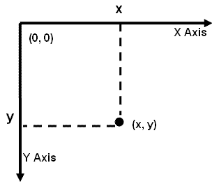
The screen origin is in the top left corner of the screen. Given this information, consider the method
call on the Graphics context g:
g.drawRect(10,10, 100, 100);
Where would this rectangle be drawn on the screen?
If you answered something like "10 pixels from the top, and 10 pixels from the left of the screen,"
you might be right. It depends on whether the graphics has a translation or transform applied to it. If there is
currently a translation of (20,20) (that’s: 20 pixels to the right, and 20 pixels down), then the rectangle would be
rendered at (30, 30).
You can always find out the current translation of the graphics context using the Graphics.getTranslateX()
and Graphics.getTranslateY() methods:
// Find out the current translation
int currX = g.getTranslateX();
int currY = g.getTranslateY();

// Reset the translation to zeroes
g.translate(-currX, -currY);

// Now we are working in absolute screen coordinates
g.drawRect(10, 10, 100, 100);

// This rectangle should now be drawn at the exact screen
// coordinates (10,10).

//Restore the translation
g.translate(currX, currY);
paint() method, there is a clip applied to the context so that
the content you draw within the bounds of the component will be seen.If, also, there is a transform applied that rotates the context 45 degrees clockwise, then the rectangle will be drawn at a 45-degree angle with its top left corner somewhere on the left edge of the screen.
You don’t have to worry about the exact screen coordinates for the things you paint. Most of the time, you will be concerned with relative coordinates.
Relative coordinates
Usually, when you’re drawing onto a Graphics context, you’re doing so within the context of a Component’s
paint() method (or one of its variants). In this case, you don’t care what the exact screen coordinates
are of your drawing. You’re concerned with their relative location within the coordinate. You can leave
the positioning (and even sizing) of the coordinate up to Codename One. Thank you for reading.
To show this, create a simple component called Rectangle component, that draws a rectangle on the screen. You will use the component’s position and size to dictate the size of the rectangle to be drawn. And you will keep a 5 pixel padding between the edge of the component and the edge of your rectangle:
class RectangleComponent extends Component {
    public void paint(Graphics g){
        g.setColor(0x0000ff);
        g.drawRect(getX()+5, getY()+5, getWidth()-10, getHeight()-10);
    }
}
The result is as follows:
x and y coordinates that are passed to the drawRect(x,y,w,h) method are relative to the
component’s parent’s origin — not the component itself.. Its parent. This is why you the x position is getX()+5
and not 5.Transforms and rotations
Unlike the Graphics drawXXX primitives, methods for setting transformations, including scale(x,y) and
rotate(angle), are always applied in screen coordinates. This can be confusing at first, because you
may be unsure whether to provide a relative coordinate or an absolute coordinate for a given method.
The general rule is:
All coordinates passed to the drawXXX() and fillXXX() methods will be subject to the graphics context’s transform and translation settings.
All coordinates passed to the context’s transformation settings are considered to be screen coordinates, and aren’t subject to current transform and translation settings.
Take your RectangleComponent as an example. Suppose you want to rotate the rectangle by 45 degrees,
your first try might look something like:
class RectangleComponent extends Component {

        @Override
        protected Dimension calcPreferredSize() {
            return new Dimension(250,250);
        }

        public void paint(Graphics g) {
            g.setColor(0x0000ff);
            g.rotate((float) (Math.PI / 4.0));
            g.drawRect(getX() + 5, getY() + 5, getWidth() - 10, getHeight() - 10);
            g.rotate(-(float) (Math.PI / 4.0));
        }
    }
paint() method, always remember to revert your
transformations at the end of the method so that it doesn’t pollute the rendering pipeline for later components.The behavior of this rotation will vary based on where the component is rendered on the screen. To show this, try to place five of these components on a form inside a BorderLayout and see how it looks:
class MyForm extends Form {

    public MyForm() {
        super("Rectangle Rotations", new BorderLayout());
        // one per position, so the rotation can be compared across the screen
        add(BorderLayout.NORTH, new RectangleComponent());
        add(BorderLayout.SOUTH, new RectangleComponent());
        add(BorderLayout.EAST, new RectangleComponent());
        add(BorderLayout.WEST, new RectangleComponent());
        add(BorderLayout.CENTER, new RectangleComponent());
    }
}
new MyForm().show();
The result is as follows:
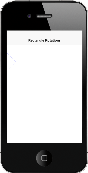
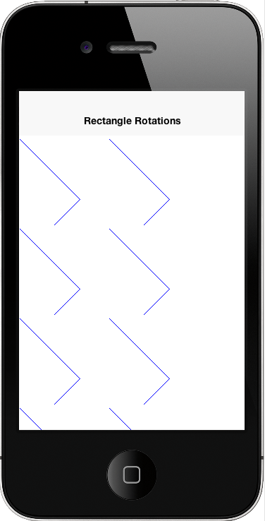
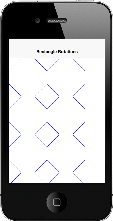
This may not be an intuitive outcome since you drew five rectangle components, but you see a portion of one
rectangle. The reason is that the rotate(angle) method uses the screen origin as the pivot point for the rotation.
Components nearer to this pivot point will experience a less dramatic effect than components farther from it. In
your case, the rotation has caused all rectangles except the first one to be rotated outside the bounds of their
containing component, and are therefore being clipped. A more sensible solution for your component would be to place
the rotation pivot point somewhere inside the component. That way all the components would look the same.
Some possibilities would be:
Top Left Corner:
public void paint(Graphics g) {
    g.setColor(0x0000ff);
    g.rotate((float)(Math.PI/4.0), getAbsoluteX(), getAbsoluteY());
    g.drawRect(getX() + 5, getY() + 5, getWidth() - 10, getHeight() - 10);
    g.rotate(-(float) (Math.PI / 4.0), getAbsoluteX(), getAbsoluteY());
}
Center:
public void paint(Graphics g) {
    g.setColor(0x0000ff);
    g.rotate(
        (float)(Math.PI/4.0),
        getAbsoluteX()+getWidth()/2,
        getAbsoluteY()+getHeight()/2
    );
    g.drawRect(getX() + 5, getY() + 5, getWidth() - 10, getHeight() - 10);
    g.rotate(
        -(float)(Math.PI/4.0),
        getAbsoluteX()+getWidth()/2,
        getAbsoluteY()+getHeight()/2
    );
}
You could also use the Graphics.setTransform() class to apply rotations and other complex transformations
(including 3D perspective transforms), but that belongs to its own topic as it’s a little bit more complex.
Global alpha & Anti-Aliasing
Up to this point you’ve relied on the per-pixel alpha stored in images and gradients. Graphics
also lets you apply a global alpha multiplier to every draw call by using
setAlpha(int) or concatenateAlpha(int) after checking isAlphaSupported().
Both methods accept values from 0 (fully transparent) to 255 (fully opaque)
and remain active until you change them again. concatenateAlpha() is
especially handy when you need to temporarily fade a component because it
returns the previous alpha so you can restore it later.
Anti-aliasing can likewise be toggled at runtime. Call isAntiAliasingSupported()
and isAntiAliasedTextSupported() to discover which hints the current port
exposes, then use setAntiAliased(boolean) and setAntiAliasedText(boolean) to
opt into smoother edges for shapes and glyphs respectively. These switches make
it easy to balance rendering quality versus speed depending on the type of
content you draw.
Event coordinates
The coordinate system and event handling are tied. You can listen for touch events on a component by
overriding the pointerPressed(x,y) method. The coordinates received in this method will be absolute screen
coordinates, so you may need to do some conversions on these coordinates before using them in your drawXXX()
methods.
For example: a pointerPressed() callback method can look like this:
public void pointerPressed(int x, int y) {
    addPoint(x-getParent().getAbsoluteX(), y-getParent().getAbsoluteY());
}
In this case you translated these points so that they would be relative to the origin of the parent component.
This is because the drawXXX() methods for this component take coordinates relative to the parent component.
Images
Codename One has a few image types: loaded, RGB (built-in), RGB (Codename One), Mutable,
EncodedImage, SVG, MultiImage, FontImage & Timeline. URLImage, FileEncodedImage, FileEncodedImageAsync,
and StorageEncodedImage/Async also exist, and are covered in the IO section.
All image types are seamless to use and will work with drawImage and various image related image
APIs for the most part with caveats on performance etc.
animate() method on the image (this is done automatically by Codename One when placing the image as a background or as an icon!You need to do it if you invoke
drawImage in code rather than use a built-in component).Performance and memory wise you should read the section below and be aware of the image types you use.
The Codename One designer tries to conserve memory and be "clever" by using EncodedImage. While these are great for low memory you need to understand the complexities of image locking and be aware that you might pay a penalty if you don’t.
Here are the pros/cons and logic behind every image type. This covers the logic of how it’s created:
Loaded Image
This is the basic image you get when loading an image from the jar or network using
Image.createImage(String), Image.createImage(InputStream) & Image.createImage(byte array, int, int),…
In some platforms calling getGraphics() on an image like this will throw an exception as it’s immutable). This is true for most other images as well.
This restriction might not apply for all platforms.
The image is stored in RAM based on device logic and should be reasonably efficient in drawing speed. For example, it takes up a lot of RAM.
To calculate the amount of RAM taken by a loaded image you use the following formula:
Image Width * Image Height * 4 = Size In RAM in Bytes
For example: a 50×100 image will take up 20,000 bytes of RAM.
The logic behind this is simple, every pixel contains 3 color channels and an alpha component hence 3 bytes for color and one for alpha.
The RGB image’s
There are two types of RGB constructed images that are different from one another but since they’re both technically "RGB image’s" you’re bundling them under the same subsection.
Internal
This is a close cousin of the loaded image. This image is created using the method Image.createImage(int array, int, int) and receives the AARRGGBB data to form the image. It’s more efficient than the Codename One RGB image but can’t be modified, at least not on the pixel level.
The goal of this image type is to provide an easy way to render RGB data that isn’t modified efficiently at platform native speeds. It’s technically a standard "Loaded Image" internally.
RGBImage class
RGBImage is effectively an AARRGGBB array that can be drawn by Codename One.
On most platforms this is inefficient but for some pixel level manipulations there is no other way.
An RGBImage is constructed with an int array (int[]) that includes width*height elements. You can then change the colors and alpha channel directly within the array and draw the image to any source using standard image drawing APIs.
EncodedImage
EncodedImage is the workhorse of Codename One. Images returned from resource files are EncodedImage and many APIs expect it.
The EncodedImage is effectively a loaded image that’s "hidden" and extracted as needed to remove the memory overhead associated with loaded image. When creating an EncodedImage the PNG (or JPEG etc.) is loaded to an array in RAM. Such images are small (relatively) so they can be kept in memory without much overhead.
When image information is needed (pixels) the image is decoded into RAM and kept in a weak/sort reference. This allows the image to be cached for performance and allows the garbage collector to reclaim it when the memory becomes scarce.
Since the fully decoded image can be pretty big (width X height X 4) the ability to store the encoded image can be pretty stark. For example: taking your example above a 50×100 image will take up 20,000 bytes of RAM for a loaded image but an EncodedImage can reduce that to 1kb-2kb of RAM.
EncodedImage might be more expensive than a loaded image as it will take up both the encoded size and the loaded size. The cost might be slightly bigger sometimes. It’s main value is its ability to shrink.When drawing an EncodedImage it checks the weak reference cache and if the image is cached then it’s shown otherwise the image is loaded the encoded image cache it then drawn.
EncodedImage isn’t final and can be derived to produce complex image fetching strategies for example: the URLImage class that can dynamically download its content from the web.
EncodedImage can be instantiated through the create methods in the EncodedImage class. Pretty much any image can be converted into an EncodedImage through the createFromImage(Image, boolean) method.
MultiImage
Multi images don’t physically exist as a concept within the Codename One API so there is no way to actually create them and they’re in no way distinguishable from EncodedImage.
The built-in support for multi images is in the resource file loading logic where a MultiImage is decoded and the version that matches the current DPI is physically loaded. From that point on user code can treat it like any other EncodedImage.
The 9-image borders use multi images by default to keep their appearance more refined on the different DPI’s.
FontImage & Material design icons
FontImage allows using an icon font as if it was an image. You can specify the character, color and size and then treat the FontImage as if its a regular image. The huge benefits are that the font image can adapt to platform conventions in color and scale to adapt to DPI.
You can generate icon fonts using free tools on the internet such as this. Icon fonts are a simple and powerful technique to create a small, modern applications.
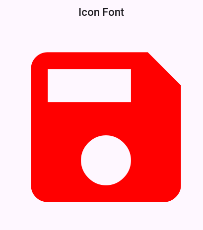
Icon fonts can be created in 2 basic ways the first is explicitly by defining all the elements within the font:
Form hi = new Form("Icon Font");
Font materialFont = FontImage.getMaterialDesignFont();
int w = Display.getInstance().getDisplayWidth();
FontImage fntImage = FontImage.createFixed("\uE161", materialFont, 0xff0000, w, w);
hi.add(fntImage);
hi.show();
A more common and arguably "correct" way to construct such an icon would be through the Style object. The Style object can provide the color, size and background information needed by FontImage.
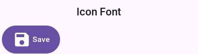
There are two versions of this method: the first one expects the Style object to have the correct icon font set to its font attribute. The second accepts a Font object as an argument. The latter is useful for a case where you want to reuse the same Style object that you defined for a general UI element for example: you can set an icon for a Button like this and it will take up the style of the Button:
Form hi = new Form("Icon Font");
Font materialFont = FontImage.getMaterialDesignFont();
int size = Display.getInstance().convertToPixels(6, true);
materialFont = materialFont.derive(size, Font.STYLE_PLAIN);
Button myButton = new Button("Save");
myButton.setIcon(FontImage.create("\uE161", myButton.getUnselectedStyle(), materialFont));
hi.add(myButton);
hi.show();
FontImage creation the size of the font is ignored!Material design icons
There are many icon fonts on the web, but the field is rather volatile and constantly changing. For example, you wanted to have built-in icons that would allow you to create better looking demos and built-in components.
That’s why you picked the material design icon font for inclusion in the Codename One distribution. It features a stable core set of icons, that aren’t IP encumbered.
You can use the built-in font directly as demonstrated above but there are far better ways to create a material design icon. To find the icon you want you can check out the material design icon gallery. For example: you used the save icon in the samples above.
To recreate the save icon from above you can do something like:
Form hi = new Form("Icon Font");
Button myButton = new Button("Save");
myButton.setIcon(FontImage.createMaterial(FontImage.MATERIAL_SAVE, myButton.getUnselectedStyle()));
hi.add(myButton);
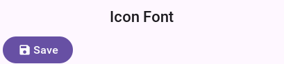
Button UIID.You can even write the code in a more terse style using:
Form hi = new Form("Icon Font");
Button myButton = new Button("Save");
FontImage.setMaterialIcon(myButton, FontImage.MATERIAL_SAVE);
hi.add(myButton);
This will produce the same result for slightly shorter syntax.
FontImage can conflict with some complex APIs that expect a "real" image underneath. Some odd issues can often be resolved by using the toImage() or toEncodedImage() methods to convert the scaled FontImage to a loaded image.Timeline
Timelines allow rudimentary animation and enable GIF importing using the Codename One Designer. Effectively a timeline is a set of images that can be moved rotated, scaled & blended to provide interesting animation effects. It can be created manually using the Timeline class.
Image masking
Image masking allows you to manipulate images by changing the opacity of an image according to a mask image. The mask image can be hardcoded or generated dynamically, it’s then converted to a Mask object that can be applied to any image. Notice that the masking process is computationally intensive, it should be done once and cached/saved.
The code below can convert an image to a rounded image:
Toolbar.setGlobalToolbar(true);
Form hi = new Form("Rounder", new BorderLayout());
Label picture = new Label("", "Container");
hi.add(BorderLayout.CENTER, picture);
hi.getUnselectedStyle().setBgColor(0xff0000);
hi.getUnselectedStyle().setBgTransparency(255);
Style s = UIManager.getInstance().getComponentStyle("TitleCommand");
Image camera = FontImage.createMaterial(FontImage.MATERIAL_CAMERA, s);
hi.getToolbar().addCommandToRightBar("", camera, (ev) -> {
    try {
        int width = Display.getInstance().getDisplayWidth();
        Image capturedImage = Image.createImage(Capture.capturePhoto(width, -1));
        Image roundMask = Image.createImage(width, capturedImage.getHeight(), 0xff000000);
        Graphics gr = roundMask.getGraphics();
        gr.setColor(0xffffff);
        gr.fillArc(0, 0, width, width, 0, 360);
        Object mask = roundMask.createMask();
        capturedImage = capturedImage.applyMask(mask);
        picture.setIcon(capturedImage);
        hi.revalidate();
    } catch(IOException err) {
        Log.e(err);
    }
});

Notice that this example is simplistic to be self contained. You often recommend that developers ship "ready made" mask images with their application which can allow complex effects on the images.
URLImage
URLImage is an image created with a URL, it implicitly downloads and adapts the image in the given URL while
caching it locally. The typical adapt process scales the image or crops it to fit into the same size which is a
hard restriction because of the way URLImage is implemented.
The simple use case is pretty trivial:
Image i = URLImage.createToStorage(placeholder, "fileNameInStorage", "https://xxx/myurl.jpg", URLImage.RESIZE_SCALE);
Or you can use the similar URLImage.createToFileSystem method instead of the Storage version.
This image can now be used anywhere a regular image will appear, it will initially show the placeholder image
and then seamlessly replace it with the file after it was downloaded and stored. Notice that if you make changes
to the image itself (for example: the scaled method) it will generate a new image which won’t be able to fetch the actual
image.
ImageIO will work.
it’s working in Java SE, Android, iOS & Windows Phone.If the file in the URL contains an image that’s too big it will scale it to match the size of the placeholder precisely!
An option also exists to fail if the sizes don’t match. Notice that the image that will be saved is the scaled
image, this means you will have little overhead in downloading images that are the wrong size although you
will get some artifacts.
The last argument is powerful, its an interface called URLImage.ImageAdapter and you can implement it to adapt the downloaded image in any way you like. For example: you can use an image mask to automatically create a rounded version of the downloaded image.
To do this you can override:
public EncodedImage adaptImage(EncodedImage downloadedImage, EncodedImage placeholderImage);
In the adapter interface and return the processed encoded image. If you do heavy processing (for example: rounded edge images) you would need to convert the processed image back to an encoded image so it can be saved. You would then also want to show that this operation should run asynchronously through the appropriate method in the class.
If you need to download the file instantly and not wait for the image to appear before download initiates you can explicitly invoke the fetch() method which will asynchronously fetch the image from the network. Notice that the downloading will still take time so the placeholder is still required.
Authenticated image URLs — RequestDecorator
The standard createToStorage path doesn’t expose the underlying
ConnectionRequest, so attaching an Authorization header (or any
other custom header / cookie / timeout) requires the RequestDecorator
hook. Two ways to install one:
// Global default for createToStorage images from this point on.
// createToFileSystem downloads do not consult it.
// The most common case is "all our images sit behind the same bearer
// token", which has its own shorthand:
URLImage.setDefaultBearerToken(Preferences.get("auth.token", null));

// Or the explicit form, which can attach any header / cookie / timeout:
URLImage.setDefaultRequestDecorator(req ->
        req.addRequestHeader("Authorization", "Bearer " + token));
For per-image overrides (for example one endpoint needs an extra API-version
header on top of the global bearer token), use the
createToStorage(placeholder, key, url, adapter, RequestDecorator)
overload. Per-instance decorators run after the global default so they
can override or augment whatever the default set:
URLImage profilePic = URLImage.createToStorage(
        placeholder,
        "profile-" + userId,
        baseUrl + "/users/" + userId + "/picture",
        URLImage.RESIZE_SCALE_TO_FILL,
        req -> req.addRequestHeader("X-API-Version", "2"));
URLImage.fetch()
downloads a file-system-backed image through Util.downloadImageToFileSystem,
which takes neither the global default nor a per-image decorator, so an image
created with createToFileSystem is fetched without your Authorization
header. Use createToStorage when the endpoint needs one.When a decorator is installed (global or per-call), URLImage skips the
default Util.downloadImageToStorage path and builds a
ConnectionRequest inline so the decorator can inspect / mutate it
before it’s queued. The legacy path remains the default for back-compat
when no decorator is set.
Mask adapter
A URLImage can be created with a mask adapter to apply an effect to an image. This allows you to round downloaded images or apply any sort of masking for example: you can adapt the round mask code above as such:
Image roundMask = Image.createImage(placeholder.getWidth(), placeholder.getHeight(), 0xff000000);
Graphics gr = roundMask.getGraphics();
gr.setColor(0xffffff);
gr.fillArc(0, 0, placeholder.getWidth(), placeholder.getHeight(), 0, 360);

URLImage.ImageAdapter ada = URLImage.createMaskAdapter(roundMask);
Image i = URLImage.createToStorage(placeholder, "fileNameInStorage", "https://xxx/myurl.jpg", ada);
URLImage in lists
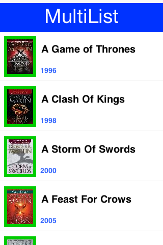
The biggest problem with image download service is with lists. Codename One attacks this issue at the core by
integrating URLImage support directly into GenericListCellRenderer which means it will work with MultiList,
List & ContainerList. To use this support define the name of the component (name not UIID) to end with
_URLImage and give it an icon to use as the placeholder. This is easy to do in the multilist by changing the
name of icon to icon_URLImage then using this in the data:
map.put("icon_URLImage", urlToActualImage);
Make sure you also set a "real" icon to the entry in the GUI builder or in handcoded applications. This is important
since the icon will be implicitly extracted and used as the placeholder value. Everything else should be handled
automatically. You can use setDefaultAdapter & setAdapter on the generic list cell renderer to install adapters
for the images. The default is a scale adapter although you might change that to scale fill in the future:
Style s = UIManager.getInstance().getComponentStyle("Button");
FontImage p = FontImage.createMaterial(FontImage.MATERIAL_PORTRAIT, s);
EncodedImage placeholder = EncodedImage.createFromImage(p.scaled(p.getWidth() * 3, p.getHeight() * 4), false);

Form hi = new Form("MultiList", new BorderLayout());

ArrayList<Map<String, Object>> data = new ArrayList<>();

data.add(createListEntry("A Game of Thrones", "1996", "https://www.georgerrmartin.com/wp-content/uploads/2013/03/GOTMTI2.jpg"));
data.add(createListEntry("A Clash Of Kings", "1998", "https://www.georgerrmartin.com/wp-content/uploads/2012/08/clashofkings.jpg"));
data.add(createListEntry("A Storm Of Swords", "2000", "https://www.georgerrmartin.com/wp-content/uploads/2013/03/stormswordsMTI.jpg"));
data.add(createListEntry("A Feast For Crows", "2005", "https://www.georgerrmartin.com/wp-content/uploads/2012/08/feastforcrows.jpg"));
data.add(createListEntry("A Dance With Dragons", "2011", "https://georgerrmartin.com/gallery/art/dragons05.jpg"));
data.add(createListEntry("The Winds of Winter", "2016 (please, please, please)", "https://www.georgerrmartin.com/wp-content/uploads/2013/03/GOTMTI2.jpg"));
data.add(createListEntry("A Dream of Spring", "Ugh", "https://www.georgerrmartin.com/wp-content/uploads/2013/03/GOTMTI2.jpg"));

DefaultListModel<Map<String, Object>> model = new DefaultListModel<>(data);
MultiList ml = new MultiList(model);
ml.getUnselectedButton().setIconName("icon_URLImage");
ml.getSelectedButton().setIconName("icon_URLImage");
ml.getUnselectedButton().setIcon(placeholder);
ml.getSelectedButton().setIcon(placeholder);
hi.add(BorderLayout.CENTER, ml);
hi.show();
The createListEntry method then looks like this:
private Map<String, Object> createListEntry(String name, String date, String coverURL) {
    Map<String, Object> entry = new HashMap<>();
    entry.put("Line1", name);
    entry.put("Line2", date);
    entry.put("icon_URLImage", coverURL);
    entry.put("icon_URLImageName", name);
    return entry;
}
Charts
Codename One includes a charting toolkit in the com.codename1.charts package
that’s designed to integrate with regular UI layouts. Charts are drawn by
creating an appropriate dataset and renderer pair, instantiating the matching
chart view class, and wrapping it in a
ChartComponent
it can be added to a form:
XYSeriesRenderer seriesRenderer = new XYSeriesRenderer();
seriesRenderer.setColor(0xff0000);

XYMultipleSeriesRenderer renderer = new XYMultipleSeriesRenderer();
renderer.addSeriesRenderer(seriesRenderer);

XYSeries series = new XYSeries("Sales");
series.add(1, 42);
series.add(2, 57);

XYMultipleSeriesDataset dataset = new XYMultipleSeriesDataset();
dataset.addSeries(series);

BarChart chart = new BarChart(dataset, renderer, BarChart.Type.DEFAULT);
Form form = new Form(new BorderLayout());
form.add(BorderLayout.CENTER, new ChartComponent(chart));
form.show();
The following classes are available for different kinds of visualisations:
| Chart class | Dataset & renderer | Notes |
|---|---|---|
| Draws categorical data as vertical bars. The | |
| Represents each data point as a circle whose size is proportional to a third value. | |
| Combines several XY chart types in a single plot using | |
| Smooths line series with cubic interpolation. Pass a smoothness factor to the constructor to control the curve. | |
| Renders one or more gauges on a dial, making it useful for KPI dashboards. | |
| Shows hierarchical proportions as concentric rings around a common center. | |
| Connects series of points using straight line segments. Supports optional fill areas and point markers. | |
| Splits a circle into slices that are proportional to each category value. | |
| Draws a spider/web chart that compares multiple categories across the same set of axes. | |
| Variation of | |
| Abstract base class for circular charts. Use subclasses such as | |
| Plots unconnected X/Y points with configurable marker shapes. | |
| Extends |