The Skin Designer turns a device specification (resolution, PPI,
fonts, safe-area insets, cutouts) into a .skin file that the
JavaSE simulator can load. It runs in your browser at
https://www.codenameone.com/skindesigner — there is nothing to
install.
This chapter walks through the wizard and explains what each step
contributes to the generated .skin. If you only want a skin and
don’t care how it’s built: pick a device, accept the defaults, click
Finish, then Download skin. The file is ready to load via Add
in the simulator’s Skins menu.
Themes/iPhoneTheme.res,
Themes/iOS7Theme.res, and Themes/android_holo_light.res themes
shipped with Codename One. For a custom skin from a hand-painted
device render, jump straight to the
"Upload an image" source.Stage 1 — pick a device
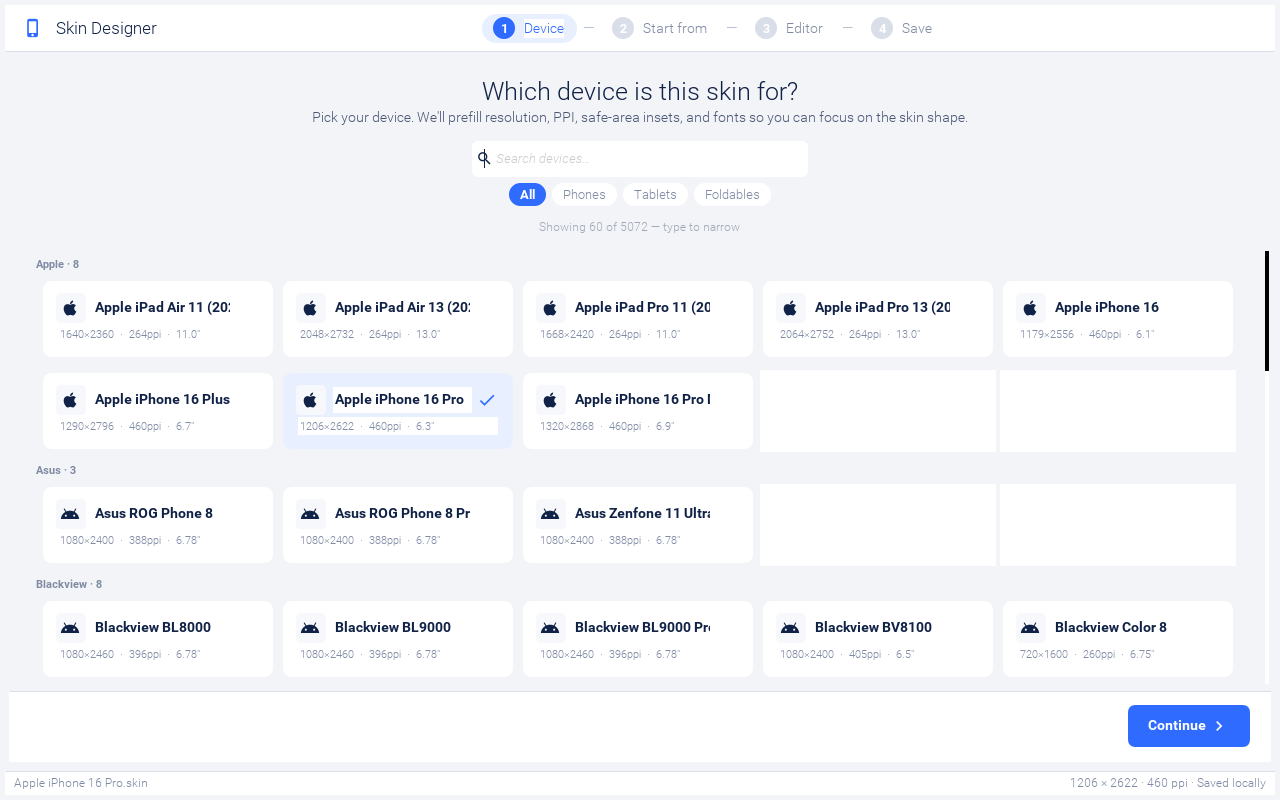
The first step shows a card per device from the bundled catalog. Use the search box to filter by name (it matches both the model and the brand) and the chips below to narrow by form factor: All / Phones / Tablets / Foldables. Tapping a card selects the device and enables the Continue button in the footer.
Picking a device pulls in its resolution, PPI, screen size, default safe-area insets, and the iOS / Android system font names from the device catalog, then seeds a sensible starting frame: notch, island, or hole presets are applied automatically based on the device’s hardware.
Showing X of Y hint between the chips and
the grid tells you when you’re looking at a clamped subset.Stage 2 — pick a starting source
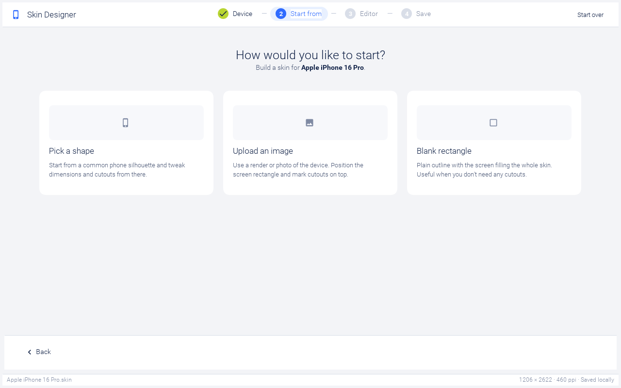
Three ways exist to seed the skin’s body image:
Pick a shape — generates the device frame procedurally from a small preset library (rounded rect, notch, dynamic island, punch-hole, corner hole, classic home-button). The frame is rendered as a dark gradient with the screen rect (and any cutouts) carved into it. Best when you want a generic-looking iPhone or Android frame and don’t care about exact hardware fidelity.
Upload an image — opens an image picker. The wizard scales the image into the device’s resolution, then carves the screen rect (and cutouts) on top. Use this when you have a marketing render of the specific device you’re targeting.
Blank rectangle — collapses the bezel and corner radius to almost nothing, drops every cutout, and turns the home indicator off. The screen fills the entire skin. Useful for desktop / web simulators where the device frame would just be visual noise.
Hover over a card on desktop to see the blue selection ring; click to advance to the editor.
Stage 3 — the editor
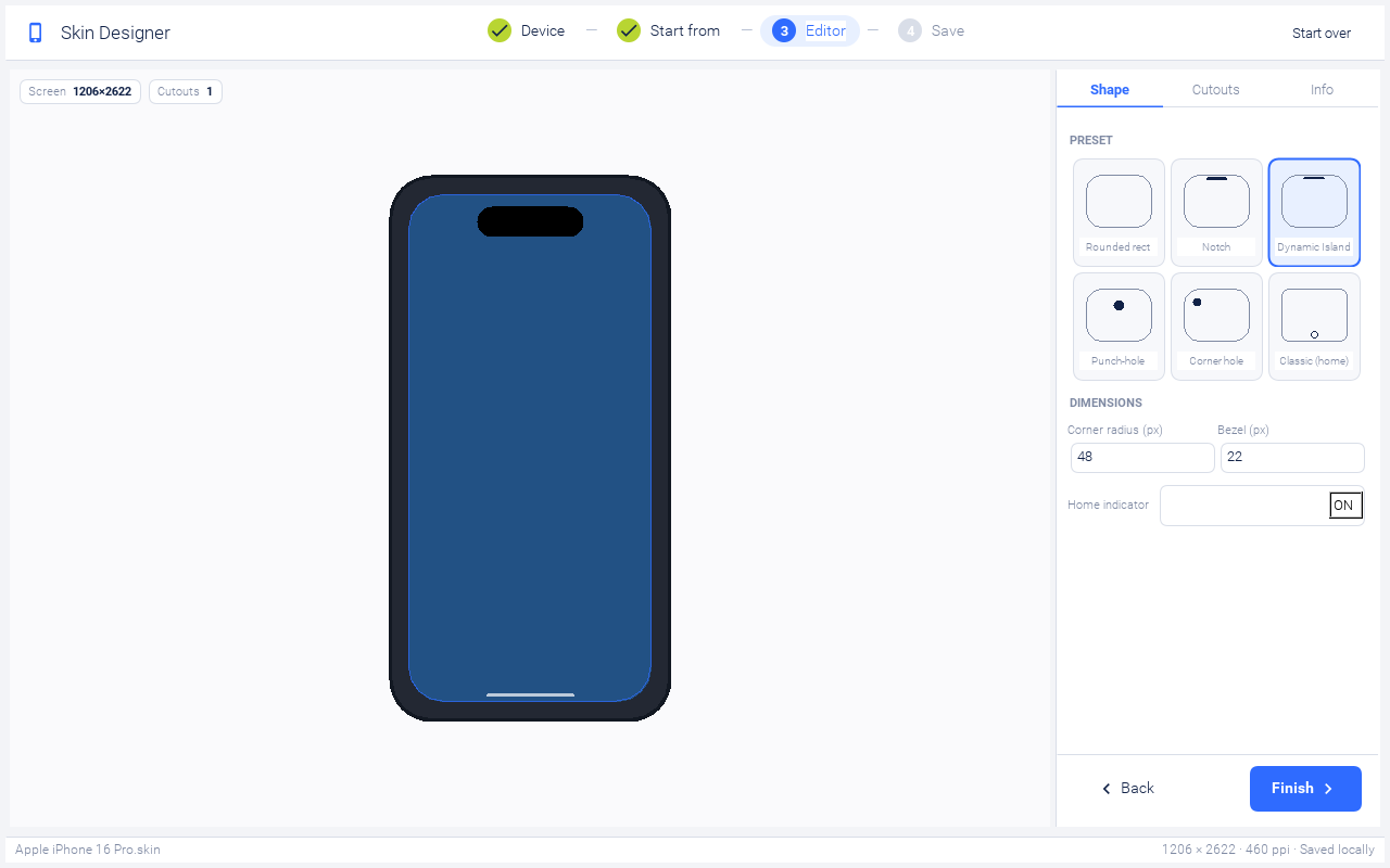
The editor is split into two panes: a live preview on the left that paints the device frame, screen tint, cutouts, and home indicator, and a sidebar on the right with three tabs.
Shape tab
When you started from Pick a shape, the Shape tab shows a preset grid (Rounded rect / Notch / Dynamic Island / Punch-hole / Corner hole / Classic home) and dimension fields:
Corner radius — the device’s outer corner radius in viewbox pixels (the design uses a 320 × 620 viewbox; the actual skin image is scaled to the device’s resolution).
Bezel — frame thickness in viewbox pixels. The screen rect is positioned at
(bezel, bezel)inside the skin image.Home indicator — toggles the lime pill drawn at the bottom edge. iPhones from X onward and most modern Androids should leave this on; classic devices with a hardware home button should turn it off.
When you started from Upload an image, the Shape tab swaps the preset grid for a Replace image button so you can swap the body image without restarting the wizard.
Cutouts tab
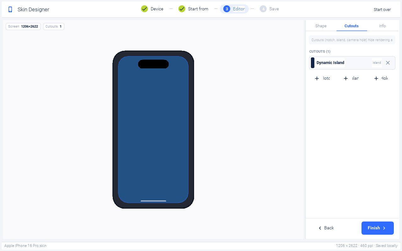
The Cutouts tab lists every cutout currently on the skin. Tap a row to expand its width / height / offset fields; the X button on the right removes it. The three add buttons at the bottom seed a sensible default of each type:
Notch (180 × 30 viewbox px) — the iPhone X / 11 / 12 / 13 hardware cutout. Drawn as an opaque shape hanging from the top edge inside the screen rect, square at the top and rounded at the bottom, because that’s where it sits on the hardware: an iPhone 13 Pro Max reports 1284 × 2778 pixels and the notch eats into the top of that rectangle.
Island (120 × 35) — Dynamic Island. Software-reserved space rendered as an opaque pill inside the screen rect, floating on top of the iOS status bar.
Hole (28 × 28) — Android punch-hole camera. Rendered like the island: opaque circle inside the screen rect.
Offsets are relative to the top-center of the screen, in viewbox
pixels. For islands and holes, Offset Y is the gap between the
cutout’s top edge and the screen top. For notches, Offset Y is
ignored, because a notch is anchored to the screen’s top edge.
The wizard also writes each cutout’s rectangle into the cutouts
property. The simulator drops pointer events that land inside one, so a
click on an opaque notch or island can’t reach app content hidden
underneath it, the way the hardware cutout can’t be touched at all.
.skin file, it
automatically pushes safePortraitY down to the lowest cutout edge
whenever that sits below the platform’s own status-bar inset, so app
content lands below the shape instead of underneath it. You don’t
need to adjust the safe area for a cutout yourself; only adjust it
if you want extra padding above your title bar.Info tab
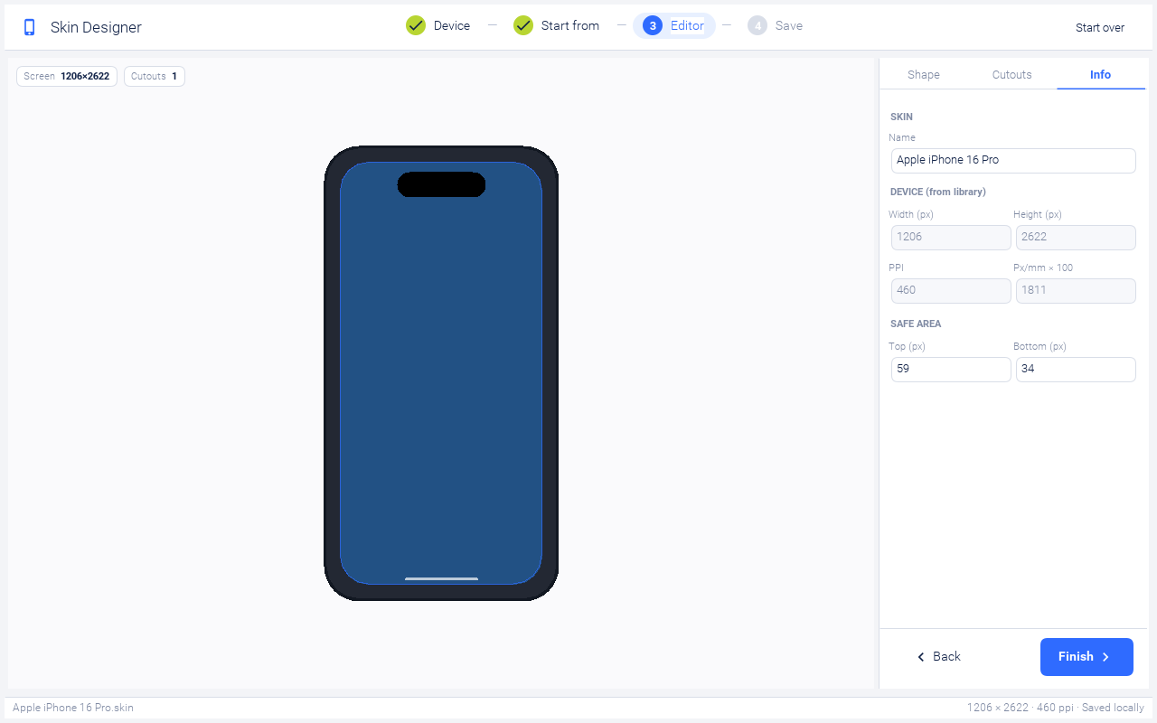
The Info tab is mostly read-only and shows what’s about to be
written into skin.properties:
Name — the only editable field. Determines the saved file name (sanitised: spaces become hyphens, special characters dropped, appended with
.skin).Width / Height — display resolution from the device catalog.
PPI / Pixels per millimeter — the simulator uses
pixelMilliRatio = ppi / 25.4to derive font sizes when none are specified in the skin.Safe area Top / Bottom — the user-editable safe-area insets, in the density-independent units the platform vendors publish: points on iOS, dp on Android. A notched iPhone reserves 47pt at the top and 34pt at the bottom, a Dynamic Island iPhone 59pt and 34pt, and an iPad 24pt on both edges. The wizard multiplies them by the device’s density scale to get the display-relative pixel insets it writes into
skin.properties, so the same 47 is correct on every notched iPhone regardless of resolution.
Stage 4 — finish and download
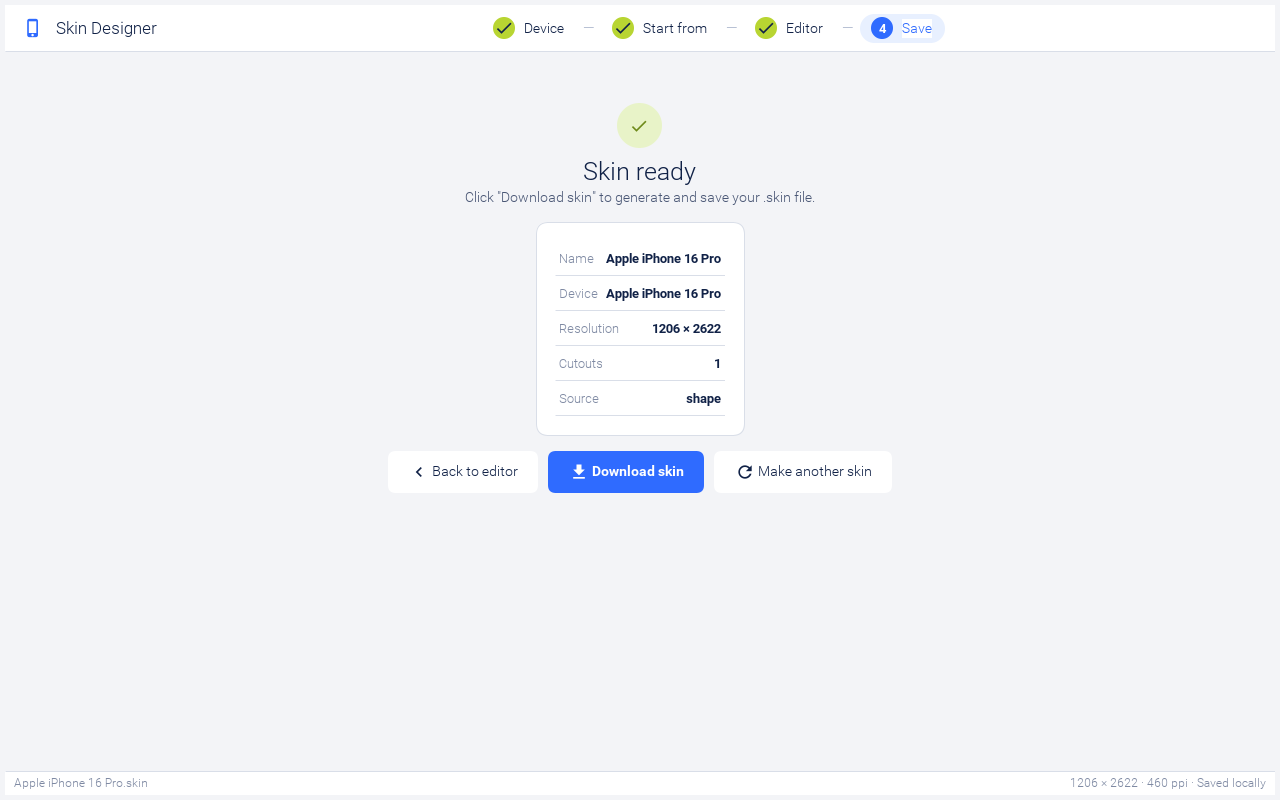
Clicking Finish in the editor’s footer:
Renders the portrait skin image (
skin.png) at the device’s actual resolution plus the bezel on all four sides, with rounded corners, a transparent screen, opaque cutouts painted on that screen, and a home indicator if enabled.Synthesises the landscape skin (
skin_l.png) by 90° rotation.Writes
skin_map.png/skin_map_l.pngoverlays that mark the screen rectangle for the simulator’s screen-position detection.Bundles the appropriate native theme (
iOS7Theme.res,android_holo_light.res, orwinTheme.res) inside the skin zip.Writes
skin.propertieswithroundScreen=true,displayX/Y/Width/Height,safePortrait*/safeLandscape*,cutouts, the platform name, override names, fonts, and PPI.
Clicking Download skin on the done page hands the file to the browser’s download dialog. The button is the only reliable trigger because the browser’s user-gesture window expires during the heavy image-generation step that Finish runs.
After the file is on disk, drop it into your simulator’s skins folder (or use the Add command in the simulator’s Skins menu) and your new device should appear in the picker.
File layout of a generated skin
A generated .skin is just a renamed zip. Unzip it to see the
layout:
Apple-iPhone-16-Pro.skin/
  skin.png            # portrait body (device frame + transparent screen + cutouts)
  skin_l.png          # 90° rotated portrait
  skin_map.png        # black rect = screen, white = frame, used for hit-testing
  skin_map_l.png      # rotated map
  iOS7Theme.res       # bundled native theme (or android_holo_light.res / winTheme.res)
  skin.properties     # platform metadata, safe-area, PPI, display rect
The skin.properties file is a normal Java .properties. The most
important keys the wizard writes:
touch=true
platformName=ios
tablet=false
ppi=460
pixelRatio=18.110236220472443

# roundScreen=true makes the simulator paint skin.png *over* the rendered
# UI rather than clipping the UI to non-frame pixels. That overlay step is
# what makes the Dynamic Island / punch-hole shapes appear "floating" on
# top of the iOS status bar instead of being carved out of the display.
roundScreen=true
displayX=151
displayY=151
displayWidth=1206
displayHeight=2622

# The cutouts the skin paints on the screen, as display-relative
# x,y,w,h rectangles separated by ";". The simulator drops pointer events
# inside them, so a click on the opaque island cannot reach app content
# hidden underneath. A skin that omits this key keeps every cutout
# clickable.
cutouts=377,53,452,132

# Safe area in display-relative coordinates (origin = screen top-left),
# in PIXELS. The Info tab's Top/Bottom fields are points (iOS) or dp
# (Android); the wizard multiplies them by the device's density scale.
# Here the Dynamic Island's bottom edge sits below the 59pt status-bar
# inset, so it is the island that sets safePortraitY.
safePortraitX=0
safePortraitY=185
safePortraitWidth=1206
safePortraitHeight=2335
# skin_l.png is skin.png rotated clockwise, so the portrait TOP inset lands
# on the landscape RIGHT edge. X therefore carries the BOTTOM inset (34pt x
# 3), and the 185px island inset is what is left on the right.
safeLandscapeX=102
safeLandscapeY=0
safeLandscapeWidth=2335
safeLandscapeHeight=1206

# These get composed by overrideNames(device) — they let users layer
# device-specific styling on top of the platform theme via
# UIManager.addThemeProps()-style theme inheritance.
overrideNames=phone,ios,iphone

systemFontFamily=SF Pro
proportionalFontFamily=SF Pro
monospaceFontFamily=SF Mono
smallFontSize,
mediumFontSize, or largeFontSize. When those are absent the
simulator automatically derives them from pixelMilliRatio (med = round(2.6
* ppmm), sm = 2 * ppmm, la = 3.3 * ppmm), which is what you
want on high-PPI screens. Writing iOS-style point values (12 / 15 /
22) into the file used to make text render at sub-millimeter sizes
on a 460 PPI device.