This chapter covers the components of Codename One. It doesn’t cover every component, but it goes deeper than the Javadocs.
Container
The Codename One container is a base class for many high-level components. A container can hold other components.
Every component has a parent container. That parent can be null when the component isn’t inside another container or when it’s a top-level container. A container can have many children.
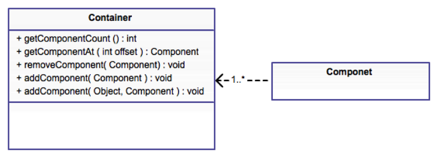
Components are arranged in containers with layout managers. A layout manager decides how to arrange components inside the container.
You can read more about layout managers in the basics section.
Composite components
Codename One components share a generic inheritance hierarchy. For example, Button derives from Label and thus receives all its abilities.
Some components are composites and derive from the Container class. For example, the MultiButton is a composite button that derives from Container but behaves like a Button. Most of the time this feels seamless, but a few details matter.
Don’t use the
Container-derived methods on such a composite component (for example,addandremove).You can’t cast it to the type it relates to. For example, you can’t cast
MultiButtontoButton.Events can be more nuanced. For example, if you rely on ActionEvent.getSource() or ActionEvent.getComponent(), they may not behave as expected. For a
MultiButton, they return the underlyingButton. To work around that, use ActionEvent.getActualComponent().
Form
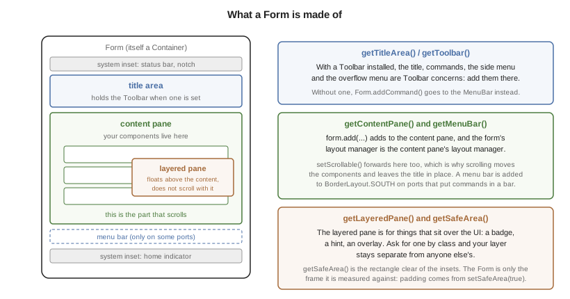
A Form isn’t one surface. It’s a title area, a content pane, any number of
layered panes, and on ports that place commands in a soft-key or button bar, a
menu bar as well. Knowing which of them receives a component explains most of
what happens next:
Form is the top-level container in Codename One. Form derives from Container and is the element the app shows. Only one form can be visible at any given time. You can get the visible Form with the code:
Form currentForm = Display.getInstance().getCurrent();
A form is a container with a title, a content area, and an optional menu or menu-bar area. When you call methods such as add or remove on a form, you’re invoking something that maps to this:
myForm.getContentPane().add(cmp);
Form is effectively a Container with a border layout. The north section holds the title area, the south section holds the optional menu bar, and the center stretches as the content pane. Place all components in the content pane.
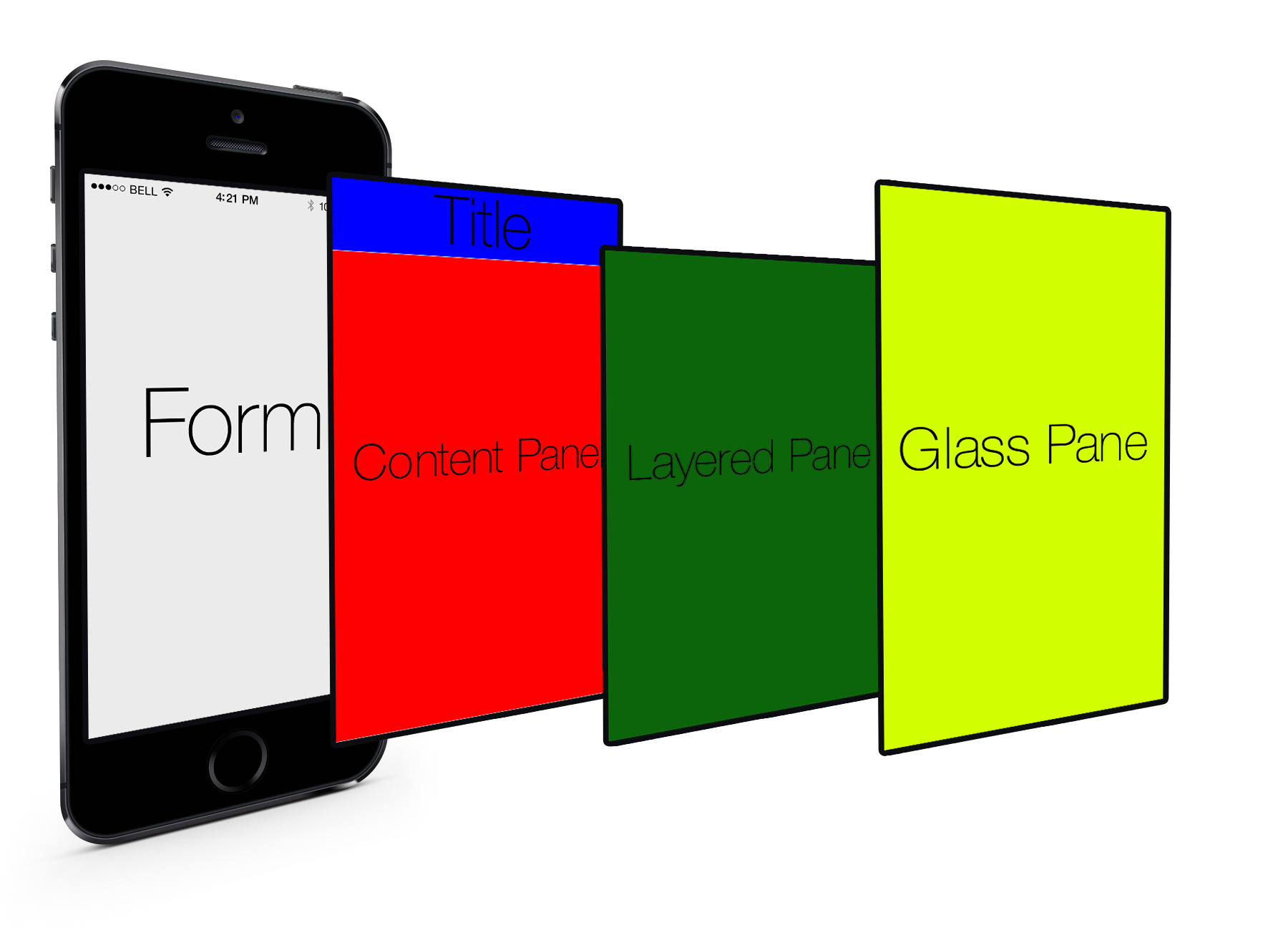
You can see that every Form has space allocated for the title area. If you don’t set the title, it won’t show up, but it will still be there. The same isn’t always true for the menu bar, which can vary. Effectively, the section that matters is the content pane, so the form tries to do the right thing by pretending to be the content pane. For example, this isn’t always seamless, and sometimes code needs to invoke getContentPane() to work directly with the container.
getContentPane() instead of working with the Form directly.As you can see from the graphic, Form has two layers that live on top of the content pane/title. The first is the layered pane, which allows you to place "always on top" components. The layered pane is added implicitly when you invoke getLayeredPane().
Safe areas
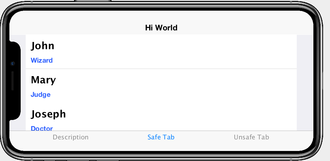
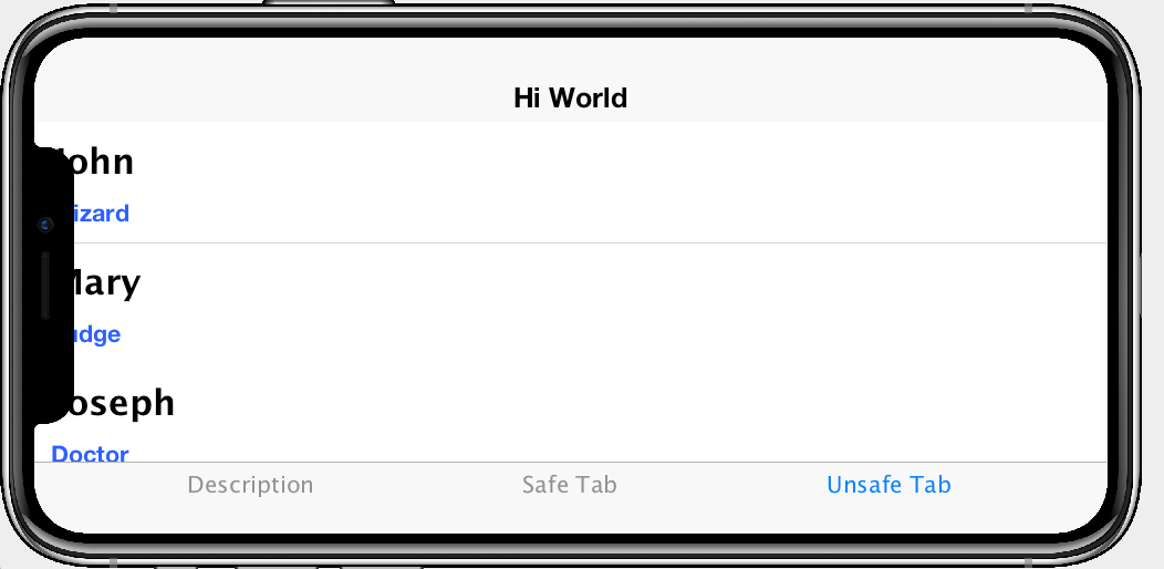
Modern phones often include display cut-outs, rounded corners, or persistent gesture/navigation indicators that overlap the physical screen edges. These intrusions are no longer limited to iOS—many recent Android devices behave the same way—so Codename One provides a "safe area" API to ensure your UI remains visible regardless of the device. The safe area is the portion of the display that’s guaranteed to be unobstructed.
Automatic Safe-Area handling
Form calculates the safe region automatically, and core UI components that anchor themselves to the screen edges apply that information without more work:
Toolbarand the status bar placeholder respect the top safe margins so that titles and action buttons remain legible around notches.Tabs,Sheet, andFloatingActionButtoninstances mark their internal containers as safe areas so navigation controls are padded above gesture/navigation bars.UI fragment templates can opt-in to safe areas declaratively using the
safeAreaflag, ensuring generated components stay within the padded region.
This means that many applications will work on devices such as the iPhone X/14 family or Android devices with edge-to-edge displays. You need to intervene when you use custom containers that you position flush against a screen edge or when you perform your own painting.
Marking your own containers as safe
If you create a container that should always stay clear of the unsafe portions of the screen (for example, a bottom navigation bar, an on-screen joystick, or a floating tool palette), enable safe-area padding explicitly:
Form form = new Form(new BorderLayout());

Container bottomBar = new Container(BoxLayout.x());
bottomBar.setSafeArea(true);
bottomBar.addAll(new Button("Home"), new Button("Search"), new Button("Profile"));

form.add(BorderLayout.SOUTH, bottomBar);
form.show();
Safe-area padding is applied when the container doesn’t have a scrollable parent. For scrollable content, you can assume the user can scroll the component into view instead.
Most layouts never need to know where the safe area begins, but if you draw manually (for example, inside paint() or on the glass pane) you can query it directly:
Form form = Display.getInstance().getCurrent();
Rectangle safe = form.getSafeArea();

Graphics g = null; // e.g. inside paint()
g.setClip(safe.getX(), safe.getY(), safe.getWidth(), safe.getHeight());
// Custom drawing code that should avoid the notch/gesture areas
The rectangle returned by Form#getSafeArea() is updated automatically whenever the OS reports a change (rotation, multitasking gestures, showing or hiding the system navigation area, etc.). In unusual situations where you adjust the safe-area root yourself (for example, when animating a container in from off-screen) you can force a recalculation by calling Form#setSafeAreaChanged().
Safe-Area roots and advanced layouts
Safe-area padding is calculated relative to a "safe-area root." Forms are roots by default, but you can mark any container as a root using Container#setSafeAreaRoot(true) when you need precise control, for example, when preparing a side menu that starts off-screen and slides in:
Container drawer = new Container(BoxLayout.y());
drawer.setSafeAreaRoot(true); // Ensure safe margins apply before the drawer is visible
drawer.setSafeArea(true);
Marking the drawer as both a root and a safe area prevents a jump the moment it becomes visible, because the safe padding is already applied while it’s off-screen.
Remember that safe areas apply across platforms. Always verify your screens on actual devices (or in the Codename One simulator with a device skin that exposes cut-outs) to make sure critical UI elements remain inside the padded region.
The second layer is the glass pane which allows you to draw arbitrary things on top of everything. The order in the image is indeed right:
ContentPaneis lowestLayeredPaneis secondGlassPaneis painted last
ContentPane and doesn’t stretch to the title. A GlassPane stretches all the way but with a "lightweight" title area, for example, the Toolbar API.The GlassPane allows developers to overlay UI on top of existing UI and paint as they see fit. This is useful for things that provide notification but don’t want to intrude with application functionality.
Dialog
A Dialog is a special kind of Form that can occupy a portion of the screen. It also has the more functionality of the modal show method.
When showing a dialog you have two basic options: modeless and modal:
Modal dialogs (the default) block the current EDT thread until the dialog is dismissed. To understand how they do it, read about
invokeAndBlock.
Modal dialogs are a useful way to prompt the user since the code can assume the user responded in the next line of execution. This promotes a linear and intuitive way of writing code.Modeless dialogs return, so a call to show such a dialog can’t assume anything in the next line of execution. This is useful for features such as progress indicators where you aren’t waiting for user input.
For example: a modal dialog can be expressed as such:
if(Dialog.show("Click Yes Or No", "Select one", "Yes", "No")) {
    // user clicked yes
} else {
    // user clicked no
}
Notice that during the show call above the execution of the next line was "paused" until you got a response from the user and once the response was returned you could proceed directly.
Dialog must be within the Event Dispatch Thread (the default thread of Codename One). This is true for modal dialogs. The Dialog class knows how to "block the EDT" without blocking it.To learn more about invokeAndBlock which is the workhorse behind the modal dialog functionality check out the EDT section.
The Dialog class contains many static helper methods to show user notifications, but also allows a
developer to create a Dialog instance, add information to its content pane and show the dialog.
ContentPane like Form.When showing a dialog in this way, you can either ask Codename One to position the dialog in a specific location based on the BorderLayout concept of locations, or position it by spacing it in pixels from the four edges of the screen.
For example: you could do something like this to show a simple modal Dialog:
Dialog d = new Dialog("Title");
d.setLayout(new BorderLayout());
d.add(BorderLayout.CENTER, new SpanLabel("Dialog Body", "DialogBody"));
d.showPacked(BorderLayout.SOUTH, true);
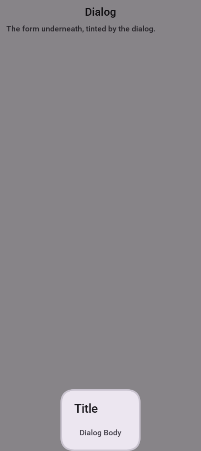
Dialog by flipping the boolean true argument to false.You can position a Dialog by determining the space from the edges for example: with this code you can occupy the bottom portion of the screen:
Dialog d = new Dialog("Title");
d.setLayout(new BorderLayout());
d.add(BorderLayout.CENTER, new SpanLabel("Dialog Body", "DialogBody"));
d.show(hi.getHeight() / 2, 0, 0, 0);
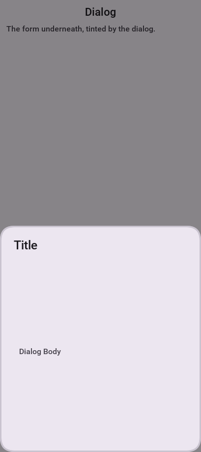
hi is the name of the parent Form in the sample above.Styling dialogs
It’s important to style a Dialog using getDialogStyle() or
setDialogUIID methods rather than styling the dialog object directly.
The reason for this is that the Dialog is a Form that takes up the whole screen. The Form that’s visible behind the Dialog is rendered as a screenshot. Customizing the actual UIID of the Dialog won’t produce the desired results.
Tint and blurring
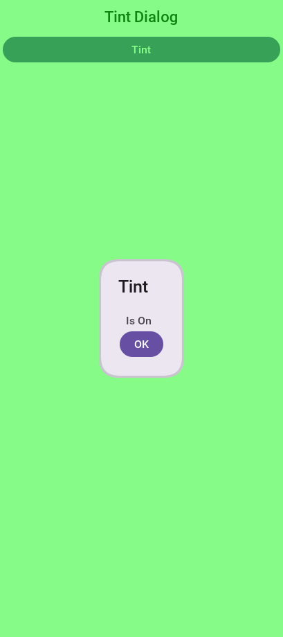
By default a Dialog uses a platform specific tint color when it’s showing for example: notice the background in the image below is tinted:
Form hi = new Form("Tint Dialog", new BoxLayout(BoxLayout.Y_AXIS));
Button showDialog = new Button("Tint");
showDialog.addActionListener((e) -> Dialog.show("Tint", "Is On/* omitted */", "OK", null));
hi.add(showDialog);
hi.show();
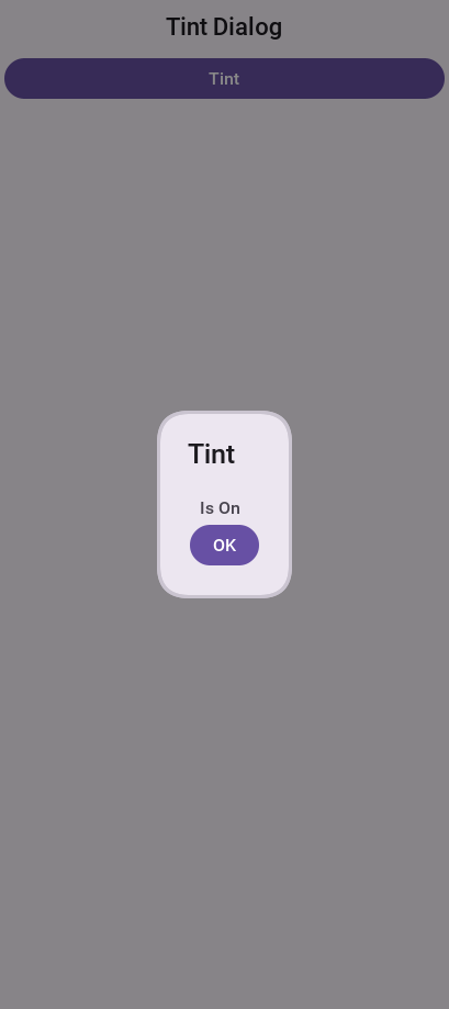
The tint color can be manipulated on the parent form, you can set it to any AARRGGBB value to set any color using the setTintColor method. Notice that this is invoked on the parent form and not on the Dialog!
You can also manipulate this default value globally using the theme constant tintColor. The sample below tints the background in green:
Form hi = new Form("Tint Dialog", new BoxLayout(BoxLayout.Y_AXIS));
hi.setTintColor(0x7700ff00);
Button showDialog = new Button("Tint");
showDialog.addActionListener((e) -> Dialog.show("Tint", "Is On/* omitted */", "OK", null));
hi.add(showDialog);
hi.show();
You can apply Gaussian blur to the background of a dialog to highlight the foreground further and produce an attractive effect. You can use the setDefaultBlurBackgroundRadius to apply this globally, you can use the theme constant dialogBlurRadiusInt to do the same or you can do this on a per Dialog basis using setBlurBackgroundRadius.
Display.getInstnace().isGaussianBlurSupported(). If blur isn’t supported the blur setting will be ignored:Form hi = new Form("Blur Dialog", new BoxLayout(BoxLayout.Y_AXIS));
Dialog.setDefaultBlurBackgroundRadius(8);
Button showDialog = new Button("Blur");
showDialog.addActionListener((e) -> Dialog.show("Blur", "Is On/* omitted */", "OK", null));
hi.add(showDialog);
hi.show();
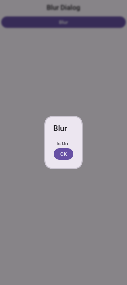
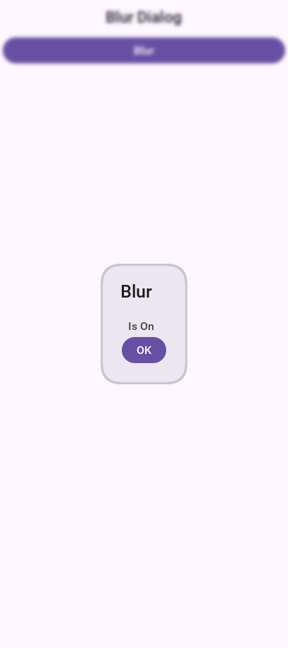
It might be a bit hard to notice the blur effect with the tinting so here is the same code with tinting disabled:
hi.setTintColor(0);
Popup dialog
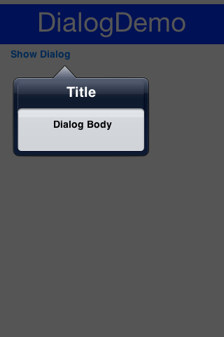
A popup dialog is a common mobile paradigm showing a Dialog that points at a specific component. It’s a standard Dialog that’s shown in a unique way:
Form hi = new Form("Popup Dialog", new BoxLayout(BoxLayout.Y_AXIS));
Button showDialog = new Button("Show");
showDialog.addActionListener(e -> {
    Dialog d = new Dialog("Title");
    d.setLayout(new BorderLayout());
    d.add(BorderLayout.CENTER, new SpanLabel("Dialog Body", "DialogBody"));
    // the popup points at the button, which must be on screen to have a position
    d.showPopupDialog(showDialog);
});
hi.add(showDialog);
hi.show();
Styling the arrow of the popup dialog
When Codename One was young you needed a popup arrow implementation but your low-level graphics API was pretty basic. As a workaround you created a version of the 9-piece image border that supported pointing arrows at a component.
Today Codename One supports pointing an arrow from the RoundRectBorder class. This is implicit for the PopupDialog UI. This allows for better customization of the border (color etc.) and it looks better on newer displays. It also works on all OSs. Right now the iOS theme has the old image border approach.
PopupDialog UIID and defining its style to RoundRectBorderThe new RoundRectBorder support works by setting the track component property on border. When that’s done the border implicitly points to the right location.
If you still need deeper customization of the arrow you can still use the old 9-piece border functionality illustrated below.
Legacy 9-Piece Border arrow
One of the harder aspects of a popup dialog is the construction of the theme elements required for arrow styling. To get that sort of behavior you will need a custom image border and 4 arrows pointing in each direction that will be overlaid with the border.
PopupDialog image should have 32 pixels of transparent pixels around it.You will need to define the following theme constants for the arrow to work:
PopupDialogArrowBool=true
PopupDialogArrowTopImage=arrow-up.png
PopupDialogArrowBottomImage=arrow-down.png
PopupDialogArrowLeftImage=arrow-left.png
PopupDialogArrowRightImage=arrow-right.png
Each of the four image constants names an image in your theme resource, so add your own arrows under those names — the values here are placeholders and there are no arrows built in. A constant naming an image the theme doesn’t hold leaves the border with nothing to paint.
Then style the PopupDialog UIID with the image for the Dialog itself.
InteractionDialog
Dialogs in Codename One can be modal or modeless, the former blocks the calling thread and the latter doesn’t. For example, there is another definition to those terms: A modal dialog blocks access to the rest of the UI while a modeless dialog "floats" on top of the UI.
In that sense, all dialogs in Codename One are modal; they block the parent form since they’re effectively forms that show the "parent" in their background. InteractionDialog has an API that’s like the Dialog API but, unlike dialog, it never blocks anything. Neither the calling thread nor the UI.
InteractionDialog isn’t a Dialog since it doesn’t share the same inheritance hierarchy. For example, it acts and "feels" like a Dialog although it’s a Container in the LayeredPane.InteractionDialog is a container that’s positioned within the layered pane. Notice that because of that
design, you can have one such dialog at the moment and, if you add something else to the layered pane, you
might run into trouble.
Using the interaction dialog is pretty trivial and like dialog:
InteractionDialog dlg = new InteractionDialog("Hello");
dlg.setLayout(new BorderLayout());
dlg.add(BorderLayout.CENTER, new Label("Hello Dialog"));
Button close = new Button("Close");
close.addActionListener((ee) -> dlg.dispose());
dlg.addComponent(BorderLayout.SOUTH, close);
Dimension pre = dlg.getContentPane().getPreferredSize();
int displayWidth = Display.getInstance().getDisplayWidth();
int dialogWidth = Math.max(pre.getWidth() + pre.getWidth() / 6, displayWidth * 2 / 3);
dlg.show(0, 0, displayWidth - dialogWidth, 0);
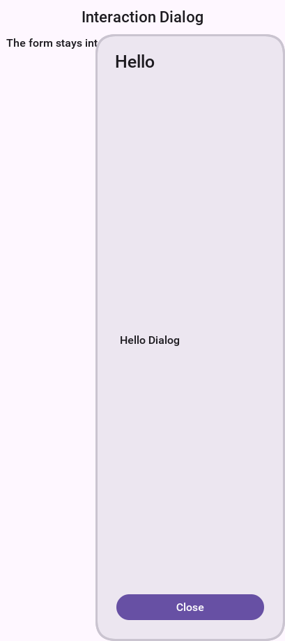
This will show the dialog on the right-hand side of the screen, which is pretty useful for a floating in place dialog.
InteractionDialog can be shown at absolute or popup locations. This is inherent to its use case which is "non-blocking." When using this component you need to be aware of its location.To make popup behavior feel natural on touch devices you can call setDisposeWhenPointerOutOfBounds(true) so the dialog automatically dismisses as soon as the user taps outside the title or content area. Internally the dialog listens for pointer pressed/released events and will call dispose() for you when the interaction happens beyond its bounds, so you no longer need to wire that logic manually.
By default the dialog is placed on the form’s layered pane, but you can switch between the global layered pane and form-specific layered pane using setFormMode(boolean). Setting form mode to true keeps the dialog coupled with the showing form even when the global layered pane is used elsewhere in your app.
Finally, recent updates added animation toggles so you can fine-tune presentation. setAnimateShow(boolean) turns the show/dispose animations on or off, while setRepositionAnimation(boolean) enables a "grow/shrink" reposition effect during those animations when you want a more dynamic transition.
Label
Label represents a text, icon, or both. Label is also the base class of Button which in turn is the base class for RadioButton & CheckBox. Thus the functionality of the Label class extends to all these components.
Label text can be positioned in one of 4 locations as such:
Form hi = new Form("Label Position", new BoxLayout(BoxLayout.Y_AXIS));
Image icon = FontImage.createMaterial(FontImage.MATERIAL_INFO, "Label", 3.0f);
Label left = new Label("Left", icon);
left.setTextPosition(Component.LEFT);
Label right = new Label("Right", icon);
right.setTextPosition(Component.RIGHT);
Label bottom = new Label("Bottom", icon);
bottom.setTextPosition(Component.BOTTOM);
Label top = new Label("Top", icon);
top.setTextPosition(Component.TOP);
hi.add(left).add(right).add(bottom).add(top);
hi.show();
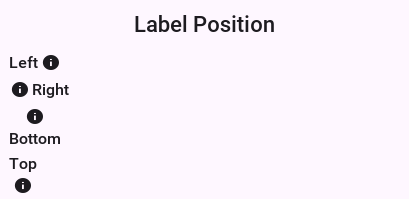
Label allows a single line of text, line breaking is an expensive operation on mobile devices [1] and so the Label class doesn’t support it.
Labels support tickering and the ability to end with "…" if there isn’t enough space to render the label. Developers can determine the placement of the label to its icon in a few powerful ways.
Label gap
The gap between the label text & the icon defaults to 2 pixels due to legacy settings. The setGap method of Label accepts a gap size in pixels.
Two pixels is low for most cases & it’s hard to customize for each Label.
You can use the theme constant labelGap which is a floating point value you can specify in millimeters that will allow you to determine the default gap for a label. You can also customize this manually using the method Label.setDefaultGap(int) which determines the default gap in pixels.
Autosizing labels
One of the common requests you received over the years is a way to let text "fit" into the allocated space so the font will match almost the width available. In some designs this is important but it’s also tricky. Measuring the width of a String is an expensive operation on some OSes., there is no other way other than trial & error to find the "best size."
Still although something is "slow" you might still want to use it for some cases, this isn’t something you should use in a renderer, infinite scroll etc. and recommend minimizing the usage of this feature as much as possible.
This feature is applicable to Label and its subclasses (for example: Button), with components such as TextArea (for example: SpanButton) the choice between shrinking and line break would require some complex logic.
To activate this feature use setAutoSizeMode(true) for example:
Form hi = new Form("AutoSize", BoxLayout.y());

Label a = new Label("Short Text");
a.setAutoSizeMode(true);
Label b = new Label("Much Longer Text than the previous line...");
b.setAutoSizeMode(true);
Label c = new Label("MUCH MUCH MUCH Much Longer Text than the previous line by a pretty big margin...");
c.setAutoSizeMode(true);

Label a1 = new Button("Short Text");
a1.setAutoSizeMode(true);
Label b1 = new Button("Much Longer Text than the previous line...");
b1.setAutoSizeMode(true);
Label c1 = new Button("MUCH MUCH MUCH Much Longer Text than the previous line by a pretty big margin...");
c1.setAutoSizeMode(true);
hi.addAll(a, b, c, a1, b1, c1);

hi.show();
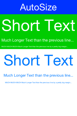
TextField and TextArea
The TextField class derives from the TextArea class, and both are used for text input in Codename One.
TextArea defaults to multi-line input and TextField defaults to single line input but both can be used in both cases. The main differences between TextField and TextArea are:
Blinking cursor is rendered on
TextFieldDataChangedListener is available in
TextField. This is crucial for character by character input event trackingDone listener is available in the
TextFieldDifferent
UIID
TextField & TextArea dates back to the ancestor of Codename One: LWUIT. Feature phones don’t have "proper" in-place editing capabilities & thus TextField was introduced to allow such input.Because it lacks the blinking cursor capability TextArea is often used as a multi-line label and is used internally in SpanLabel, SpanButton etc.
Form. Codename One forms support this exact use case through the Form.setEditOnShow(TextArea) method.TextField & TextArea support constraints for various types of input such as NUMERIC, EMAIL, URL, etc. Those usually
affect the virtual keyboard used, but might not limit input in some platforms. For example: on iOS even with NUMERIC
constraint you would still be able to input characters.
The following sample shows off simple text field usage:
Form hi = new Form("Text", BoxLayout.y());
TextField plain = new TextField("", "Any text");
TextField email = new TextField("", "E-Mail", 20, TextField.EMAILADDR);
TextField url = new TextField("", "URL", 20, TextField.URL);
TextField phone = new TextField("", "Phone", 20, TextField.PHONENUMBER);
TextField number = new TextField("", "Number", 20, TextField.NUMERIC);
TextArea notes = new TextArea(4, 20);
notes.setHint("Notes");
hi.addAll(plain, email, url, phone, number, notes);
hi.show();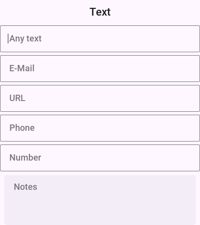
TextField search sample with DataChangedListener and rather unique styling.Masking
A common use case when working with text components is the ability to "mask" input for example: in the credit card number above you would want 4 digits for each text field and don’t want the user to tap Next 3 times.
Masking allows you to accept partial input in one field and implicitly move to the next, this can be used to all types of complex input thanks to the text component API. E.g with the code above you can mask the credit card input so the cursor jumps to the next field implicitly using this code:
TextField num1 = new TextField("", "", 5, TextField.NUMERIC);
TextField num2 = new TextField("", "", 5, TextField.NUMERIC);
TextField num3 = new TextField("", "", 5, TextField.NUMERIC);
TextField num4 = new TextField("", "", 5, TextField.NUMERIC);
// the first three are trimmed to four by automoveToNext when the fifth
// digit arrives; the last one has no successor, so it needs a limit
num4.setMaxSize(4);
automoveToNext(num1, num2);
automoveToNext(num2, num3);
automoveToNext(num3, num4);
Then implement the method automoveToNext as:
private void automoveToNext(final TextField current, final TextField next) {
    current.addDataChangedListener((type, index) -> {
        String val = current.getText();
        // more than one digit can arrive at once from a paste or autofill, so
        // keep four and hand the whole remainder on -- the next field's own
        // listener splits it again if it is still too long
        if(val.length() > 4) {
            current.stopEditing();
            current.setText(val.substring(0, 4));
            String rest = val.substring(4);
            next.setText(rest);
            if(rest.length() <= 4) {
                // a longer remainder means the next field's listener is still
                // splitting; let the last one in the chain take the focus
                next.startEditingAsync();
            }
        }
    });
}
Notice you can invoke stopEditing(Runnable) where you receive a callback as editing is stopped.
The virtual keyboard
A common misconception for developers is assuming the virtual keyboard represents "keys." For example: developers often override the "keyEvent" callbacks which are invoked for physical keyboard typing and expect those to occur with a virtual keyboard.
This isn’t the case since a virtual keyboard is a different beast. With a virtual keyboard characters typed might produce a different output due to autocorrect. Some keyboards don’t even have "keys" in the traditional sense or don’t type them in the traditional sense (for example: swiping).
TextField/TextArea is crucial for a virtual keyboard.Container for the TextField/TextArea is scrollable. Otherwise the component won’t be reachable or the UI might be distorted when the keyboard appears.Action Button client property
By default, the virtual keyboard on Android has a "Done" button, you can customize it to be a search icon, a send icon, or a go icon using a hint such as this:
searchTextField.putClientProperty("searchField", Boolean.TRUE);
sendTextField.putClientProperty("sendButton", Boolean.TRUE);
goTextField.putClientProperty("goButton", Boolean.TRUE);
This will adapt the icon for the action on the keys.
Next and done on iOS
You try to hide a lot of the platform differences in Codename One, input is ** different between OSes. A common reliance is the ability to send the "Done" event when the user presses the Done button. This button doesn’t always exist for example: if there is an Enter button (due to multiline input) or if there is a Next button in that place.
To unify the behavior you slightly customized the iOS keyboard as such:
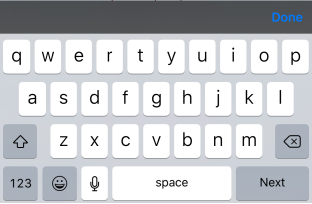
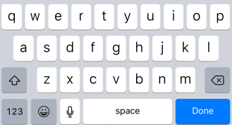
For example, this behavior might not be desired so to block that you can do:
tf.putClientProperty("iosHideToolbar", Boolean.TRUE);
This will hide the toolbar for that given field.
ios.doneButtonColor display property. For example: To change the color to red, you could do Display.getInstance().setProperty("ios.doneButtonColor", String.valueOf(0xff0000)).Clearable text field
iOS has a convention where an X can be placed after the text field to clear it. Some Android apps have it but there is no native support for that as of this writing.
You can wrap a TextField with a clearable wrapper to get this effect on all platforms. For example: replace this:
cnt.add(myTextField);
With this:
cnt.add(ClearableTextField.wrap(myTextField));
You can also specify the size of the clear icon if you wish. This is technically a Container with the text field style and a button to clear the text at the edge.
TextComponent
When building input forms you sometimes want to adapt to the native OS behavior and create a UI that’s a bit more distinct to the native OS. TextField and TextArea are low-level, you can create an Android style UI with such components but it might look out of place in iOS.
For example: this is how most of you would expect the UI to look on iOS and Android respectively:
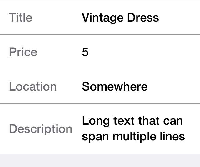
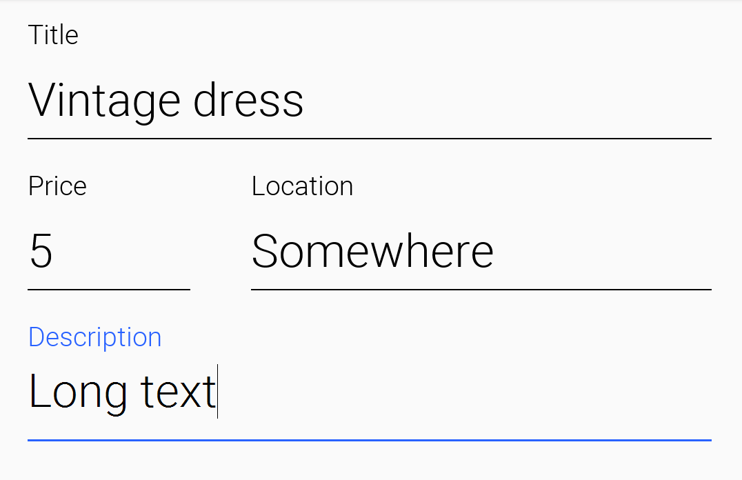
Doing this with text fields is possible but would require code that looks a bit different and jumps through hoops. TextComponent allows this exact UI without forcing developers to write OS specific code:
TextModeLayout tl = new TextModeLayout(3, 2);
Form f = new Form("Pixel Perfect", tl);
TextComponent title = new TextComponent().label("Title");
TextComponent price = new TextComponent().label("Price");
TextComponent location = new TextComponent().label("Location");
TextComponent description = new TextComponent().label("Description").multiline(true);

f.add(tl.createConstraint().horizontalSpan(2), title);
f.add(tl.createConstraint().widthPercentage(30), price);
f.add(tl.createConstraint().widthPercentage(70), location);
f.add(tl.createConstraint().horizontalSpan(2), description);
f.setEditOnShow(title.getField());
f.show();
TextModeLayout which is discussed in the layouts sectionThe text component uses a builder approach to set various values for example:
TextComponent t = new TextComponent().
    text("This appears in the text field").
    hint("This is the hint").
    label("This is the label").
    multiline(true);
The code is pretty self-explanatory and more convenient than typical setters/getters. It automatically handles the floating hint style of animation when running on Android.
Error handling
The validator class supports text component and it should "work." But the cool thing is that it uses the material design convention for error handling!
If you add to the sample above a Validator:
Validator val = new Validator();
val.addConstraint(title, new LengthConstraint(2));
val.addConstraint(price, new NumericConstraint(true));
You would see something that looks like this on Android:
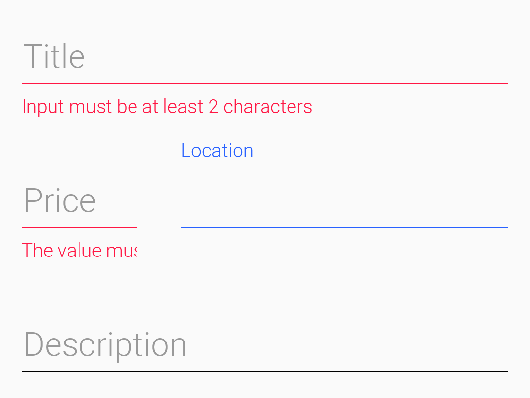
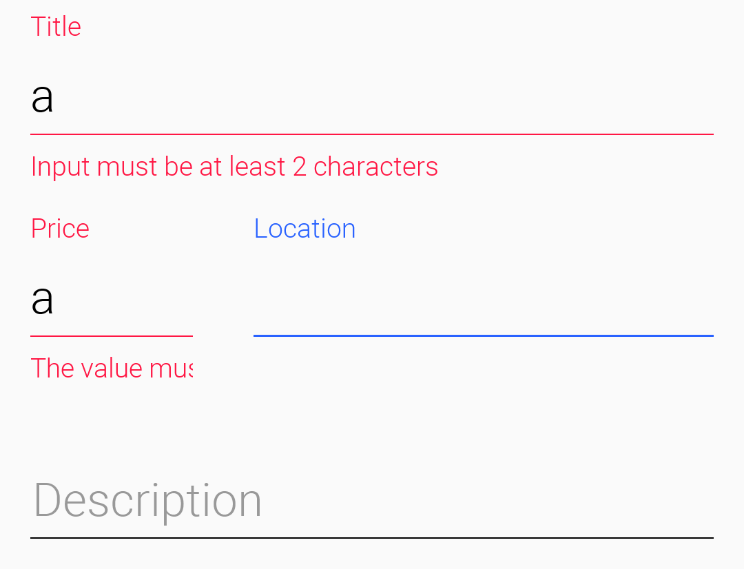
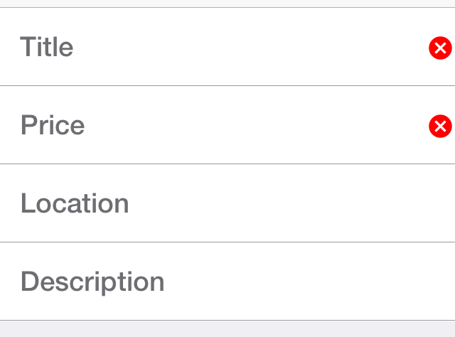
The underlying system is the errorMessage method which you can chain like the other methods on TextComponent as such:
TextComponent tc = new TextComponent().
    label("Input Required").
    errorMessage("Input is essential in this field");
InputComponent and PickerComponent
To keep the code common and generic you use the InputComponent abstract base class and derive the other classes from that. PickerComponent is the other option.
A picker can work with your existing sample using code like this:
TextModeLayout tl = new TextModeLayout(3, 2);
Form f = new Form("Pixel Perfect", tl);
TextComponent title = new TextComponent().label("Title");
TextComponent price = new TextComponent().label("Price");
TextComponent location = new TextComponent().label("Location");
PickerComponent date = PickerComponent.createDate(new Date()).label("Date");
TextComponent description = new TextComponent().label("Description").multiline(true);
Validator val = new Validator();
val.addConstraint(title, new LengthConstraint(2));
val.addConstraint(price, new NumericConstraint(true));
f.add(tl.createConstraint().widthPercentage(60), title);
f.add(tl.createConstraint().widthPercentage(40), date);
f.add(location);
f.add(price);
f.add(tl.createConstraint().horizontalSpan(2), description);
f.setEditOnShow(title.getField());
f.show();
This produces the following which looks pretty standard:
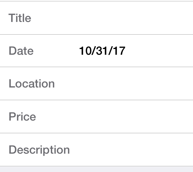
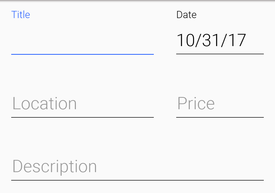
The one tiny thing you should notice with the PickerComponent is that you don’t construct the picker component using new PickerComponent(). Instead you use create methods such as PickerComponent.createDate(new Date()). The reason for that’s that you have many types of pickers and it wouldn’t make sense to have one constructor.
Underlying theme constants and UIID’s
These varying looks are implemented through a combination of layouts, theme constants and UIID’s. The most important UIID’s are: TextComponent, FloatingHint & TextHint.
There are many related theme constants that can manipulate some pieces of this functionality:
textComponentErrorColora hex RGB color which defaults to null in which case this has no effect. When defined this will change the color of the border and label to the given color to match the material design styling. This implements the red border underline in cases of error and the label text color changetextComponentErrorLineBorderBooltoggles the material-style underline that appears on validation errors. Set it tofalseif you prefer to supply a different border when errors are showntextComponentOnTopBooltoggles the on top mode which makes things look like they do on Android. This defaults to true on Android and false on other OSes. This can also be manipulated through theonTopMode(boolean)method inInputComponent, but the layout will use the theme constanttextComponentAnimBooltoggles the animation mode which again can be manipulated by a method inInputComponent. If you want to keep the UI static without the floating hint effect set this to false. Notice this defaults to true on AndroidtextComponentFieldUIIDsets the UIID of the text field to something other thanTextFieldthis is useful for platforms such as iOS where the look of the text field is different within the text component. This allows you to make the background of the text field transparent when it’s within theTextComponentand make it different from the regular text fieldinputComponentErrorMultilineBoolmakes error labels multi-line by default so longer validation messages can wrap instead of being clipped
Button
Button is a subclass of Label and as a result it inherits all its functionality, specifically icon placement, tickering, etc.
Button adds to the mix some more states such as a pressed UIID state and pressed icon.
Button supports more icon states such as rollover and disabled icon.Button also exposes some functionality for subclasses specifically the setToggle method call which has no meaning when invoked on a Button but has a lot of implications for CheckBox & RadioButton.
Button event handling can be performed through an ActionListener or through a Command.
Command won’t be reflected into the Button after the command was set to the Button.Here is a trivial hello world style Button:
Form hi = new Form("Button");
Button b = new Button("My Button");
hi.add(b);
b.addActionListener((e) -> Log.p("Clicked"));
The same three buttons under the two modern native themes. A button takes its shape, fill and font from the theme, so the platform difference costs no code:
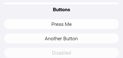
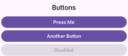
Such a button can be styled to look like a link using code like this or by making these settings in the theme and using code such as btn.setUIID("Hyperlink"):
Form hi = new Form("Button");
Button b = new Button("Link Button");
b.getAllStyles().setBorder(Border.createEmpty());
b.getAllStyles().setTextDecoration(Style.TEXT_DECORATION_UNDERLINE);
hi.add(b);
b.addActionListener((e) -> Log.p("Clicked"));

Uppercase buttons
Buttons on Android’s material design UI use upper case styling which isn’t the case for iOS. To solve this you have the method setCapsText(boolean) in Button which has the corresponding isCapsText, isCapsTextDefault & setCapsTextDefault(boolean). This is pretty core to Codename One so to prevent this from impacting everything unless you explicitly invoke setCapsText(boolean) the default value of true will apply when the UIID is Button, RaisedButton or for the built-in Dialog buttons.
You also have a theme constant: capsButtonTextBool. This constant controls caps text behavior from the theme and is set to true in the Android native theme.
Raised Button
Raised button is a style of button that’s available on Android and used to highlight an important action within a form. To confirm with the material design UI guidelines you might want to leverage a raised button UI element on Android but use a regular button everywhere else.
First you need to know whether a raised button exists in the theme. On Android this will return true but on other OSes it will return false. A potential future update might make another platform true based on UI guidelines in other OSes.
For this purpose you have got the theme constant hasRaisedButtonBool which will return true on Android but will be false elsewhere. You can use it like this:
if(UIManager.getInstance().isThemeConstant("hasRaisedButtonBool", false)) {
    // that means we can use a raised button
}
To enable this you have the RaisedButton UIID that derives from Button and will act like it except for the places where hasRaisedButtonBool is true in which case it will look like this:
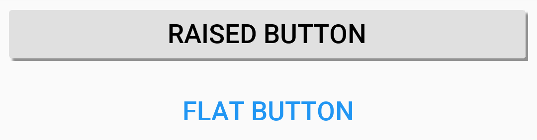
Notice that you can customize the colors of these buttons now since the border respects user colors…
In this case set the background color to purple and the foreground to white:

Form f = new Form("Pixel Perfect", BoxLayout.y());
Button b = new Button("Raised Button", "RaisedButton");
Button r = new Button("Flat Button");
f.add(b);
f.add(r);
f.show();
Ripple effect
The ripple effect in material design highlights the location of the finger and grows as a circle to occupy the full area of the component as the user presses the button.
You can perform a ripple effect by darkening the touched area and growing that in a quick animation.
Ripple effect can be applied to any component but you have it turned on for buttons on Android which also applies to things like title commands, side menu elements etc. This might not apply at this moment to lead components like multi-buttons but that might change in the future.
Component has a property to enable the ripple effect setRippleEffect(boolean) and the corresponding isRippleEffect(). You can turn it on or off individually in the component level. For example, Button has static setButtonRippleEffectDefault(boolean) and isButtonRippleEffectDefault(). These allow you to define the default behavior for all the buttons and that can be configured through the theme constant buttonRippleBool which is on by default on the native Android theme.
CheckBox/RadioButton
CheckBox & RadioButton are subclasses of button that allow for either a toggle state or exclusive selection state.
Both CheckBox & RadioButton have a selected state that allows you to determine their selection.
RadioButton doesn’t allow you to "deselect" it, the way to "deselect" a RadioButton is by selecting another RadioButton.The CheckBox can be added to a Container like any other Component but the RadioButton must be associated with a ButtonGroup otherwise if you have more than one set of RadioButton’s in the form you might have an issue.
Notice in the sample below that you associate all the radio buttons with a group but don’t do anything with the group as the radio buttons keep the reference internally. You also show the opposite side functionality and icon behavior:
Form hi = new Form("CheckBox", new BoxLayout(BoxLayout.Y_AXIS));
Image icon = FontImage.createMaterial(FontImage.MATERIAL_INFO, "Label", 3.0f);
CheckBox cb1 = new CheckBox("CheckBox No Icon");
cb1.setSelected(true);
CheckBox cb2 = new CheckBox("CheckBox With Icon", icon);
CheckBox cb3 = new CheckBox("CheckBox Opposite True", icon);
CheckBox cb4 = new CheckBox("CheckBox Opposite False", icon);
cb3.setOppositeSide(true);
cb4.setOppositeSide(false);
RadioButton rb1 = new RadioButton("Radio 1");
RadioButton rb2 = new RadioButton("Radio 2");
RadioButton rb3 = new RadioButton("Radio 3", icon);
new ButtonGroup(rb1, rb2, rb3);
rb2.setSelected(true);
hi.add(cb1).add(cb2).add(cb3).add(cb4).add(rb1).add(rb2).add(rb3);
hi.show();
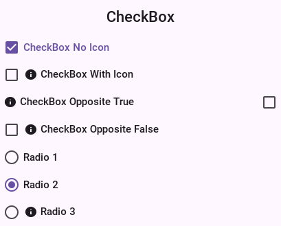
Both of these components can be displayed as toggle buttons (see the toggle button section below), or use the default check mark/filled circle appearance based on the type/OS.
Toggle Button
A toggle button is a button that’s pressed and stays pressed. When a toggle button is pressed again it’s released from the pressed state. Hence the button has a selected state to show if it’s pressed or not like the CheckBox/RadioButton components in Codename One.
To turn any CheckBox or RadioButton to a toggle button use the setToggle(true) method. Or you can use the static createToggle method on both CheckBox and RadioButton to create a toggle button directly.
setToggle(true) implicitly converts the UIID to ToggleButton unless it was changed by the user from its original default value.You can convert the sample above to use toggle buttons as such:
Form hi = new Form("RadioButton", new BoxLayout(BoxLayout.Y_AXIS));
Image icon = FontImage.createMaterial(FontImage.MATERIAL_INFO, "Label", 3.0f);
CheckBox cb1 = CheckBox.createToggle("CheckBox No Icon");
cb1.setSelected(true);
CheckBox cb2 = CheckBox.createToggle("CheckBox With Icon", icon);
CheckBox cb3 = CheckBox.createToggle("CheckBox Opposite True", icon);
CheckBox cb4 = CheckBox.createToggle("CheckBox Opposite False", icon);
cb3.setOppositeSide(true);
cb4.setOppositeSide(false);
ButtonGroup bg = new ButtonGroup();
RadioButton rb1 = RadioButton.createToggle("Radio 1", bg);
RadioButton rb2 = RadioButton.createToggle("Radio 2", bg);
RadioButton rb3 = RadioButton.createToggle("Radio 3", icon, bg);
rb2.setSelected(true);
hi.add(cb1).add(cb2).add(cb3).add(cb4).add(rb1).add(rb2).add(rb3);
hi.show();
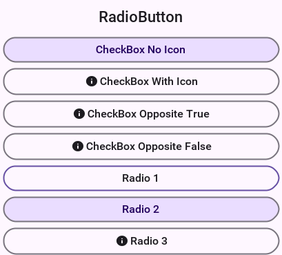
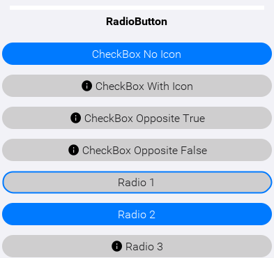
Both themes draw the selection as a change of fill rather than of label color alone, so a selected toggle stays readable for someone who can’t separate the two hues. The outlined row in each figure is the one holding focus: focus is drawn as a ring precisely so it can’t be mistaken for a value, since the framework resolves a focused toggle through the same style whether it’s checked or not.
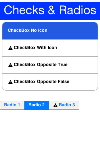
That’s half the story though: to get the full effect of some cool toggle button UI’s you can use a ComponentGroup. This allows you to create a button bar effect with the toggle buttons.
For example, to enclose the CheckBox components in a vertical ComponentGroup and the RadioButton’s in a horizontal group, change the last line of the code above as such:
Form hi = new Form("ComponentGroup", new BoxLayout(BoxLayout.Y_AXIS));
CheckBox cb1 = CheckBox.createToggle("CheckBox 1");
CheckBox cb2 = CheckBox.createToggle("CheckBox 2");
CheckBox cb3 = CheckBox.createToggle("CheckBox 3");
CheckBox cb4 = CheckBox.createToggle("CheckBox 4");
ButtonGroup bg = new ButtonGroup();
RadioButton rb1 = RadioButton.createToggle("Radio 1", bg);
RadioButton rb2 = RadioButton.createToggle("Radio 2", bg);
RadioButton rb3 = RadioButton.createToggle("Radio 3", bg);
hi.add(ComponentGroup.enclose(cb1, cb2, cb3, cb4)).
        add(ComponentGroup.encloseHorizontal(rb1, rb2, rb3));
hi.show();
ComponentGroup
ComponentGroup is a special container that can be either horizontal or vertical (BoxLayout X_AXIS or Y_AXIS respectively).
ComponentGroup "restyles" the elements within the group to have a UIID that allows you to create a "round border" effect that groups elements together.
The following code adds 4 component groups to a Container to show the various UIID changes:
hi.add("Three Labels").
        add(ComponentGroup.enclose(new Label("GroupElementFirst UIID"), new Label("GroupElement UIID"), new Label("GroupElementLast UIID"))).
        add("One Label").
        add(ComponentGroup.enclose(new Label("GroupElementOnly UIID"))).
        add("Three Buttons").
        add(ComponentGroup.enclose(new Button("ButtonGroupFirst UIID"), new Button("ButtonGroup UIID"), new Button("ButtonGroupLast UIID"))).
        add("One Button").
        add(ComponentGroup.enclose(new Button("ButtonGroupOnly UIID")));
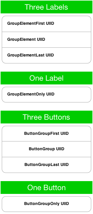
Notice the following about the code above and the resulting image:
Buttons have a different UIID than other element types. Their styling is slightly different in such UI’s so you need to pay attention to that.
When an element is placed alone within a
ComponentGroupits a special caseUIID.
ComponentGroup does nothing unless the theme sets the ComponentGroupBool constant to true; without it the group is just a box layout container. The legacy iOS themes set that flag, the current native themes don’t, and neither of them styles the GroupElement UIIDs a vertical group applies. A horizontal group is the exception, as long as it keeps the UIID setHorizontal gives it: it’s a segmented control, it renames its members to ToggleButton, and both native themes style that UIID and its First / Last / Only variants in full, so it needs no constant. Name your own element UIID with setElementUIID and it’s theme-gated again, exactly like a vertical one.When ComponentGroupBool is set to true, the component group will change the styles of all components placed within it to match the element UIID given to it (GroupElement by default) with special caveats to the first/last/ elements. For example:
With one element in a component group it will have the UIID:
GroupElementOnlyWith two elements in a component group they will have the UIID’s
GroupElementFirst,GroupElementLastWith three elements in a component group they will have the UIID’s
GroupElementFirst,GroupElement,GroupElementLastWith four elements in a component group they will have the UIID’s
GroupElementFirst,GroupElement,GroupElement,GroupElementLast
This allows you to define special styles for the edges.
You can customize the UIID set by the component group by calling setElementUIID in the component group for example: setElementUIID("ToggleButton") for three elements result in the following UIID’s:
ToggleButtonFirst, ToggleButton, ToggleButtonLast
MultiButton
MultiButton is a composite component (lead component) that acts like a versatile Button. It supports up to 4 lines of text (it doesn’t automatically wrap the text), an emblem (usually navigational arrow, or check box) and an icon.
MultiButton can be used as a button, a CheckBox or a RadioButton for creating rich UI’s.
MultiButton was inspired by the aesthetics of the UITableView iOS component.A common source of confusion in the MultiButton is the difference between the icon and the emblem, since both may have an icon image associated with them. The icon is an image representing the entry while the emblem is an optional visual representation of the action that will be undertaken when the element is pressed. Both may be used simultaneously or individually of one another:
Form hi = new Form("MultiButton", new BoxLayout(BoxLayout.Y_AXIS));
Image icon = FontImage.createMaterial(FontImage.MATERIAL_INFO, "Label", 3.0f);
Image emblem = FontImage.createMaterial(FontImage.MATERIAL_STAR, "Label", 2.0f);
MultiButton twoLinesNoIcon = new MultiButton("MultiButton");
twoLinesNoIcon.setTextLine2("Line 2");
MultiButton oneLineIconEmblem = new MultiButton("Icon + Emblem");
oneLineIconEmblem.setIcon(icon);
oneLineIconEmblem.setEmblem(emblem);
MultiButton twoLinesIconEmblem = new MultiButton("Icon + Emblem");
twoLinesIconEmblem.setIcon(icon);
twoLinesIconEmblem.setEmblem(emblem);
twoLinesIconEmblem.setTextLine2("Line 2");

MultiButton twoLinesIconEmblemHorizontal = new MultiButton("Icon + Emblem");
twoLinesIconEmblemHorizontal.setIcon(icon);
twoLinesIconEmblemHorizontal.setEmblem(emblem);
twoLinesIconEmblemHorizontal.setTextLine2("Line 2 Horizontal");
twoLinesIconEmblemHorizontal.setHorizontalLayout(true);

MultiButton twoLinesIconCheckBox = new MultiButton("CheckBox");
twoLinesIconCheckBox.setIcon(icon);
twoLinesIconCheckBox.setCheckBox(true);
twoLinesIconCheckBox.setTextLine2("Line 2");

MultiButton fourLinesIcon = new MultiButton("With Icon");
fourLinesIcon.setIcon(icon);
fourLinesIcon.setTextLine2("Line 2");
fourLinesIcon.setTextLine3("Line 3");
fourLinesIcon.setTextLine4("Line 4");

hi.add(oneLineIconEmblem).
add(twoLinesNoIcon).
add(twoLinesIconEmblem).
add(twoLinesIconEmblemHorizontal).
add(twoLinesIconCheckBox).
add(fourLinesIcon);
hi.show();
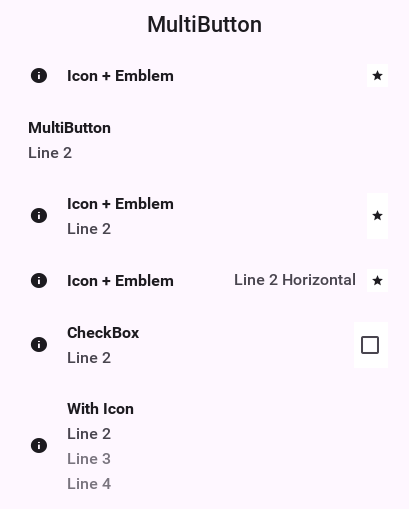
Styling the MultiButton
Since the MultiButton is a composite component setting its UIID will impact the top level UI.
To customize everything you need to customize the UIID’s for MultiLine1, MultiLine2, MultiLine3, MultiLine4 & Emblem.
You can customize the individual UIID’s through the API directly using the setIconUIID, setUIIDLine1, setUIIDLine2, setUIIDLine3, setUIIDLine4 & setEmblemUIID.
Recent versions also include a badge overlay that can be rendered in the corner of the main icon. Use setBadgeText() to display a value (for example a notification count) and setBadgeUIID() if you need a custom UIID instead of the default Badge styling. When you need to inspect or adjust the badge style programmatically, getBadgeStyleComponent() returns the component whose styles are applied to the badge so you can tweak padding, colors or borders before showing the MultiButton.
SpanButton
SpanButton is a composite component (lead component) that looks/acts like a Button but can break lines rather than crop them when the text is long.
Unlike the MultiButton it uses the TextArea internally to break lines seamlessly. The SpanButton is far simpler than the MultiButton and as a result isn’t as configurable:
Form hi = new Form("SpanButton", new BoxLayout(BoxLayout.Y_AXIS));
Image icon = FontImage.createMaterial(FontImage.MATERIAL_INFO, "Label", 3.0f);
SpanButton sb = new SpanButton("SpanButton is a composite component (lead component) that looks/acts like a Button but can break lines rather than crop them when the text is very long.");
sb.setIcon(icon);
hi.add(sb);
hi.show();
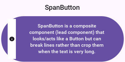
SpanButton is slower than both Button and MultiButton. Recommend using it when there is a genuine need for its functionality.SpanLabel
SpanLabel is a composite component (lead component) that looks/acts like a Label but can break lines rather than crop them when the text is long.
SpanLabel uses the TextArea internally to break lines seamlessly and so doesn’t provide all the elaborate configuration options of Label.
One of the features of label that moved into SpanLabel to some extent is the ability to position the icon. For example, unlike a Label the icon position is determined by the layout manager of the composite so setIconPosition accepts a BorderLayout constraint:
Form hi = new Form("SpanLabel", new BoxLayout(BoxLayout.Y_AXIS));
Image icon = FontImage.createMaterial(FontImage.MATERIAL_INFO, "Label", 3.0f);
SpanLabel d = new SpanLabel("Default SpanLabel that can seamlessly line break when the text is really long.");
d.setIcon(icon);
SpanLabel l = new SpanLabel("NORTH Positioned Icon SpanLabel that can seamlessly line break when the text is really long.");
l.setIcon(icon);
l.setIconPosition(BorderLayout.NORTH);
SpanLabel r = new SpanLabel("SOUTH Positioned Icon SpanLabel that can seamlessly line break when the text is really long.");
r.setIcon(icon);
r.setIconPosition(BorderLayout.SOUTH);
SpanLabel c = new SpanLabel("EAST Positioned Icon SpanLabel that can seamlessly line break when the text is really long.");
c.setIcon(icon);
c.setIconPosition(BorderLayout.EAST);
hi.add(d).add(l).add(r).add(c);
hi.show();
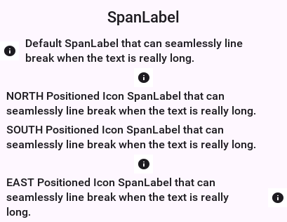
SpanLabel is slower than Label. Recommend using it when there is a genuine need for its functionality.OnOffSwitch
The OnOffSwitch allows you to write an application where the user can swipe a switch between two states (on/off). This is a common UI paradigm in Android and iOS, although it’s implemented in a radically different way in both platforms.
This is a rather elaborate component because of its unique design on iOS, but you’re able to accommodate most of the small behaviors of the component into your version, and it seamlessly adapts between the Android style and the iOS style.
The image below was generated based on the default use of the OnOffSwitch:
OnOffSwitch onOff = new OnOffSwitch();
hi.add(onOff);
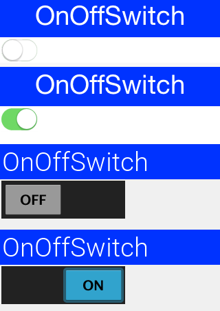
As you can understand the difference between the way iOS and Android render this component has triggered two different implementations within a single component. The Android implementation uses standard buttons and is the default for non-iOS platforms.
onOffIOSModeBool.Validation
Validation is an inherent part of text input, and the Validator class allows that. You can enable validation
through the Validator class to add constraints for a specific component.
It’s also possible to define components that would be enabled/disabled based on validation state and the way in which validation errors are rendered (change the components UIID, paint an emblem on top, etc.). A Constraint is an interface
that represents validation requirements. You can define a constraint in Java or use some built-in
constraints such as LengthConstraint, RegexConstraint, etc.
This sample below continues from the place where the TextField sample above stopped by adding validation to that code:
TextField firstName = new TextField("", "First Name");
TextField surname = new TextField("", "Surname");
TextField url = new TextField("", "URL", 20, TextField.URL);
TextField email = new TextField("", "E-Mail", 20, TextField.EMAILADDR);
TextField phone = new TextField("", "Phone", 20, TextField.PHONENUMBER);
String phoneRegex = "[0-9\\-\\+ ]+";
TextField num1 = new TextField("", "", 5, TextField.NUMERIC);
TextField num2 = new TextField("", "", 5, TextField.NUMERIC);
TextField num3 = new TextField("", "", 5, TextField.NUMERIC);
TextField num4 = new TextField("", "", 5, TextField.NUMERIC);
Button submit = new Button("Submit");
// the masking from the previous sample still applies to these fields
automoveToNext(num1, num2);
automoveToNext(num2, num3);
automoveToNext(num3, num4);
num4.setMaxSize(4);

Validator v = new Validator();
v.addConstraint(firstName, new LengthConstraint(2)).
        addConstraint(surname, new LengthConstraint(2)).
        addConstraint(url, RegexConstraint.validURL()).
        addConstraint(email, RegexConstraint.validEmail()).
        addConstraint(phone, new RegexConstraint(phoneRegex, "Must be valid phone number")).
        addConstraint(num1, new LengthConstraint(4)).
        addConstraint(num2, new LengthConstraint(4)).
        addConstraint(num3, new LengthConstraint(4)).
        addConstraint(num4, new LengthConstraint(4));

v.addSubmitButtons(submit);

Form hi = new Form("Validation", new BoxLayout(BoxLayout.Y_AXIS));
hi.add(firstName).add(surname).add(url).add(email).add(phone).
        add(num1).add(num2).add(num3).add(num4).add(submit);
hi.show();
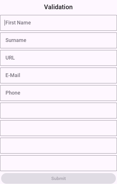
When the form components are bound to a model with @Bindable, the
same constraints can be expressed as field annotations — @Required,
@Length, @Regex, @Email, @Url, @Numeric, @ExistIn,
@Validate — and the generated binder wires them into a Validator
exposed through Binding#getValidator(). See the
Validation annotations section in the
component binding chapter for the full reference.
InfiniteProgress
The InfiniteProgress indicator spins an image infinitely to show that a background process is still working.
InfiniteProgress can be used in one of two ways either by embedding the component into the UI through something like this:
myContainer.add(new InfiniteProgress());
InfiniteProgress can also appear over the entire screen, thus blocking all input. This tints the background while the infinite progress rotates:
Dialog ip = new InfiniteProgress().showInifiniteBlocking();

// do some long operation here using invokeAndBlock or do something in a separate thread and callback later
// when you are done just call

ip.dispose();
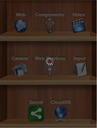
The image used in the InfiniteProgress animation is defined by the native theme. You can override that definition either by defining the theme constant infiniteImage or by invoking the setAnimation method.
setAnimation expects a static image that will be rotated internally. Don’t use an animated image.InfiniteScrollAdapter and InfiniteContainer
InfiniteScrollAdapter & InfiniteContainer allow you to create a scrolling effect that "never" ends with the typical Container/Component paradigm.
The motivation behind these classes is simple, say you have a lot of data to fetch from storage or from the internet. You can fetch the data in batches and show progress sign while you do this.
Infinite scroll fetches the next batch of data dynamically as you reach the end of the Container. InfiniteScrollAdapter & InfiniteContainer represent two similar ways to do that task.
Let start by exploring how you can achieve this UI that fetches data from a webservice:
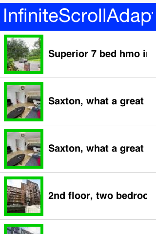
The first step is creating the webservice call, you won’t go into too much detail here as webservices & IO are discussed later in the guide:
int pageNumber = 1;
java.util.List<Map<String, Object>> fetchPropertyData(String text) {
    try {
        ConnectionRequest r = new ConnectionRequest();
        r.setPost(false);
        r.setUrl("https://api.nestoria.co.uk/api");
        r.addArgument("pretty", "0");
        r.addArgument("action", "search_listings");
        r.addArgument("encoding", "json");
        r.addArgument("listing_type", "buy");
        r.addArgument("page", "" + pageNumber);
        pageNumber++;
        r.addArgument("country", "uk");
        r.addArgument("place_name", text);
        NetworkManager.getInstance().addToQueueAndWait(r);
        Map<String,Object> result = new JSONParser().parseJSON(new InputStreamReader(new ByteArrayInputStream(r.getResponseData()), "UTF-8"));
        Map<String, Object> response = (Map<String, Object>)result.get("response");
        return (java.util.List<Map<String, Object>>)response.get("listings");
    } catch(Exception err) {
        Log.e(err);
        return null;
    }
}
The fetchPropertyData is a simplistic tool that fetches the next page of listings for the nestoria webservice. Notice that this method is synchronous and will block the calling thread (legally) until the network operation completes.
Now that you have a webservice lets proceed to create the UI. Check out the code annotations below:
Form hi = new Form("InfiniteScrollAdapter", new BoxLayout(BoxLayout.Y_AXIS));

Style s = UIManager.getInstance().getComponentStyle("MultiLine1");
FontImage p = FontImage.createMaterial(FontImage.MATERIAL_PORTRAIT, s);
EncodedImage placeholder = EncodedImage.createFromImage(p.scaled(p.getWidth() * 3, p.getHeight() * 3), false); // (1)

InfiniteScrollAdapter.createInfiniteScroll(hi.getContentPane(), () -> { // (2)
    java.util.List<Map<String, Object>> data = fetchPropertyData("Leeds"); // (3)
    if(data == null) { // the fetch failed, so there is nothing more to add
        InfiniteScrollAdapter.addMoreComponents(hi.getContentPane(), new Component[0], false);
        return;
    }
    MultiButton[] cmps = new MultiButton[data.size()];
    for(int iter = 0 ; iter < cmps.length ; iter++) {
        Map<String, Object> currentListing = data.get(iter);
        if(currentListing == null) { // (4)
            InfiniteScrollAdapter.addMoreComponents(hi.getContentPane(), new Component[0], false);
            return;
        }
        String thumb_url = (String)currentListing.get("thumb_url");
        String guid = (String)currentListing.get("guid");
        String summary = (String)currentListing.get("summary");
        cmps[iter] = new MultiButton(summary);
        cmps[iter].setIcon(URLImage.createToStorage(placeholder, guid, thumb_url));
    }
    InfiniteScrollAdapter.addMoreComponents(hi.getContentPane(), cmps, !data.isEmpty()); // (5)
}, true); // (6)
hi.show();
Placeholder is essential for the URLImage class which this guide covers at a different place.
The
InfiniteScrollAdapteraccepts a runnable which is invoked every time you reach the edge of the scrolling. You used a closure instead of the typical run() method override.This is a blocking call, after the method completes you will have all the data you need. Notice that this method doesn’t block the EDT illegally.
If there is no more data you call the
addMoreComponentsmethod with a false argument. This indicates that there is no more data to fetch.Here you add the actual components to the end of the form. Notice that you must not invoke the
add/removemethod ofContainer. Those might conflict with the work of theInfiniteScrollAdapter.You pass true to show that the data isn’t "prefilled" so the method should be invoked when the
Formis first shown
The InfiniteContainer
InfiniteContainer was introduced to simplify and remove some boilerplate of the InfiniteScrollAdapter. It takes a more traditional approach of inheriting the Container class to provide its functionality.
Unlike the InfiniteScrollAdapter the InfiniteContainer accepts an index and amount to fetch. This is useful for tracking your position but also important since the InfiniteContainer also implements Pull To Refresh as part of its functionality.
Converting the code above to an InfiniteContainer is pretty simple you moved all the code into the callback fetchComponents method and returned the array of Component’s as a response.
Unlike the InfiniteScrollAdapter you can’t use the ContentPane directly so you’ve to use a BorderLayout and place the InfiniteContainer there:
Form hi = new Form("InfiniteContainer", new BorderLayout());

Style s = UIManager.getInstance().getComponentStyle("MultiLine1");
FontImage p = FontImage.createMaterial(FontImage.MATERIAL_PORTRAIT, s);
EncodedImage placeholder = EncodedImage.createFromImage(p.scaled(p.getWidth() * 3, p.getHeight() * 3), false);

InfiniteContainer ic = new InfiniteContainer() {
    @Override
    public Component[] fetchComponents(int index, int amount) {
        if(index == 0) {
            // a pull to refresh asks for the start of the list again
            pageNumber = 1;
        }
        java.util.List<Map<String, Object>> data = fetchPropertyData("Leeds");
    if(data == null) { // the fetch failed, so there is nothing more to add
        return null;
    }
        MultiButton[] cmps = new MultiButton[data.size()];
        for(int iter = 0 ; iter < cmps.length ; iter++) {
            Map<String, Object> currentListing = data.get(iter);
            if(currentListing == null) {
                return null;
            }
            String thumb_url = (String)currentListing.get("thumb_url");
            String guid = (String)currentListing.get("guid");
            String summary = (String)currentListing.get("summary");
            cmps[iter] = new MultiButton(summary);
            cmps[iter].setIcon(URLImage.createToStorage(placeholder, guid, thumb_url));
        }
        return cmps;
    }
};
hi.add(BorderLayout.CENTER, ic);
hi.show();
List, MultiList, renderers & models
InfiniteContainer/InfiniteScrollAdapter vs. List/ContainerList
The recommendation is to always go with Container, InfiniteContainer or InfiniteScrollAdapter.
Recommend avoiding List or its subclasses/related classes specifically ContainerList & MultiList.
ComboBox with Picker but that’s a different discussion.A Container with ~5000 nested containers within it can perform on par with a List and probably exceed its performance when used.
Larger sets of data are manageable on phones or tablets so the benefits for lists are dubious.
In API you found that even experienced developers experienced a great deal of pain when wrangling the Swing styled lists and their stateless approach.
Since animation, swiping and other capabilities that are so common in mobile are so hard to do with lists you see no actual reason to use them.
Why isn’t list deprecated
ContainerList is deprecated because it performs badly and has some inherent complexity issues. List has some unique use cases and is still used all over Codename One.
MultiList is a reasonable version of List that’s far easier to use without most of the pains related to renderer configuration.
Some cases justify using List or MultiList, but they’re rarer than usual, hence the recommendation.
MVC in lists
A Codename One List doesn’t contain components, but rather arbitrary data; this seems odd at first but makes sense. If you want a list to contain components, use a Container.
The advantage of using a List in this way is that you can display it in many ways (for example: fixed focus positions, horizontally, etc.), and that you can have more than a million entries without performance overhead. You can also do some pretty nifty things, like filtering the list on the fly or fetching it dynamically from the Internet as the user scrolls down the list.
To achieve these things the list uses two interfaces: ListModel and ListCellRenderer.
List model represents the data; its responsibility is to return the arbitrary object within the list at a given offset. Its second responsibility is to tell the list when the data changes, so the list can refresh.
The list renderer is like a rubber stamp that knows how to draw an object from the model, it’s called many times per entry in an animated list and must be fast. Unlike standard Codename One components, it’s used to draw the entry in the model and is discarded, hence it has no memory overhead, but if it takes too long to process a model value it can be a big bottleneck!
This is all generic, but a bit too much for most, doing a list correctly requires some understanding. The main source of confusion for developers is the stateless nature of the list and the transfer of state to the model (for example: a checkbox list needs to listen to action events on the list and update the model, in order for the renderer to display that state). Once you understand that it’s easy.
Understanding MVC
A quick recap of what MVC is:
Model - Represents the data for the component (list), the model can tell you how many items are in it and which item resides at a given offset within the model. This differs from a simple
Vector(or array), since all access to the model is controlled (the interface is simpler), and unlike aVector/Array, the model can tell you of changes that occur within it.View - The view draws the content of the model. It’s a "dumb" layer that has no notion of what’s displayed and knows how to draw. It tracks changes in the model (the model sends events) and redraws itself when it changes.
Controller - The controller accepts user input and performs changes to the model, which in turn cause the view to refresh.
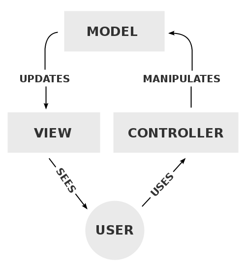
Codename One’s List component uses the MVC paradigm in its implementation. List itself is the Controller (with a bit of the View mixed in). The ListCellRenderer interface is the rest of the View and the ListModel is (you guessed it by now) the Model.
When the list is painted, it iterates over the visible elements in the model and asks the model for the data, it then draws them using the renderer. Notice that because of this both the model and the renderer must be fast and that’s hard.
Why is this useful
Since the model is a lightweight interface, it can be implemented by you and replaced in runtime if so desired, this allows many use cases:
A list can contain thousands of entries but load the portion visible to the user. Since the model will be queried for the elements that are visible to the user, it won’t need to load the large data set into memory until the user starts scrolling down (at which point other elements may be offloaded from memory).
A list can cache efficiently. For example: a list can mirror data from the server into local RAM without actually downloading all the data. Data can also be mirrored from storage for better performance and discarded for better memory use.
The is no need for state copying. Since renderers allow you to display any object type, the list model interface can be implemented by the application’s data structures (for example: persistence/network engine), which would return internal application data structures saving you the need of copying application state into a list specific data structure. Note that this advantage applies with a custom renderer which is pretty difficult to get right.
Using the proxy pattern you can layer logic such as filtering, sorting, caching, etc. On top of existing models without changing the model source code.
You can reuse generic models for many views, for example: a model that fetches data from the server can be initialized with different arguments, to fetch different data for different views. View objects in different Forms can display the same model instance in different view instances, thus they would update automatically when you change one global model.
Most of these use cases work best for lists that grow to a larger size, or represent complex data, which is what the list object is designed to do.
Important - lists and Layout managers
When working with lists, you want the list to handle the scrolling (otherwise it will perform badly). This means you should place the list in a non-scrollable container (no parent can be scrollable), notice that the content pane is scrollable by default, so you should disable that.
It’s also recommended to place the list in the CENTER location of a BorderLayout to produce the most effective results. For example:
form.setScrollable(false);
form.setLayout(new BorderLayout());
form.add(BorderLayout.CENTER, myList);
MultiList & DefaultListModel
After this long start, here is the first sample of creating a list using the MultiList.
The MultiList is a preconfigured list that contains a ready made renderer with defaults that make sense for the most common use cases. It still retains most of the power available to the List component but reduces the complexity of one of the hardest things to grasp for most developers: rendering.
The full power of the ListModel is still available and allows you to create a million entry list with a few lines of code. For example the objects that the model returns should always be in the form of Map objects and not an arbitrary object like the standard List allows.
Here is a simple example of a MultiList containing a highly popular subject matter:
Form hi = new Form("MultiList", new BorderLayout());

ArrayList<Map<String, Object>> data = new ArrayList<>();

data.add(createListEntry("A Game of Thrones", "1996"));
data.add(createListEntry("A Clash Of Kings", "1998"));
data.add(createListEntry("A Storm Of Swords", "2000"));
data.add(createListEntry("A Feast For Crows", "2005"));
data.add(createListEntry("A Dance With Dragons", "2011"));
data.add(createListEntry("The Winds of Winter", "2016 (please, please, please)"));
data.add(createListEntry("A Dream of Spring", "Ugh"));

DefaultListModel<Map<String, Object>> model = new DefaultListModel<>(data);
MultiList ml = new MultiList(model);
hi.add(BorderLayout.CENTER, ml);
hi.show();
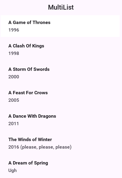
createListEntry is trivial:
private Map<String, Object> createListEntry(String name, String date) {
    Map<String, Object> entry = new HashMap<>();
    entry.put("Line1", name);
    entry.put("Line2", date);
    return entry;
}
One major piece is missing here: the cover images for the books. A simple approach would be to place the image objects into the entries using the "icon" property as such:
private Map<String, Object> createListEntry(String name, String date, Image cover) {
    Map<String, Object> entry = new HashMap<>();
    entry.put("Line1", name);
    entry.put("Line2", date);
    entry.put("icon", cover);
    return entry;
}
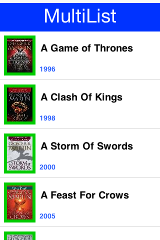
MultiList uses the GenericListCellRenderer internally you can use URLImage to dynamically fetch the data. This is discussed in the graphics section of this guide.Going further with the ListModel
Suppose that GRRM was prolific and wrote 1 million books. The default list model won’t make much sense in that case but you would still be able to render everything in a list model.
You will fake it a bit but notice that 1M components won’t be created even if you somehow scroll all the way down…
The ListModel interface can be implemented by anyone in this case you did a stupid simple implementation:
static class GRMMModel implements ListModel<Map<String, Object>> {
    private int selection;
    private final java.util.List<SelectionListener> selectionListeners = new ArrayList<>();

    @Override
    public Map<String, Object> getItemAt(int index) {
        int idx = index % 7;
        switch (idx) {
            case 0:
                return createListEntry("A Game of Thrones " + index, "1996");
            case 1:
                return createListEntry("A Clash Of Kings " + index, "1998");
            case 2:
                return createListEntry("A Storm Of Swords " + index, "2000");
            case 3:
                return createListEntry("A Feast For Crows " + index, "2005");
            case 4:
                return createListEntry("A Dance With Dragons " + index, "2011");
            case 5:
                return createListEntry("The Winds of Winter " + index, "2016 (please, please, please)");
            default:
                return createListEntry("A Dream of Spring " + index, "Ugh");
        }
    }

    @Override
    public int getSize() {
        return 1000000;
    }

    @Override
    public int getSelectedIndex() {
        return selection;
    }

    @Override
    public void setSelectedIndex(int index) {
        int old = selection;
        selection = index;
        for (SelectionListener l : selectionListeners) {
            l.selectionChanged(old, index);
        }
    }

    @Override
    public void addDataChangedListener(DataChangedListener l) {
    }

    @Override
    public void removeDataChangedListener(DataChangedListener l) {
    }

    @Override
    public void addSelectionListener(SelectionListener l) {
        selectionListeners.add(l);
    }

    @Override
    public void removeSelectionListener(SelectionListener l) {
        selectionListeners.remove(l);
    }

    @Override
    public void addItem(Map<String, Object> item) {
    }

    @Override
    public void removeItem(int index) {
    }
}
You can now replace the existing model by removing all the model related logic and changing the constructor call as such:
MultiList ml = new MultiList(new GRMMModel());
Form hi = new Form("Million Entries", new BorderLayout());
hi.add(BorderLayout.CENTER, ml);
hi.show();
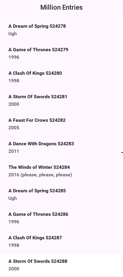
List cell renderer
The Renderer is a simple interface with 2 methods:
public interface ListCellRenderer {
   //This method is called by the List for each item, when the List paints itself.
   public Component getListCellRendererComponent(List list, Object value, int index, boolean isSelected);

   //This method returns the List animated focus which is animated when list selection changes
   public Component getListFocusComponent(List list);
}
The most simple/naive implementation may choose to implement the renderer as follows:
public Component getListCellRendererComponent(List list, Object value, int index, boolean isSelected){
     return new Label(value.toString());
}

public Component getListFocusComponent(List list){
     return null;
}
This will compile and work, but won’t give you much, notice that you won’t see the List selection move on the List, this is because the renderer returns a Label with the same style regardless if it’s selected or not.
Now make it a bit more useful:
public Component getListCellRendererComponent(List list, Object value, int index, boolean isSelected){
      Label l = new Label(value.toString());
if (isSelected) {
             l.setFocus(true);
             l.getAllStyles().setBgTransparency(100);
         } else {
             l.setFocus(false);
             l.getAllStyles().setBgTransparency(0);
        }
        return l;
}   public Component getListFocusComponent(List list){
      return null;
}
In this renderer you set the Label.setFocus(true) if it’s selected, calling to this method doesn’t give the focus to the Label, it renders the label as selected.
Then you invoke Label.getAllStyles().setBgTransparency(100) to give the selection semi transparency, and 0 for full transparency if not selected.
That’s still not efficient because you create a new Label each time the method is invoked.
To make the code tighter, keep a reference to the Component or extend it as DefaultListCellRenderer does:
class MyRenderer extends Label implements ListCellRenderer {
    public Component getListCellRendererComponent(List list, Object value, int index, boolean isSelected){
        setText(value.toString());
        if (isSelected) {
            setFocus(true);
            getAllStyles().setBgTransparency(100);
        } else {
            setFocus(false);
            getAllStyles().setBgTransparency(0);
        }
        return this;
    }

    public Component getListFocusComponent(List list) {
        // this renderer highlights the selected row itself, and returning the
        // rubber stamp would draw the focus overlay with the last row's text
        return null;
    }
}
Now look at a more advanced Renderer:
class ContactsRenderer extends Container implements ListCellRenderer {

 private Label name = new Label("");
 private Label email = new Label("");
 private Label pic = new Label("");

 private Label focus = new Label("");

 public ContactsRenderer() {
     setLayout(new BorderLayout());
     addComponent(BorderLayout.WEST, pic);
     Container cnt = new Container(new BoxLayout(BoxLayout.Y_AXIS));
     name.getAllStyles().setBgTransparency(0);
     name.getAllStyles().setFont(Font.createTrueTypeFont("native:MainBold"));
     email.getAllStyles().setBgTransparency(0);
     cnt.addComponent(name);
     cnt.addComponent(email);
     addComponent(BorderLayout.CENTER, cnt);

     focus.getStyle().setBgTransparency(100);
 }

 public Component getListCellRendererComponent(List list, Object value, int index, boolean isSelected) {

     Contact person = (Contact) value;
     name.setText(person.getDisplayName());
     email.setText(person.getPrimaryEmail());
     pic.setIcon(person.getPhoto());
     return this;
 }

 public Component getListFocusComponent(List list) {
     return focus;
 }
}
In this renderer you want to render a Contact object to the Screen, you build the Component in the constructor and in the getListCellRendererComponent you update the Labels' texts according to the Contact object.
Notice that in this renderer you return a focus Label with semi transparency, as mentioned before, the focus component can be modified within this method.
For example, you can change the focus Component to have an icon:
focus.getAllStyles().setBgTransparency(100);
focus.setIcon(FontImage.createMaterial(FontImage.MATERIAL_STAR, "Label", 3.0f));
focus.setAlignment(Component.RIGHT);
Generic list cell renderer
As part of the GUI builder work, you needed a way to customize rendering for a List, but the renderer/model approach seemed impossible to adapt to a GUI builder (it seems the Swing GUI builders had a similar issue). Your solution was to introduce the GenericListCellRenderer, which while introducing limitations and implementation requirements still manages to make life easier, both in the GUI builder and outside of it.
GenericListCellRenderer is a renderer designed to be as simple to use as a Component-Container hierarchy, you effectively crammed most of the common renderer use cases into one class. To enable that, you need to know the content of the objects within the model, so the GenericListCellRenderer assumes the model contains Map objects. Since Maps can contain arbitrary data the list model is still generic and allows storing application specific data. Furthermore a Map can still be derived and extended to provide domain specific business logic.
The GenericListCellRenderer accepts two container instances (more later on why at least two, and not one), which it maps to individual Map entries within the model, by finding the appropriate components within the given container hierarchy. Components are mapped to the Map entries based on the name property of the component (getName/setName) and the key/value within the Map, for example:
For a model that contains a Map entry like this:
"Foo": "Bar"
"X": "Y"
"Not": "Applicable"
"Number": Integer(1)
A renderer will loop over the component hierarchy in the container, searching for components whose name matches Foo, X, Not, and Number, and assigning the appropriate value to them.
To make matters even more attractive the renderer seamlessly supports list tickering when appropriate, and if a CheckBox appears within the renderer, it will toggle a boolean flag within the Map seamlessly.
One issue that crops up with this approach is that, if a value is missing from the Map, it’s treated as empty and the component is reset.
This can pose an issue if you hardcode an image or text within the renderer and you don’t want them replaced (for example: an arrow graphic on a Label within the renderer). The solution for this is to name the component with Fixed in the end of the name, for example: HardcodedIconFixed.
Naming a component within the renderer with $number will automatically set it as a counter component for the offset of the component within the list.
Styling the GenericListCellRenderer is slightly different, the renderer uses the UIID of the Container passed to the generic list cell renderer, and the background focus uses that same UIID with the word "Focus" appended to it.
Note that the generic list cell renderer will grant focus to the child components of the selected entry if they’re focusable, thus changing the style of said entries. For example: a Container might have a child Label that has one style when the parent container is unselected and another when it’s selected (focused), this can be achieved by defining the label as focusable. Notice that the component will never receive direct focus, since it’s still part of a renderer.
Finally, the generic list cell renderer accepts two or four instances of a Container, rather than the obvious choice of accepting one instance. This allows the renderer to treat the selected entry differently, which is important to tickering, although it’s also useful for the fisheye effect [3]. Since it might not be practical to seamlessly clone the Container for the renderer’s needs, Codename One expects the developer to provide two separate instances, they can be identical in all respects, but they must be separate instances for tickering to work. The renderer also allows for a fisheye effect, where the selected entry is actually different from the unselected entry in its structure, it also allows for a pinstripe effect, where odd/even rows have different styles (this is accomplished by providing 4 instances of the containers selected/unselected for odd/even).
The best way to learn about the generic list cell renderer and the Map model is by playing with them in the old GUI builder. Notice they can be used in code without any dependency on the GUI builder and can be useful at that.
Here is a simple example of a list with checkboxes that gets updated automatically:
list.setRenderer(new GenericListCellRenderer(createGenericRendererContainer(), createGenericRendererContainer()));
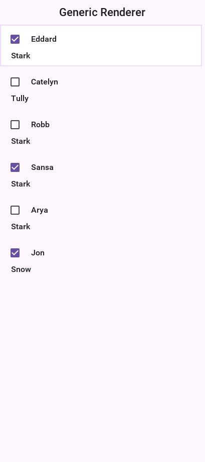
Custom UIID of entry in GenericListCellRenderer/MultiList
With MultiList/GenericListCellRenderer one of the common issues is making a UI where a specific component
within the list renderer has a different UIID style based on data. For example: this can be helpful to mark a label within the
list as red, for instance, for a list of monetary transactions.
This can be achieved with a custom renderer, but that’s a pretty difficult task.GenericListCellRenderer (MultiList uses GenericListCellRenderer internally) has another option.
Normally, to build the model for a renderer of this type, you use something like:
map.put("componentName", "Component Value");
What if you want componentName to be red? Just use:
map.put("componentName_uiid", "red");
This will apply the UIID "red" to the component, which you can then style in the theme. Notice that once you start doing this, you need to define this entry for all entries, for example:
map.put("componentName_uiid", "blue");
Otherwise the component will stay red for the next entry (since the renderer acts like a rubber stamp).
Rendering prototype
Because of the rendering architecture of a List its pretty hard to calculate the right preferred size for such a component. The default behavior includes querying a few entries from the model then constructing their renderers to get a "sample" of the preferred size value.
As you might guess this triggers a performance penalty that’s paid with every reflow of the UI. The solution is to use setRenderingPrototype.
setRenderingPrototype accepts a "fake" value that represents a reasonably large amount of data and it will be used to calculate the preferred size. For example: for a multiList that should render 2 lines of text with 20 characters and a 5mm square icon you can do something like this:
Map<String, Object> proto = new HashMap<>();
proto.put("Line1", "WWWWWWWWWWWWWWWWWWWW");
proto.put("Line2", "WWWWWWWWWWWWWWWWWWWW");
int mm5 = Display.getInstance().convertToPixels(5, true);
proto.put("icon", Image.createImage(mm5, mm5));
myMultiList.setRenderingPrototype(proto);
ComboBox
The ComboBox is a specialization of List that displays a single selected entry. When clicking that entry a popup is presented allowing the user to pick an entry from the full list of entries.
ComboBox UI paradigm isn’t as common on OSes such as iOS where there is no native equivalent to it. Recommend using either the Picker class or the AutoCompleteTextField.ComboBox is notoriously hard to style as it relies on a complex dynamic of popup renderer and instantly visible renderer. The UIID for the ComboBox is ComboBox
but if you set it to something else all the other UIID’s will also change their prefix. For example: the ComboBoxPopup
UIID will become MyNewUIIDPopup.
The combo box defines the following UIID’s by default:
ComboBoxComboBoxItemComboBoxFocusPopupContentPanePopupItemPopupFocus
The ComboBox also defines theme constants that allow some native themes to manipulate its behavior for example:
popupTitleBool- shows the "label for" value as the title of the popup dialogpopupCancelBodyBool- Adds a cancel button into the popup dialogcenteredPopupBool- shows the popup dialog in the center of the screen instead of under the popupotherPopupRendererBool- Uses a different list cell render for the popup than the one used for theComboBoxitself. When this isfalsePopupItem&PopupFocusbecome irrelevant. Notice that the Android native theme defines this totrue.
Since a ComboBox is a List you can use everything you learned about a List to build a ComboBox including models, GenericListCellRenderer etc.
For example: the demo below uses the GRRM demo data from above to build a ComboBox:
Form hi = new Form("ComboBox", new BoxLayout(BoxLayout.Y_AXIS));
ComboBox<Map<String, Object>> combo = new ComboBox<> (
        createListEntry("A Game of Thrones", "1996"),
        createListEntry("A Clash Of Kings", "1998"),
        createListEntry("A Storm Of Swords", "2000"),
        createListEntry("A Feast For Crows", "2005"),
        createListEntry("A Dance With Dragons", "2011"),
        createListEntry("The Winds of Winter", "2016 (please, please, please)"),
        createListEntry("A Dream of Spring", "Ugh"));

combo.setRenderer(new GenericListCellRenderer<>(new MultiButton(), new MultiButton()));
hi.add(combo);
hi.show();
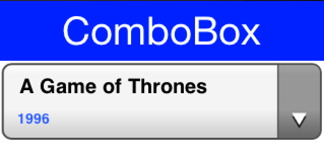
Slider
A Slider is an empty component that can be filled horizontally or vertically to allow indicating progress, setting volume etc. It can be editable to allow the user to determine its value or none editable to relay that information to the user. It can have a thumb on top to show its current position.

The interesting part about the slider is that it has two separate style UIID’s, Slider & SliderFull. The Slider UIID is always painted and SliderFull is rendered on top based on the amount the Slider should be filled.
Slider is highly customizable for example: a slider can be used to replicate a 5-star rating widget as such. Notice that this slider will work when its given its preferred size otherwise more stars will appear. That’s why you place it within a FlowLayout:
Form hi = new Form("Star Slider", new BoxLayout(BoxLayout.Y_AXIS));
hi.add(FlowLayout.encloseCenter(createStarRankSlider()));
hi.show();
The slider itself is initialized in the code below. Notice that you can achieve almost the same result using a theme by setting the Slider & SliderFull UIID’s (both in selected & unselected states).
In fact doing this in the theme might be superior as you could use one image that contains 5 stars already and that way you won’t need the preferred size hack below:
private void initStarRankStyle(Style s, Image star) {
    s.setBackgroundType(Style.BACKGROUND_IMAGE_TILE_BOTH);
    s.setBorder(Border.createEmpty());
    s.setBgImage(star);
    s.setBgTransparency(0);
}

private Slider createStarRankSlider() {
    Slider starRank = new Slider();
    starRank.setEditable(true);
    starRank.setMinValue(0);
    starRank.setMaxValue(10);
    Font fnt = Font.createTrueTypeFont("native:MainLight", "native:MainLight").
            derive(Display.getInstance().convertToPixels(5, true), Font.STYLE_PLAIN);
    Style s = new Style(0xffff33, 0, fnt, (byte)0);
    Image fullStar = FontImage.createMaterial(FontImage.MATERIAL_STAR, s).toImage();
    s.setOpacity(100);
    s.setFgColor(0);
    Image emptyStar = FontImage.createMaterial(FontImage.MATERIAL_STAR, s).toImage();
    initStarRankStyle(starRank.getSliderEmptySelectedStyle(), emptyStar);
    initStarRankStyle(starRank.getSliderEmptyUnselectedStyle(), emptyStar);
    initStarRankStyle(starRank.getSliderFullSelectedStyle(), fullStar);
    initStarRankStyle(starRank.getSliderFullUnselectedStyle(), fullStar);
    starRank.setPreferredSize(new Dimension(fullStar.getWidth() * 5, fullStar.getHeight()));
    return starRank;
}
private void showStarPickingForm() {
  Form hi = new Form("Star Slider", new BoxLayout(BoxLayout.Y_AXIS));
  hi.add(FlowLayout.encloseCenter(createStarRankSlider()));
  hi.show();
}
Label to represent the first star and have the slider work between 0 - 8 values to provide 4 more stars.Table
Table is a composite component (but it isn’t a lead component), this means it’s a subclass of Container. It’s effectively built from many components.
Table is based on the TableLayout class. It’s important to be familiar with that layout manager when working with Table.Here is a trivial sample of using the standard table component:
Form hi = new Form("Table", new BorderLayout());
TableModel model = new DefaultTableModel(
new String[] {"Col 1", "Col 2", "Col 3"},
new Object[][] {
{"Row 1", "Row A", "Row X"},
{"Row 2", "Row B", "Row Y"},
{"Row 3", "Row C", "Row Z"},
{"Row 4", "Row D", "Row K"},
}) {
public boolean isCellEditable(int row, int col) {
return col != 0;
}
};
Table table = new Table(model);
hi.add(BorderLayout.CENTER, table);
hi.show();
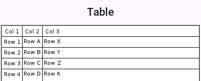
The more "interesting" capabilities of the Table class can be utilized through the TableLayout. You can use the layout constraints (also exposed in the table class) to create spanning and elaborate UI’s.
For example:
Form hi = new Form("Table", new BorderLayout());
TableModel model = new DefaultTableModel(
new String[] {"Col 1", "Col 2", "Col 3"},
new Object[][] {
{"Row 1", "Row A", "Row X"},
{"Row 2", "Row B can now stretch", null},
{"Row 3", "Row C", "Row Z"},
{"Row 4", "Row D", "Row K"},
}) {
public boolean isCellEditable(int row, int col) {
return col != 0;
}
};
Table table = new Table(model) {
@Override
protected TableLayout.Constraint createCellConstraint(Object value, int row, int column) {
TableLayout.Constraint con = super.createCellConstraint(value, row, column);
if (row == 1 && column == 1) {
con.setHorizontalSpan(2);
}
con.setWidthPercentage(33);
return con;
}
};
hi.add(BorderLayout.CENTER, table);
hi.show();
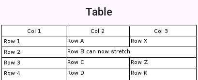
To customize the table cell behavior you can derive the Table to create a "renderer like" widget, but unlike the list this component is "kept" and used as is. This means you can bind listeners to this component and work with it as you would with any other component in Codename One.
The example above can be extended to include far more capabilities:
Form hi = new Form("Table", new BorderLayout());
TableModel model = new DefaultTableModel(
new String[] {"Col 1", "Col 2", "Col 3"},
new Object[][] {
{"Row 1", "Row A", "Row X"},
{"Row 2", "Row B can now stretch", null},
{"Row 3", "Row C", "Row Z"},
{"Row 4", "Row D", "Row K"},
}) {
public boolean isCellEditable(int row, int col) {
return col != 0;
}
};
Table table = new Table(model) {
@Override
protected Component createCell(Object value, int row, int column, boolean editable) {
Component cell;
if (row == 1 && column == 1) {
Picker p = new Picker();
p.setType(Display.PICKER_TYPE_STRINGS);
p.setStrings("Row B can now stretch", "This is a good value",
"So Is This", "Better than text field");
p.setSelectedString((String)value);
p.setUIID("TableCell");
p.addActionListener(e -> getModel().setValueAt(row, column, p.getSelectedString()));
cell = p;
} else {
cell = super.createCell(value, row, column, editable);
}
if (row > -1 && row % 2 == 0) {
cell.getAllStyles().setBgColor(0xeeeeee);
cell.getAllStyles().setBgTransparency(255);
}
return cell;
}

@Override
protected TableLayout.Constraint createCellConstraint(Object value, int row, int column) {
TableLayout.Constraint con = super.createCellConstraint(value, row, column);
if (row == 1 && column == 1) {
con.setHorizontalSpan(2);
}
con.setWidthPercentage(33);
return con;
}
};
hi.add(BorderLayout.CENTER, table);
hi.show();
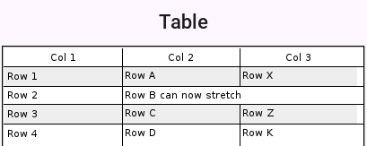
To line wrap table cells you can override the createCell method and return a TextArea instead of a TextField since the TextArea defaults to the multi-line behavior this should work seamlessly. For example:
Form hi = new Form("Table", new BorderLayout());
TableModel model = new DefaultTableModel(
        new String[] {"Name", "Description", "Status"},
        new Object[][] {
            {"Row 1", "A short value", "OK"},
            {"Row 2", "A much longer value that wraps to multiple lines", "OK"},
            {"Row 3", "Another long table cell that needs wrapping", "Pending"},
        });
Table table = new Table(model) {
    @Override
    protected Component createCell(Object value, int row, int column, boolean editable) {
        if (row > -1 && column == 1) {
            TextArea cell = new TextArea(String.valueOf(value));
            cell.setUIID("TableCell");
            cell.setEditable(false);
            cell.setGrowByContent(true);
            return cell;
        }
        return super.createCell(value, row, column, editable);
    }

    @Override
    protected TableLayout.Constraint createCellConstraint(Object value, int row, int column) {
        TableLayout.Constraint con = super.createCellConstraint(value, row, column);
        con.setWidthPercentage(column == 1 ? 50 : 25);
        return con;
    }
};
hi.add(BorderLayout.CENTER, table);
hi.show();
TextArea is built-in to the Table.
Sorting tables
Sorting tables by clicking the titles is something that should work out of the box by using an API like setSortSupported(true):
Form hi = new Form("Table", new BorderLayout());
TableModel model = new DefaultTableModel(
        new String[] {"Col 1", "Col 2", "Col 3"},
        new Object[][] {
            {"Row 1", "Row A", 1},
            {"Row 2", "Row B", 4},
            {"Row 3", "Row C", 7.5},
            {"Row 4", "Row D", 2.24},
        });
Table table = new Table(model);
table.setSortSupported(true);
hi.add(BorderLayout.CENTER, table);
hi.add(BorderLayout.NORTH, new Button("Button"));
hi.show();
Notice this works with numbers, Strings and might work with dates but you can support any object type by overriding the method protected Comparator createColumnSortComparator(int column) which should return a comparator for your custom object type in the column.
Tree
Tree allows displaying hierarchical data such as folders and files in a collapsible/expandable UI. Like the Table it’s a composite component (but it isn’t a lead component).
Like the Table it works in consort with a model to construct its user interface on the fly but doesn’t use a stateless renderer (as List does).
The data of the Tree arrives from a model for example: this:
class StringArrayTreeModel implements TreeModel {
    String[][] arr = new String[][] {
        {"Colors", "Letters", "Numbers"},
        {"Red", "Green", "Blue"},
        {"A", "B", "C"},
        {"1", "2", "3"}
    };

    @Override
    public Vector getChildren(Object parent) {
        Vector v = new Vector();
        if (parent == null) {
            for (int iter = 0; iter < arr[0].length; iter++) {
                v.addElement(arr[0][iter]);
            }
            return v;
        }
        for (int iter = 0; iter < arr[0].length; iter++) {
            if (parent.equals(arr[0][iter]) && arr.length > iter + 1 && arr[iter + 1] != null) {
                for (int i = 0; i < arr[iter + 1].length; i++) {
                    v.addElement(arr[iter + 1][i]);
                }
            }
        }
        return v;
    }

    @Override
    public boolean isLeaf(Object node) {
        Vector v = getChildren(node);
        return v == null || v.size() == 0;
    }
}

Tree dt = new Tree(new StringArrayTreeModel());
Form hi = new Form("Tree", new BorderLayout());
hi.add(BorderLayout.CENTER, dt);
hi.show();
Will result in this:
Tree is hierarchy based you can’t have a simple model like you’ve for the Table as deep hierarchy is harder to represent with arrays.A more practical "real world" example would be working with XML data. You can use something like this to show an XML Tree:
Form hi = new Form("XML Tree", new BorderLayout());
// Parsed inline so the sample runs as it stands; in an application this
// would come from the network or from a packaged resource.
String xml = "<project name=\"demo\">"
        + "<target name=\"compile\"><javac srcdir=\"src\"/></target>"
        + "<target name=\"jar\"><zip destfile=\"demo.jar\"/></target>"
        + "</project>";
try (Reader r = new CharArrayReader(xml.toCharArray())) {
    Element e = new XMLParser().parse(r);
    Tree tree = new Tree(new XMLTreeModel(e)) {
        @Override
        protected String childToDisplayLabel(Object child) {
            if (child instanceof Element) {
                Element el = (Element) child;
                // getTagName() throws for the elements that carry text
                if (el.isTextElement()) {
                    return el.getText();
                }
                return el.getTagName();
            }
            return child.toString();
        }
    };
    hi.add(BorderLayout.CENTER, tree);
    xmlTree = tree;
} catch (IOException err) {
    Log.e(err);
}
hi.show();
try with resources syntax closes the Reader for you however the block ends.
The model for the XML hierarchy is implemented as such:
/// Walks a parsed XML document as a tree: the document element is the single
/// root, and a node's children are the element's children.
static class XMLTreeModel implements TreeModel {
    private Element root;

    XMLTreeModel(Element e) {
        root = e;
    }

    @Override
    public Vector getChildren(Object parent) {
        if (parent == null) {
            Vector c = new Vector();
            c.addElement(root);
            return c;
        }
        Vector result = new Vector();
        Element e = (Element) parent;
        for (int iter = 0; iter < e.getNumChildren(); iter++) {
            result.addElement(e.getChildAt(iter));
        }
        return result;
    }

    @Override
    public boolean isLeaf(Object node) {
        Element e = (Element) node;
        return e.getNumChildren() == 0;
    }
}
ShareButton
ShareButton is a button you can add into the UI to let a user share an image or block of text.
The ShareButton uses a set of predefined share options on the simulator. On Android & iOS the ShareButton is mapped to the OS native sharing functionality and can share the image/text with the services configured on the device (for example: Twitter, Facebook etc.).
In the sample code below you take a screenshot which is saved to FileSystemStorage for sharing:
Form hi = new Form("ShareButton");
ShareButton sb = new ShareButton();
sb.setText("Share Screenshot");
hi.add(sb);

Image screenshot = Image.createImage(hi.getWidth(), hi.getHeight());
hi.revalidate();
hi.setVisible(true);
hi.paintComponent(screenshot.getGraphics(), true);

String imageFile = FileSystemStorage.getInstance().getAppHomePath() + "screenshot.png";
try(OutputStream os = FileSystemStorage.getInstance().openOutputStream(imageFile);) {
    ImageIO.getImageIO().save(screenshot, os, ImageIO.FORMAT_PNG, 1);
} catch(IOException err) {
    Log.e(err);
}
sb.setImageToShare(imageFile, "image/png");
ShareButton behaves differently on the device…
ShareButton features some share service classes to allow plugging in more share services. For example, this functionality is relevant to devices where native sharing isn’t supported. This code isn’t used on iOS/Android…Share Result Callback
The share API can report what the user did with the share sheet. Register a ShareResultListener on either ShareButton or directly with Display.share(…) and you receive a single ShareResult describing the outcome:
SHARED_TO(packageName)— the user picked a destination.packageNameis the chosen target’s identifier: an Android package name (for example,com.whatsapp) or, on iOS, aUIActivityTypesuch ascom.apple.UIKit.activity.PostToTwitter. It may benullwhen the platform doesn’t expose the selection (for example, older Android, Web Share API).DISMISSED— the user cancelled without picking a target. iOS reports this reliably; Android’s chooser has no public dismissal signal, so on Android the listener simply doesn’t fire on cancel.FAILED— the share couldn’t be completed.getError()may carry a short platform-supplied message.
The listener is always invoked on the EDT, exactly once per share request.
ShareButton sb = new ShareButton();
sb.setTextToShare("Check this out!");
sb.setShareResultListener(result -> {
    if (result.isSharedTo()) {
        Log.p("Shared to " + result.getPackageName());
    } else if (result.isDismissed()) {
        Log.p("User dismissed the share sheet");
    } else if (result.isFailed()) {
        Log.p("Share failed: " + result.getError());
    }
});
form.add(sb);
If you call Display directly instead of using ShareButton, pass the listener as the final argument to the new overload:
Display.getInstance().share(
        "Check this out!", imagePath, "image/png", sourceRect,
        result -> handleResult(result));
When the share is dispatched through the non-native fallback dialog (platforms without isNativeShareSupported), the listener still fires: it reports DISMISSED when the user picks the Cancel button, and the underlying ShareService implementations report SHARED_TO once they call ShareService.finish(). Custom ShareService subclasses can call deliverResult(ShareResult.failed("…")) from inside share(…) to publish a failure explicitly; otherwise finish() falls back to a default SHARED_TO(commandName).
iOS Share Extension Authoring Helper
An iOS share extension is a separate app target that the system shows inside UIActivityViewController when the user shares from another app (Safari, Photos, etc.). It runs in a sandboxed process and persists payloads to the host app via an App Group shared NSUserDefaults suite.
Codename One’s build pipeline already wires .ios.appext zip archives under src/main/resources into the generated Xcode project. The IOSShareExtensionBuilder helper generates that archive for you so you don’t have to create the extension target in Xcode first.
What the helper produces
For a single call the helper writes four files at the root of the extension bundle:
Info.plist— declares theNSExtensiondictionary, activation rules (SupportsText/SupportsWebURL/SupportsImage), and the principal class (ShareViewController).<ExtensionName>.entitlements— declarescom.apple.security.application-groupswith the configured App Group identifier.ShareViewController.swift— aSLComposeServiceViewControllersubclass that extracts text / URL / image attachments fromextensionContext, packs them into a dictionary, and writes that dictionary toUserDefaults(suiteName: appGroupId)under the keycn1.shareExtension.payload.buildSettings.properties— Xcode build setting overrides (deployment target, Swift version, entitlements path, plist path) picked up by the iOS build pipeline.
Generating the bundle
Call the builder from a Maven plugin, an Ant task or a one-shot main:
IOSShareExtensionBuilder lives in the Codename One Maven plugin rather than
in the framework, so this runs at build time and isn’t one of the compiled
examples:
new IOSShareExtensionBuilder()
        .setExtensionName("MyShareExtension")
        .setDisplayName("Share to MyApp")
        .setHostBundleId("com.example.myapp")
        .setAppGroupId("group.com.example.myapp")
        .acceptText(true)
        .acceptURLs(true)
        .acceptImages(true)
        .writeAppext(new File("src/main/resources/MyShareExtension.ios.appext"));
The next iOS build picks up the .ios.appext archive automatically; no Xcode steps are required.
If you prefer a directory layout (for example, to commit the generated sources or to feed a future ios/app_extensions/ pipeline) use writeTo(File) instead of writeAppext(File) — the file contents are identical.
Reading the payload from the host app
The host app has to be in that App Group too. setAppGroupId writes the
entitlement for the extension only, so add the same identifier to the
application with the ios.app_groups build hint — the two sides are reading
and writing one container, and a mismatch produces an empty
dictionary rather than an error:
codename1.arg.ios.app_groups=group.com.example.myapp
It then reads the most recent payload at startup or when it resumes:
// Inside an iOS native interface
NSUserDefaults* shared =
    [[NSUserDefaults alloc] initWithSuiteName:@"group.com.example.myapp"];
NSDictionary* payload = [shared dictionaryForKey:@"cn1.shareExtension.payload"];
The payload dictionary contains:
text— the user-composed text (String).items— an array of{ kind, value }dictionaries wherekindis"text","url"or"image". For images,valueis a file URL inside the App Group container.timestamp— aDoubleUNIX time.
Expose this to your CN1 code via a small native interface and clear the key once handled so the next share is unambiguous.
Activation rules and validation
The builder validates its inputs before writing anything:
extensionNamemust be a non-empty identifier (letters, digits,_,-). It becomes the Xcode target name and the.appexbundle name. The extension’s bundle id is set to<hostBundleId>.<extensionName>by the iOS build pipeline.appGroupIdmust start withgroup.(an Apple requirement). Create the matching App Group in your Apple Developer account and add it to both the host app’s and the extension’s provisioning profile.At least one of
acceptText,acceptURLs,acceptImagesmust be enabled, otherwise iOS will never present your extension.
The default deployment target is iOS 12.0; override with setDeploymentTarget("13.0") if you need newer APIs in your customized controller.
Customising the generated controller
The generated Swift controller covers the common case (read attachments, persist to App Group, finish the request). If you need bespoke logic — custom UI, server upload, image transcoding — treat the helper’s output as a starting point: run it once, copy the directory under ios/app_extensions/MyShareExtension/, edit ShareViewController.swift, and zip it back into .ios.appext (or wait for the directory-based pipeline tracked by issue #3427).
<hostBundleId>.<extensionName>) and add the App Group capability to it on the Apple Developer portal, alongside the host app.Tabs
The Tabs Container arranges components into groups within "tabbed" containers. Tabs is a container type that allows leafing through its children using labeled toggle buttons. The tabs can be placed in many different ways (top, bottom, left or right) with the default being determined by the platform. This class also allows swiping between components to leaf between said tabs (for this purpose the tabs themselves can also be hidden).
Since Tabs are a Container its a common mistake to try and add a Tab using the add method. That method won’t work since a Tab can have both an Image and text String associated with it:
Form hi = new Form("Tabs", new BorderLayout());

Tabs t = new Tabs();
Style s = UIManager.getInstance().getComponentStyle("Tab");
FontImage icon1 = FontImage.createMaterial(FontImage.MATERIAL_QUESTION_ANSWER, s);

Container container1 = BoxLayout.encloseY(new Label("Label1"), new Label("Label2"));
t.addTab("Tab1", icon1, container1);
t.addTab("Tab2", new SpanLabel("Some text directly in the tab"));

hi.add(BorderLayout.CENTER, t);
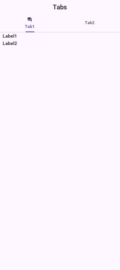
A common usage for Tabs is the swipe to proceed effect which is common in iOS applications. In the code below you use RadioButton and LayeredLayout with hidden tabs to produce that effect:
Form hi = new Form("Swipe Tabs", new LayeredLayout());
Tabs t = new Tabs();
t.hideTabs();

Style s = UIManager.getInstance().getComponentStyle("Button");
FontImage radioEmptyImage = FontImage.createMaterial(FontImage.MATERIAL_RADIO_BUTTON_UNCHECKED, s);
FontImage radioFullImage = FontImage.createMaterial(FontImage.MATERIAL_RADIO_BUTTON_CHECKED, s);
((DefaultLookAndFeel) UIManager.getInstance().getLookAndFeel())
        .setRadioButtonImages(radioFullImage, radioEmptyImage, radioFullImage, radioEmptyImage);

Container container1 = BoxLayout.encloseY(new Label("Swipe the tab to see more"),
        new Label("You can put anything here"));
t.addTab("Tab1", container1);
t.addTab("Tab2", new SpanLabel("Some text directly in the tab"));

RadioButton firstTab = new RadioButton("");
RadioButton secondTab = new RadioButton("");
firstTab.setUIID("Container");
secondTab.setUIID("Container");
new ButtonGroup(firstTab, secondTab);
firstTab.setSelected(true);
Container tabsFlow = FlowLayout.encloseCenter(firstTab, secondTab);

hi.add(t);
hi.add(BorderLayout.south(tabsFlow));

t.addSelectionListener((i1, i2) -> {
    switch (i2) {
        case 0:
            if (!firstTab.isSelected()) {
                firstTab.setSelected(true);
            }
            break;
        case 1:
            if (!secondTab.isSelected()) {
                secondTab.setSelected(true);
            }
            break;
        default:
            break;
    }
});
setRadioButtonImages to explicitly set the radio button images to the look you want for the carousel.Animated tab indicator
Modern Material 3 (NavigationBar) and iOS 26 tab bars animate a small
underline between tabs when the user changes selection. Tabs ships
this as an opt-in feature gated by the tabsAnimatedIndicatorBool
theme constant; the iOS Modern and Android Material themes turn it on
by default, so apps shipping against those themes get the effect for
free.
To enable in a custom theme:
#Constants {
    tabsAnimatedIndicatorBool: true;
    tabsAnimatedIndicatorDurationInt: 200;    /* tween duration in ms */
    tabsAnimatedIndicatorThicknessMm: 1;      /* underline thickness  */
}

TabIndicator {
    /* The indicator picks up its color from this UIID's fg. If the
       UIID isn't defined or has fgColor == 0, the indicator falls
       back to the currently-selected tab's fgColor. */
    color: #007aff;
    background-color: transparent;
    padding: 0;
    margin: 0;
}
To toggle programmatically (for example, add it to a Tabs instance whose theme hasn’t enabled it):
Tabs tabs = new Tabs();
tabs.setAnimatedIndicator(true);
The indicator animates its x / width from the previously selected
tab’s bounds to the new selection’s bounds using a Motion.createEaseInOutMotion
over the configured duration (200ms default, matching Material 3’s
spec). Rapid double-taps start the animation from the current
interpolated position rather than from a stale baseline, so the
indicator chains cleanly.
MediaManager & MediaPlayer
MediaPlayer is a peer component, understanding this is crucial if your application depends on such a component. You can learn about peer components and their issues here.The MediaPlayer allows you to control video playback. To use the MediaPlayer you need to first load the Media object from the MediaManager.
The MediaManager is the core class responsible for media interaction in Codename One.
MediaManager.In the demo code below you use the gallery functionality to pick a video from the device’s video gallery:
final Form hi = new Form("MediaPlayer", new BorderLayout());
hi.setToolbar(new Toolbar());
Style s = UIManager.getInstance().getComponentStyle("Title");
FontImage icon = FontImage.createMaterial(FontImage.MATERIAL_VIDEO_LIBRARY, s);
hi.getToolbar().addCommandToRightBar("", icon, (evt) -> {
    Display.getInstance().openGallery((e) -> {
        if(e != null && e.getSource() != null) {
            String file = (String)e.getSource();
            try {
                Media video = MediaManager.createMedia(file, true);
                hi.removeAll();
                hi.add(BorderLayout.CENTER, new MediaPlayer(video));
                hi.revalidate();
            } catch(IOException err) {
                Log.e(err);
            }
        }
    }, Display.GALLERY_VIDEO);
});
hi.show();
ImageViewer
The ImageViewer allows you to inspect, zoom and pan into an image. It also allows swiping between images if you have a set of images (using an image list model).
ImageViewer is a complex rich component designed for user interaction. If you want to display an image use Label if you want the image to scale seamlessly use ScaleImageLabel.You can use the ImageViewer as a tool to view a single image which allows you to zoom in/out to that image as such:
Image duke = FontImage.createMaterial(FontImage.MATERIAL_INFO, "Label", 3.0f);
Form hi = new Form("ImageViewer", new BorderLayout());
ImageViewer iv = new ImageViewer(duke);
hi.add(BorderLayout.CENTER, iv);
hi.show();


You can work with a list of images to produce a swiping effect for the image viewer where you can swipe from one image to the next and also zoom in/out on a specific image:
Form hi = new Form("ImageViewer", new BorderLayout());

Image red = Image.createImage(100, 100, 0xffff0000);
Image green = Image.createImage(100, 100, 0xff00ff00);
Image blue = Image.createImage(100, 100, 0xff0000ff);
Image gray = Image.createImage(100, 100, 0xffcccccc);

ImageViewer iv = new ImageViewer(red);
iv.setImageList(new DefaultListModel<>(red, green, blue, gray));
hi.add(BorderLayout.CENTER, iv);
Notice that you use a ListModel to allow swiping between images.
ImageViewer also supports optional side arrows (material font icons) and an optional thumbnail strip for direct image navigation:
Image red = FontImage.createMaterial(FontImage.MATERIAL_LOOKS_ONE, "Label", 6.0f);
Image green = FontImage.createMaterial(FontImage.MATERIAL_LOOKS_TWO, "Label", 6.0f);
Image blue = FontImage.createMaterial(FontImage.MATERIAL_LOOKS_3, "Label", 6.0f);
Image gray = FontImage.createMaterial(FontImage.MATERIAL_LOOKS_4, "Label", 6.0f);
ImageViewer iv = new ImageViewer(red);
iv.setImageList(new DefaultListModel<>(red, green, blue, gray));
iv.setNavigationArrowsVisible(true);
iv.setThumbnailsVisible(true);
iv.setThumbnailBarHeight(6f); // Optional, defaults to 6mm
Form hi = new Form("ImageViewer", new BorderLayout());
hi.add(BorderLayout.CENTER, iv);
hi.show();
When arrows are enabled, tapping near the left/right edge will move to the previous/next image. When thumbnails are enabled, tapping a thumbnail jumps directly to that image.
All three options can be configured with theme constants (using the ImageViewer UIID prefix):
imageviewerNavigationArrowsBool=true|falseimageviewerThumbnailsBool=true|falseimageviewerThumbnailBarHeightMM=<floating point millimeters>
EncodedImage’s aren’t always fully loaded and so when you swipe if the images are large you might see delays!You can dynamically download images directly into the ImageViewer with a custom list model like this:
Style s = UIManager.getInstance().getComponentStyle("Label");
Form hi = new Form("ImageViewer", new BorderLayout());
final EncodedImage placeholder = EncodedImage.createFromImage(
        FontImage.createMaterial(FontImage.MATERIAL_SYNC, s).
                scaled(300, 300), false);

class ImageList implements ListModel<Image> {
    private int selection;
    private final java.util.List<SelectionListener> selectionListeners = new ArrayList<>();
    private String[] imageURLs = {
        "https://awoiaf.westeros.org/images/thumb/9/93/AGameOfThrones.jpg/300px-AGameOfThrones.jpg",
        "https://awoiaf.westeros.org/images/thumb/3/39/AClashOfKings.jpg/300px-AClashOfKings.jpg",
        "https://awoiaf.westeros.org/images/thumb/2/24/AStormOfSwords.jpg/300px-AStormOfSwords.jpg",
        "https://awoiaf.westeros.org/images/thumb/a/a3/AFeastForCrows.jpg/300px-AFeastForCrows.jpg",
        "https://awoiaf.westeros.org/images/7/79/ADanceWithDragons.jpg"
    };
    private Image[] images;
    private EventDispatcher listeners = new EventDispatcher();

    public ImageList() {
        this.images = new EncodedImage[imageURLs.length];
    }

    public Image getItemAt(final int index) {
        if(images[index] == null) {
            images[index] = placeholder;
            Util.downloadUrlToStorageInBackground(imageURLs[index], "list" + index, (e) -> {
                    try {
                        try(InputStream is = Storage.getInstance().createInputStream("list" + index)) {
                            // EncodedImage.create reads the stream but does not close it
                            images[index] = EncodedImage.create(is);
                        }
                        listeners.fireDataChangeEvent(index, DataChangedListener.CHANGED);
                    } catch(IOException err) {
                        err.printStackTrace();
                    }
            });
        }
        return images[index];
    }

    public int getSize() {
        return imageURLs.length;
    }

    public int getSelectedIndex() {
        return selection;
    }

    public void setSelectedIndex(int index) {
        int old = selection;
        selection = index;
        // ImageViewer swaps the displayed image from this event
        for(SelectionListener l : selectionListeners) {
            l.selectionChanged(old, index);
        }
    }

    public void addDataChangedListener(DataChangedListener l) {
        listeners.addListener(l);
    }

    public void removeDataChangedListener(DataChangedListener l) {
        listeners.removeListener(l);
    }

    public void addSelectionListener(SelectionListener l) {
        selectionListeners.add(l);
    }

    public void removeSelectionListener(SelectionListener l) {
        selectionListeners.remove(l);
    }

    public void addItem(Image item) {
    }

    public void removeItem(int index) {
    }
};

ImageList imodel = new ImageList();

ImageViewer iv = new ImageViewer(imodel.getItemAt(0));
iv.setImageList(imodel);
hi.add(BorderLayout.CENTER, iv);
hi.show();

This fetches the images in the URL asynchronously and fires a data change event when the data arrives to automatically refresh the ImageViewer when that happens.
ScaleImageLabel & ScaleImageButton
ScaleImageLabel & ScaleImageButton allow you to position an image that will grow/shrink to fit available space. In that sense they differ from Label & Button which keeps the image at the same size.
ScaleImageLabel is Label, but the default UIID of ScaleImageButton is ScaleImageButton. The reasoning for the difference is that the Button UIID includes a border and a lot of legacy.You can use ScaleImageLabel/ScaleImageButton interchangeably. The major difference between these components is the buttons ability to handle click events/focus.
Here is a simple example that also shows the difference between the scale to fill and scale to fit modes:
TableLayout tl = new TableLayout(2, 2);
Form hi = new Form("ScaleImageButton/Label", tl);
Style s = UIManager.getInstance().getComponentStyle("Button");
Image icon = FontImage.createMaterial(FontImage.MATERIAL_WARNING, s);
ScaleImageLabel fillLabel = new ScaleImageLabel(icon);
fillLabel.setBackgroundType(Style.BACKGROUND_IMAGE_SCALED_FILL);
ScaleImageButton fillButton = new ScaleImageButton(icon);
fillButton.setBackgroundType(Style.BACKGROUND_IMAGE_SCALED_FILL);
hi.add(tl.createConstraint().widthPercentage(20), new ScaleImageButton(icon)).
        add(tl.createConstraint().widthPercentage(80), new ScaleImageLabel(icon)).
        add(fillLabel).
        add(fillButton);
hi.show();
Toolbar
The Toolbar API provides deep customization of the title bar area with more flexibility for example: placing a TextField
for search or buttons in arbitrary title area positions. The Toolbar API replicates some native functionality
available on Android/iOS and integrates with features such as the side menu to provide fine grained control over the title area behavior.
The Toolbar needs to be installed into the Form in order for it to work. You can setup the Toolbar in one of these three ways:
form.setToolbar(new Toolbar());- allows you to activate theToolbarto a specificFormand not for the entire applicationToolbar.setGlobalToolbar(true);- enables theToolbarfor all the forms in the appTheme constant
globalToobarBool- this is equivalent toToolbar.setGlobalToolbar(true);
The basic functionality of the Toolbar includes the ability to add a command to the following 4 places:
Left side of the title -
addCommandToLeftBarRight side of the title -
addCommandToRightBarSide menu bar (the drawer that opens when you click the icon on the top left or swipe the screen from left to right) -
addCommandToSideMenuOverflow menu (the menu that opens when you tap the 3 vertical dots in the top right corner) -
addCommandToOverflowMenu
The code below provides a brief overview of these options:
Style s = UIManager.getInstance().getComponentStyle("TitleCommand");
Image icon = FontImage.createMaterial(FontImage.MATERIAL_INFO, s);
Toolbar.setGlobalToolbar(true);

Form hi = new Form("Toolbar", new BoxLayout(BoxLayout.Y_AXIS));
hi.getToolbar().addCommandToLeftBar("Left", icon, (e) -> Log.p("Clicked"));
hi.getToolbar().addCommandToRightBar("Right", icon, (e) -> Log.p("Clicked"));
hi.getToolbar().addCommandToOverflowMenu("Overflow", icon, (e) -> Log.p("Clicked"));
hi.getToolbar().addCommandToSideMenu("Sidemenu", icon, (e) -> Log.p("Clicked"));
hi.show();

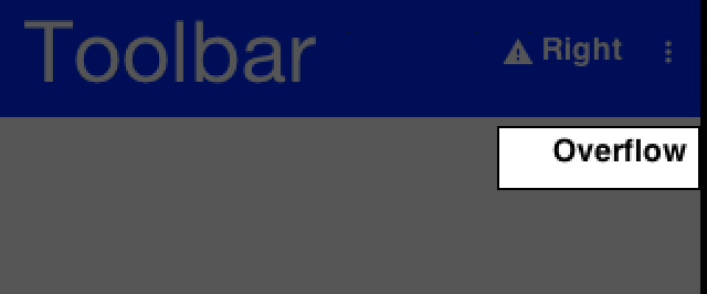
You can set a title with a String but if you would want the component to be a text field or a multi
line label you can use setTitleComponent(Component) which allows you to install any component into the
title area.
The customization of the title area allows for some pretty powerful UI effects for example: the code below allows searching dynamically within a set of entries and uses some neat tricks:
Toolbar.setGlobalToolbar(true);
Style s = UIManager.getInstance().getComponentStyle("Title");

Form hi = new Form("Toolbar", new BoxLayout(BoxLayout.Y_AXIS));
TextField searchField = new TextField("", "Toolbar Search"); // (1)
searchField.getHintLabel().setUIID("Title");
searchField.setUIID("Title");
searchField.getAllStyles().setAlignment(Component.LEFT);
hi.getToolbar().setTitleComponent(searchField);
FontImage searchIcon = FontImage.createMaterial(FontImage.MATERIAL_SEARCH, s);
searchField.addDataChangeListener((i1, i2) -> { // (2)
    String t = searchField.getText();
    if (t.length() < 1) {
        for (Component cmp : hi.getContentPane()) {
            cmp.setHidden(false);
            cmp.setVisible(true);
        }
    } else {
        String needle = t.toLowerCase();
        for (Component cmp : hi.getContentPane()) {
            String val;
            if (cmp instanceof Label) {
                val = ((Label) cmp).getText();
            } else {
                if (cmp instanceof TextArea) {
                    val = ((TextArea) cmp).getText();
                } else {
                    val = (String) cmp.getPropertyValue("text");
                }
            }
            boolean show = val != null && val.toLowerCase().indexOf(needle) > -1;
            cmp.setHidden(!show);
            cmp.setVisible(show); // (3)
        }
    }
    hi.getContentPane().animateLayout(250);
});
hi.getToolbar().addCommandToRightBar("", searchIcon, (e) -> { // (4)
    searchField.startEditingAsync();
});

hi.add("A Game of Thrones").
        add("A Clash Of Kings").
        add("A Storm Of Swords").
        add("A Feast For Crows").
        add("A Dance With Dragons").
        add("The Winds of Winter").
        add("A Dream of Spring");
hi.show();
You use a
TextFieldthe whole time and style it to make it (and its hint) look like a regular title. An alternative way is to replace the title component dynamically.You use the
DataChangedListenerto update the search results as you type them.Hidden & Visible use the opposite flag values to say similar things (for example: when hidden is set to false you would want to set visible to true).
Visible indicates whether a component can be seen. It will still occupy the physical space on the screen even when it isn’t visible. Hidden will remove the space occupied by the component from the screen, but some code might still try to paint it., visible is redundant but you use it with hidden for good measure.The search button is totally unnecessary here. You can click the
TextField!
For example, that isn’t intuitive to most users so a button is added to start editing.

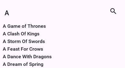
Search mode
While you can implement search manually, using the built-in search offers a simpler and uniform UI.
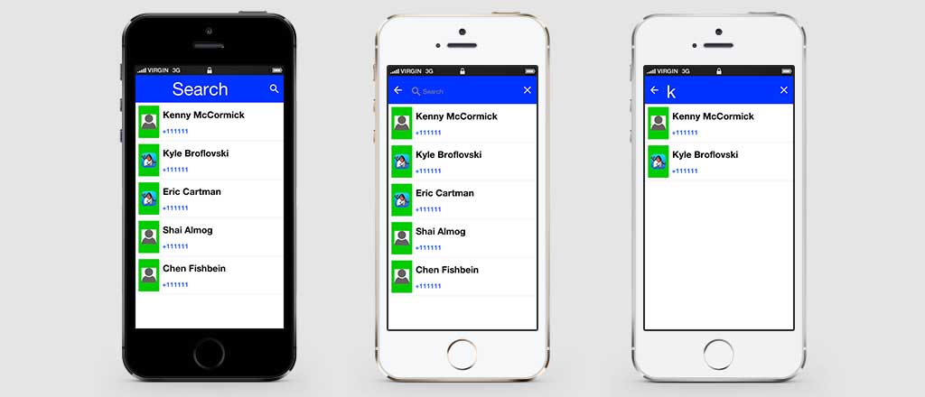
You can customize the appearance of the search bar by using the UIID’s: ToolbarSearch, TextFieldSearch & TextHintSearch.
In the sample below you fetch all the contacts from the device and enable search through them, notice it expects and image called duke.png which is the default Codename One icon renamed and placed in the src folder:
int fiveMM = Display.getInstance().convertToPixels(5);
// a material icon, so the sample needs no bundled asset
final Image finalDuke = FontImage.createMaterial(FontImage.MATERIAL_PORTRAIT, "Label", 3.0f)
        .scaledWidth(fiveMM);
Toolbar.setGlobalToolbar(true);
Form hi = new Form("Search", BoxLayout.y());
hi.add(new InfiniteProgress());
Display.getInstance().scheduleBackgroundTask(()-> {
    // this will take a while...
    Contact[] cnts = Display.getInstance().getAllContacts(true, true, true, true, false, false);
    Display.getInstance().callSerially(() -> {
        hi.removeAll();
        if(cnts == null) {
            // the platform has no contacts API, or access was refused
            hi.add(new Label("Contacts are unavailable"));
            hi.revalidate();
            return;
        }
        for(Contact c : cnts) {
            MultiButton m = new MultiButton();
            m.setTextLine1(c.getDisplayName());
            m.setTextLine2(c.getPrimaryPhoneNumber());
            Image pic = c.getPhoto();
            if(pic != null) {
                m.setIcon(pic.fill(finalDuke.getWidth(), finalDuke.getHeight()));
            } else {
                m.setIcon(finalDuke);
            }
            hi.add(m);
        }
        // the query may have been typed while the contacts were loading
        filterContacts(hi, currentSearch);
        hi.revalidate();
    });
});

hi.getToolbar().addSearchCommand(e -> {
    currentSearch = (String)e.getSource();
    filterContacts(hi, currentSearch);
}, 4);

hi.show();
The filter itself, shared by the search command and the load callback so a query typed while the contacts are still arriving is reapplied once they do:
String currentSearch;

void filterContacts(Form hi, String text) {
    if(text == null || text.length() == 0) {
        // clear search
        for(Component cmp : hi.getContentPane()) {
            cmp.setHidden(false);
            cmp.setVisible(true);
        }
        hi.getContentPane().animateLayout(150);
        return;
    }
    text = text.toLowerCase();
    for(Component cmp : hi.getContentPane()) {
        if(!(cmp instanceof MultiButton)) {
            // the loading indicator is still there until the contacts arrive
            continue;
        }
        MultiButton mb = (MultiButton)cmp;
        String line1 = mb.getTextLine1();
        String line2 = mb.getTextLine2();
        boolean show = line1 != null && line1.toLowerCase().indexOf(text) > -1 ||
                line2 != null && line2.toLowerCase().indexOf(text) > -1;
        mb.setHidden(!show);
        mb.setVisible(show);
    }
    hi.getContentPane().animateLayout(150);
}
South Component
A common feature in side menu bar is the ability to add a component to the "south" part of the side menu.
Notice that this feature works with the on-top and permanent versions of the side menu and not with the legacy versions:
toolbar.setComponentToSideMenuSouth(myComponent);
This places the component below the side menu bar. Notice that this component controls its entire UIID & is separate from the SideNavigationPanel UIID so if you set that component you might want to place it within a container that has the SideNavigationPanel UIID so it will blend with the rest of the UI.
Title animations
Modern UI’s often animate the title upon scrolling to balance the highly functional smaller title advantage with the gorgeous large image based title. This is pretty easy to do with the Toolbar API through the Title animation API.
The code below shows off an attractive title based on a book by GRRM on top of text [5] that’s scrollable. As the text is scrolled the title fades out:
Toolbar.setGlobalToolbar(true);

Form hi = new Form("Toolbar", new BoxLayout(BoxLayout.Y_AXIS));
EncodedImage placeholder = EncodedImage.createFromImage(Image.createImage(hi.getWidth(), hi.getWidth() / 5, 0xffff0000), true);
URLImage background = URLImage.createToStorage(placeholder, "400px-AGameOfThrones.jpg",
        "http://awoiaf.westeros.org/images/thumb/9/93/AGameOfThrones.jpg/400px-AGameOfThrones.jpg");
background.fetch();
Style stitle = hi.getToolbar().getTitleComponent().getUnselectedStyle();
stitle.setBgImage(background);
stitle.setBackgroundType(Style.BACKGROUND_IMAGE_SCALED_FILL);
stitle.setPaddingUnit(Style.UNIT_TYPE_DIPS, Style.UNIT_TYPE_DIPS, Style.UNIT_TYPE_DIPS, Style.UNIT_TYPE_DIPS);
stitle.setPaddingTop(15);
SpanButton credit = new SpanButton("This excerpt is from A Wiki Of Ice And Fire. Please check it out by clicking here!");
credit.addActionListener((e) -> Display.getInstance().execute("http://awoiaf.westeros.org/index.php/A_Game_of_Thrones"));
hi.add(new SpanLabel("A Game of Thrones is the first of seven planned novels in A Song of Ice and Fire, an epic fantasy series by American author George R. R. Martin. It was first published on 6 August 1996. The novel was nominated for the 1998 Nebula Award and the 1997 World Fantasy Award,[1] and won the 1997 Locus Award.[2] The novella Blood of the Dragon, comprising the Daenerys Targaryen chapters from the novel, won the 1997 Hugo Award for Best Novella. ")).
        add(new Label("Plot introduction", "Heading")).
        add(new SpanLabel("A Game of Thrones is set in the Seven Kingdoms of Westeros, a land reminiscent of Medieval Europe. In Westeros the seasons last for years, sometimes decades, at a time.\n\n" +
            "Fifteen years prior to the novel, the Seven Kingdoms were torn apart by a civil war, known alternately as \"Robert's Rebellion\" and the \"War of the Usurper.\" Prince Rhaegar Targaryen kidnapped Lyanna Stark, arousing the ire of her family and of her betrothed, Lord Robert Baratheon (the war's titular rebel). The Mad King, Aerys II Targaryen, had Lyanna's father and eldest brother executed when they demanded her safe return. Her second brother, Eddard, joined his boyhood friend Robert Baratheon and Jon Arryn, with whom they had been fostered as children, in declaring war against the ruling Targaryen dynasty, securing the allegiances of House Tully and House Arryn through a network of dynastic marriages (Lord Eddard to Catelyn Tully and Lord Arryn to Lysa Tully). The powerful House Tyrell continued to support the King, but House Lannister and House Martell both stalled due to insults against their houses by the Targaryens. The civil war climaxed with the Battle of the Trident, when Prince Rhaegar was killed in battle by Robert Baratheon. The Lannisters finally agreed to support King Aerys, but then brutally... ")).
        add(credit);

ComponentAnimation title = hi.getToolbar().getTitleComponent().createStyleAnimation("Title", 200);
hi.getAnimationManager().onTitleScrollAnimation(title);
hi.show();

Most the code above creates the "look" of the application. The key piece of code above is this:
ComponentAnimation title = hi.getToolbar().getTitleComponent().createStyleAnimation("Title", 200);
hi.getAnimationManager().onTitleScrollAnimation(title);
In the first line you create a style animation that will translate the style from the current settings to the destination UIID (the first argument) within 200 pixels of scrolling. You then bind this animation to the title scrolling animation event.
BrowserComponent & WebBrowser
BrowserComponent is a peer component, understanding this is crucial if your application depends on such a component. You can learn about peer components and their issues here.The WebBrowser component shows the native device web browser when supported by the device and the
HTMLComponent when the web browser isn’t supported on the given device. If you intend to target smartphones
you should use the BrowserComponent directly instead of the WebBrowser.
The BrowserComponent can point at an arbitrary URL to load it:
Form hi = new Form("Browser", new BorderLayout());
BrowserComponent browser = new BrowserComponent();
browser.setURL("https://www.codenameone.com/");
hi.add(BorderLayout.CENTER, browser);
BrowserComponent should be in the center of a BorderLayout. Otherwise its preferred size might be zero before the HTML finishes loading/layout in the native layer and layout might be wrong as a result.You can use WebBrowser and BrowserComponent interchangeably for most basic usage. For example, if you need access to JavaScript or native browser functionality then there is no use in going through the WebBrowser abstraction.
The BrowserComponent has full support for executing local web pages from within the jar. The basic support uses the jar:/// URL as such:
BrowserComponent wb = new BrowserComponent();
wb.setURL("jar:///Page.html");
Display.getInstance().setProperty("WebLoadingHidden", "true"); call. You need to invoke this once.Troubleshooting "Failed to create CEF browser" on Linux
In the Simulator, BrowserComponent is rendered by the bundled CEF (Chromium Embedded Framework) port. On Linux, BrowserComponent.isNativeBrowserSupported() may return true and yet creating the component throws RuntimeException: Failed to create CEF browser, with a root cause similar to:
java.lang.UnsatisfiedLinkError: .../codenameone-cef-*-linux64.zip-extracted/lib/linux64/libjcef.so:
    .../lib/linux64/libjawt.so: version `SUNWprivate_1.1' not found
    (required by .../lib/linux64/libjcef.so)
The native CEF library (libjcef.so) is loaded with a sibling libjawt.so shipped inside the CEF archive. That copy of libjawt.so expects symbols (SUNWprivate_1.1) provided by the JDK’s own libjawt.so and the matching libjvm.so. When the JVM running the Simulator doesn’t expose those symbols at load time — typically because the dynamic linker doesn’t have the JDK’s native library directories on its search path — the load fails before any browser is created. This is purely a Simulator/desktop concern; the same code runs unchanged on Android and iOS.
The fix is to launch the IDE (and therefore the Simulator JVM) with JAVA_HOME and LD_LIBRARY_PATH pointing at a supported JDK. For example, on Linux Mint / Ubuntu wrap the IDE startup script:
#!/bin/bash
export JAVA_HOME=/usr/lib/jvm/java-17-openjdk-amd64
export LD_LIBRARY_PATH=$JAVA_HOME/lib:$JAVA_HOME/lib/server${LD_LIBRARY_PATH:+:$LD_LIBRARY_PATH}
exec /path/to/your/ide "$@"
After relaunching the IDE through this wrapper, BrowserComponent instantiation succeeds in the Simulator. Any JDK from 11 through 25 that’s supported for running the Simulator works — the important part is that LD_LIBRARY_PATH resolves to that JDK’s lib and lib/server directories so the bundled libjcef.so finds a compatible libjawt/libjvm pair.
BrowserComponent instantiation fails on Linux, log the environment with CN.getProperty("java.home", "<unset>"), CN.getProperty("JAVA_HOME", "<unset>") and CN.getProperty("LD_LIBRARY_PATH", "<unset>"). An <unset> value for LD_LIBRARY_PATH while the IDE was launched from a desktop shortcut is the typical fingerprint of this problem — desktop launchers don’t source your shell profile.BrowserComponent hierarchy
When Codename One packages applications into native apps it hides a lot of details to make the process simpler. One of the things hidden is the fact that you aren’t dealing with a JAR anymore, so
getResource/getResourceAsStream are problematic… Both of these APIs support hierarchies and a concept of package
relativity both of which might not be supported on all OSes.
Codename One has its own getResourceAsSteam in the Display class and that works fine, but it requires that all files be in the src root directory.
For web developers this isn’t enough since hierarchies are used often to represent the various dependencies, this means that many links & references are relative. To work with such hierarchies place all your resources in a hierarchy under the HTML package in the project source directory (src/html). The build server will tar the entire content of that package and add an html.tar file into the native package. This tar is seamlessly extracted on the device when you actually need the resources and with new application versions (not on every launch). Assuming the resources are under the HTML root package they can be displayed with code like this:
try {
    browserComponent.setURLHierarchy("/htmlFile.html");
} catch(IOException err) {
    /* omitted */
}
Notice that the path is relative to the HTML directory and starts with / but inside the HTML files you should use
relative (not absolute) paths.
Also notice that an IOException can be thrown due to the process of untarring. Its unlikely to happen but is entirely possible.
NavigationCallback
At the core of the BrowserComponent you have the BrowserNavigationCallback. It might not seem like the most important interface within the browser but it’s the "glue" that allows the JavaScript code to communicate back into the Java layer.
You can bind a BrowserNavigationCallback by invoking setBrowserNavigationCallback on the BrowserComponent. At that point with every navigation within the browser the callback will get invoked.
shouldNavigate method from the BrowserNavigationCallback is invoked in a native thread and NOT ON THE EDT!it’s crucial that this method returns and that it won’t do any changes on the UI.
The shouldNavigate indicates to the native code whether navigation should proceed or not. For example: if a user clicks a specific link you might choose to do something in the Java code so you can return false and block the navigation. You can invoke callSerially to do the actual task in the Java side:
Form hi = new Form("BrowserComponent", new BorderLayout());
BrowserComponent bc = new BrowserComponent();
bc.setPage( "<html lang=\"en\">\n" +
            "    <head>\n" +
            "        <meta charset=\"utf-8\">\n" +
            "        <script>\n" +
            "          function  fnc(message) {\n" +
            "         document.write(message);\n" +
            "            };\n" +
            "        </script>\n" +
            "    </head>\n" +
            "    <body >\n" +
            "        <p><a href=\"http://click\">Demo</a></p>\n" +
            "    </body>\n" +
            "</html>", null);
hi.add(BorderLayout.CENTER, bc);
bc.setBrowserNavigationCallback((url) -> {
    if(url.startsWith("http://click")) {
        Display.getInstance().callSerially(() -> bc.execute("fnc('<p>You clicked!</p>')"));
        return false;
    }
    return true;
});

BrowserNavigationCallback.JavaScript
Use the BrowserComponent API to interact with JavaScript. It replaces the deprecated com.codename1.javascript package.
What was wrong with the old API
The old API provided a synchronous wrapper around an inherently asynchronous process, and made extensive use of invokeAndBlock() underneath the covers. This resulted in a nice API with high-level abstractions that played with a synchronous programming model, but it came with a price-tag in performance, complexity, and predictability. Let’s take a simple example, getting a reference to the "window" object:
JSObject window = (JSObject)ctx.get("window");
This code looks harmless enough, but this is actually expensive. It issues a command to the BrowserComponent, and uses invokeAndBlock() to wait for the command to go through and send back a response. invokeAndBlock() is a magical tool that allows you to "block" without blocking the EDT, but it has its costs, and shouldn’t be overused. Most of the Codename One APIs that use invokeAndBlock() show this in their name. For example: Component.animateLayoutAndWait(). This provides you the expectation that this call could take some time, and helps to alert you to the underlying cost.
The problem with the ctx.get("window") call is that it looks the same as a call to Map.get(key). There’s no sign that this call is expensive and could take time. One call like this probably isn’t a big deal, but it doesn’t take long before you have dozens or even hundreds of calls like this littered throughout your codebase, and they can be hard to pick out.
The new API
The new API fully embraces the asynchronous nature of JavaScript. It uses callbacks instead of return values, and provides convenience wrappers with the appropriate "AndWait()" naming convention to allow for synchronous usage. Let’s look at a simple example:
bc represent an instance of BrowserComponent:bc.execute(
"callback.onSuccess(3+4)",
res -> Log.p("The result was "+res.getInt())
);
This code should output "The result was 7" to the console. It’s fully asynchronous, so you can include this code anywhere without worrying about it "bogging down" your code. The full signature of this form of the execute() method is:
public void execute(String js, SuccessCallback<JSRef> callback)
The first parameter is a JavaScript expression. This JavaScript MUST call either callback.onSuccess(result) or callback.onError(message, errCode) at some point in order for your callback to be called.
The second parameter is your callback that’s executed from the JavaScript side, when callback.onSuccess(res) is called. The callback takes a single parameter of type JSRef which is a generic wrapper around a JavaScript variable. JSRef has accessors to retrieve the value as some primitive types. For example: getBoolean(), getDouble(), getInt(), toString(), and it provides some introspection through the getType() method.
Synchronous wrappers
As mentioned before, the new API also provides an executeAndWait() wrapper for execute() that will work synchronously. It, as its name suggests, uses invokeAndBlock under the hood so as not to block the EDT while it’s waiting.
For example:
JSRef res = bc.executeAndWait("callback.onSuccess(3+4)");
Log.p("The result was "+res.getInt());
Prints The result was 7.
andWait() variant, it’s critical that your JavaScript calls your callback method at some point - otherwise it will block indefinitely. Codename One provides variants of executeAndWait() that include a timeout in case you want to hedge against this possibility.Multi-use callbacks
The callbacks you pass to execute() and executeAndWait() are single-use callbacks. You can’t, for example, store the callback variable on the JavaScript side for later use (for example: to respond to a button click event). If you need a "multi-use" callback, you should use the addJSCallback() method instead. Its usage looks identical to execute(), the difference is that the callback will live on after its first use. For example: Consider the following code:
bc.execute(
    "$('#somebutton').click(function(){callback.onSuccess('Button was clicked')})",
    res -> Log.p(res.toString())
);
The above example, assumes that jQuery is loaded in the webpage that you’re interacting with, and you’re adding a click handler to a button with ID "somebutton." The click handler calls your callback.
If you run this example, the first time the button is clicked, you’ll see "Button was clicked" printed to the console as expected. For example, the 2nd time, you’ll get an exception. This is because the callback passed to execute() is single-use.
You need to change this code to use the addJSCallback() method as follows:
bc.addJSCallback(
    "$('#somebutton').click(function(){callback.onSuccess('Button was clicked')})",
    res -> Log.p(res.toString())
);
Now it will work no matter how many times the button is clicked.
Passing parameters to JavaScript
Often, the JavaScript expressions that you execute will include parameters from your Java code. Escaping these parameters is tricky at worst, and annoying at best. For example: If you’re passing a string, you need to make sure that it escapes quotes and new lines or it will cause the JavaScript to have a syntax error. Codename One provides variants of execute() and addJSCallback() that allow you to pass your parameters and have them automatically escaped.
For example, suppose you want to pass a string with text to set in a textarea within the webpage. You can do something like:
bc.execute(
    "jQuery('#bio').text(${0}); jQuery('#age').text(${1})",
    new Object[]{
       "A multi-line\n string with \"quotes\"",
       27
    }
);
The gist is that you embed placeholders in the JavaScript expression that are replaced by the corresponding entry in an array of parameters. The ${0} placeholder is replaced by the first item in the parameters array, the ${1} placeholder is replaced by the 2nd, etc.
Proxy objects
The new API also includes a JSProxy class that encapsulates a JavaScript object simplify the getting and setting of properties on JavaScript objects - and the calling of their methods. It provides essentially three core methods, along with many variants of each to allow for async or synchronous usages, parameters, and timeouts.
For example: You might want to create a proxy for the window.location object so that you can access its properties more from Java:
JSProxy location = bc.createJSProxy("window.location");
Then you can retrieve its properties using the get() method:
location.get("href", res -> Log.p("location.href="+res));
Or synchronously:
JSRef href = location.getAndWait("href");
Log.p("location.href="+href);
You can also set its properties:
location.set("href", "https://www.google.com");
And call its methods:
location.call("replace", new Object[]{"https://www.google.com"},
    res -> Log.p("Return value was "+res)
);
Legacy JSObject support
This section describes the now deprecated JSObject approach. It’s here for reference by developers working with older code. Use the new API when starting a new project.
BrowserComponent can communicate with the HTML code using JavaScript calls. For example: you can create HTML like this:
Form hi = new Form("BrowserComponent", new BorderLayout());
BrowserComponent bc = new BrowserComponent();
bc.setPage( "<html lang=\"en\">\n" +
            "    <head>\n" +
            "        <meta charset=\"utf-8\">\n" +
            "        <script>\n" +
            "          function  fnc(message) {\n" +
            "         document.write(message);\n" +
            "            };\n" +
            "        </script>\n" +
            "    </head>\n" +
            "    <body >\n" +
            "        <p>Demo</p>\n" +
            "    </body>\n" +
            "</html>", null);
TextField tf = new TextField();
hi.add(BorderLayout.CENTER, bc).
        add(BorderLayout.SOUTH, tf);
bc.addWebEventListener("onLoad", (e) ->  bc.execute("fnc('<p>Hello World</p>')"));
tf.addActionListener((e) -> bc.execute("fnc('<p>" + tf.getText() +"</p>')"));
hi.show();
You use the execute method above to execute custom JavaScript code. You also have an executeAndReturnString method that allows you to receive a response value from the JavaScript side.
Coupled with shouldNavigate you can effectively do everything which is what the JavaScript Bridge tries to do.
The JavaScript bridge
While it’s possible to build everything on top of execute and shouldNavigate, both of these methods have their limits. That’s why Codename One introduced the JavaScript package, it allows you to communicate with JavaScript using intuitive code/syntax.
The JavascriptContext class lays the foundation by enabling you to call JavaScript code directly from Java. It provides automatic type conversion between Java and JavaScript types as follows:
| Java Type | JavaScript Type |
|---|---|
|
|
|
|
|
|
|
|
|
|
| Not Allowed |
| JavaScript Type | Java Type |
|---|---|
|
|
|
|
|
|
|
|
|
|
|
|
|
|
|
|
You can access JavaScript variables from the context by using code like this:
Form hi = new Form("BrowserComponent", new BorderLayout());
BrowserComponent bc = new BrowserComponent();
bc.setPage( "<html lang=\"en\">\n" +
            "    <head>\n" +
            "        <meta charset=\"utf-8\">\n" +
            "    </head>\n" +
            "    <body >\n" +
            "        <p>This will appear twice...</p>\n" +
            "    </body>\n" +
            "</html>", null);
hi.add(BorderLayout.CENTER, bc);
bc.addWebEventListener("onLoad", (e) -> {
    // Create a JavaScript context for this BrowserComponent
    JavascriptContext ctx = new JavascriptContext(bc);

    String pageContent = (String)ctx.get("document.body.innerHTML");
    hi.add(BorderLayout.SOUTH, pageContent);
    hi.revalidate();
});
hi.show();
Notice that when you work with numeric values or anything related to the types mentioned above your code must be aware of the typing. For example: in this case the type is Double and not String:
Double outerWidth = (Double)ctx.get("window.outerWidth");
You can also query the context for objects and change their value for example:
Form hi = new Form("BrowserComponent", new BorderLayout());
BrowserComponent bc = new BrowserComponent();
bc.setPage( "<html lang=\"en\">\n" +
            "    <head>\n" +
            "        <meta charset=\"utf-8\">\n" +
            "    </head>\n" +
            "    <body >\n" +
            "        <p>Please Wait...</p>\n" +
            "    </body>\n" +
            "</html>", null);
hi.add(BorderLayout.CENTER, bc);
bc.addWebEventListener("onLoad", new ActionListener() {
    public void actionPerformed(ActionEvent e) {
        // the destination fires onLoad too, so stop listening before navigating
        bc.removeWebEventListener("onLoad", this);

        // Create a JavaScript context for this BrowserComponent
        JavascriptContext ctx = new JavascriptContext(bc);

        JSObject jo = (JSObject)ctx.get("window");
        jo.set("location", "https://www.codenameone.com/");
    }
});
hi.show();
This code effectively navigates to the Codename One home page by fetching the DOM’s window object and setting its location property to https://www.codenameone.com/.
Cordova/PhoneGap integration
PhoneGap was one of the first web app packager tools in the market: a tool that’s effectively a browser component within a native wrapper coupled with native access APIs, and Cordova is the open source extension of this popular project.
Codename One supports embedding PhoneGap/Cordova applications directly into Codename One applications. This is easy to do with the BrowserComponent and JavaScript integration. The main aspect that this integration requires is support for Cordova plugins & its JavaScript APIs.
The effort to integrate Cordova/PhoneGap support into Codename One is handled within an open-source GitHub project here. The chief benefits of picking Codename One rather than using Cordova directly are:
Build Cloud
Better Native Code Support
Better Protection Of IP
IDE Integration Java - JavaScript - HTML
Easy, doesn’t Require A Mac, Automates Certificates/Signing
Migration To Java
This is discussed further in the original announcement.
Text editors
RichTextArea and CodeEditor are introduced here as components, but editing is broad enough to have
its own chapter. See Rich Text and Code Editing for rich HTML, syntax highlighting, completion, diagnostics,
touch and desktop selection, scrolling, bidirectional text, input methods, backend selection, and the
port-level TextInputClient contract.
AutoCompleteTextField
The AutoCompleteTextField allows you to write text into a text field and select a completion entry from the list in a similar way to a search engine.
This is easy to incorporate into your code, replace your usage of TextField with AutoCompleteTextField and define the data that the autocomplete should work from. A default implementation accepts a String array or a ListModel for completion strings, this can work well for a "small" set of thousands (or tens of thousands) of entries.
For example: This is a trivial use case that can work well for smaller sample sizes:
Form hi = new Form("Auto Complete", new BoxLayout(BoxLayout.Y_AXIS));
AutoCompleteTextField ac = new AutoCompleteTextField("Short", "Shock", "Sholder", "Shrek");
ac.setMinimumElementsShownInPopup(5);
hi.add(ac);
For example, if you wish to query a database or a web service you will need to derive the class and perform more advanced filtering by overriding the filter method:
  Form hi = new Form("Autocomplete", new BoxLayout(BoxLayout.Y_AXIS));
public void showForm() {
  final DefaultListModel<String> options = new DefaultListModel<>();
  AutoCompleteTextField ac = new AutoCompleteTextField(options) {
      @Override
      protected boolean filter(String text) {
          if(text.length() == 0) {
              // an emptied field must not keep showing the last query's matches
              options.removeAll();
              return false;
          }
          String[] l = searchLocations(text);
          if(!text.equals(getText())) {
              // the wait above pumps the EDT, so the field may have moved on
              // and a newer query may already have filled the model
              return false;
          }
          if(l == null || l.length == 0) {
              // otherwise the popup keeps showing the previous query's matches
              options.removeAll();
              return false;
          }

          options.removeAll();
          for(String s : l) {
              options.addItem(s);
          }
          return true;
      }

  };
  ac.setMinimumElementsShownInPopup(5);
  hi.add(ac);
  hi.add(new SpanLabel("This demo requires a valid google API key to be set below "
           + "you can get this key for the webservice (not the native key) by following the instructions here: "
           + "https://developers.google.com/places/web-service/get-api-key"));
  hi.add(apiKey);
  hi.getToolbar().addCommandToRightBar("Get Key", null, e -> Display.getInstance().execute("https://developers.google.com/places/web-service/get-api-key"));
  hi.show();
}

TextField apiKey = new TextField();

String[] searchLocations(String text) {
    try {
        if(text.length() > 0) {
            ConnectionRequest r = new ConnectionRequest();
            r.setPost(false);
            r.setUrl("https://maps.googleapis.com/maps/api/place/autocomplete/json");
            r.addArgument("key", apiKey.getText());
            r.addArgument("input", text);
            NetworkManager.getInstance().addToQueueAndWait(r);
            Map<String,Object> result = new JSONParser().parseJSON(new InputStreamReader(new ByteArrayInputStream(r.getResponseData()), "UTF-8"));
            String[] res = Result.fromContent(result).getAsStringArray("//description");
            return res;
        }
    } catch(Exception err) {
        Log.e(err);
    }
    return null;
}
Using images in AutoCompleteTextField
One question that comes up frequently is "How do you customize the results of the auto complete field"?
This sounds difficult to most people as you can work with Strings so how do you represent more data or format the date correctly?
The answer is actually pretty simple, you still need to work with Strings because autocomplete is fundamentally a text field. For example, that doesn’t preclude your custom renderer from fetching data that might be placed in a different location and associated with the result.
The following source code presents an autocomplete text field with images in the completion popup and two lines for every entry:
final String[] characters = { "Tyrion Lannister", "Jaime Lannister", "Cersei Lannister", "Daenerys Targaryen",
    "Jon Snow", "Petyr Baelish", "Jorah Mormont", "Sansa Stark", "Arya Stark", "Theon Greyjoy"
    // snipped the rest for clarity
};

Form current = new Form("AutoComplete", BoxLayout.y());

AutoCompleteTextField ac = new AutoCompleteTextField(characters);

final int size = Display.getInstance().convertToPixels(7);
final EncodedImage placeholder = EncodedImage.createFromImage(Image.createImage(size, size, 0xffcccccc), true);

final String[] actors = { "Peter Dinklage", "Nikolaj Coster-Waldau", "Lena Headey"}; // (1)
final Image[] pictures = {
    URLImage.createToStorage(placeholder, "tyrion","http://i.lv3.hbo.com/assets/images/series/game-of-thrones/character/s5/tyrion-lannister-512x512.jpg"),
    URLImage.createToStorage(placeholder, "jaime","http://i.lv3.hbo.com/assets/images/series/game-of-thrones/character/s5/jamie-lannister-512x512.jpg"),
    URLImage.createToStorage(placeholder, "cersei","http://i.lv3.hbo.com/assets/images/series/game-of-thrones/character/s5/cersei-lannister-512x512.jpg")
};

ac.setCompletionRenderer(new ListCellRenderer() {
    private final Label focus = new Label(); // (2)
    private final Label line1 = new Label(characters[0]);
    private final Label line2 = new Label(actors[0]);
    private final Label icon = new Label(pictures[0]);
    private final Container selection = BorderLayout.center(
            BoxLayout.encloseY(line1, line2)).add(BorderLayout.EAST, icon);

    @Override
    public Component getListCellRendererComponent(com.codename1.ui.List list, Object value, int index, boolean isSelected) {
        for(int iter = 0 ; iter < characters.length ; iter++) {
            if(characters[iter].equals(value)) {
                line1.setText(characters[iter]);
                if(actors.length > iter) {
                    line2.setText(actors[iter]);
                    icon.setIcon(pictures[iter]);
                } else {
                    line2.setText(""); // (3)
                    icon.setIcon(placeholder);
                }
                break;
            }
        }
        return selection;
    }

    @Override
    public Component getListFocusComponent(com.codename1.ui.List list) {
        return focus;
    }
});
current.add(ac);

current.show();
you have duplicate arrays that are partial for clarity. This is a separate list of data element but you can fetch the more data from anywhere
You create the renderer UI instantly in the fields with the helper methods for wrapping elements which is pretty cool & terse
In a renderer it’s important to always set the value if you don’t have a value in place
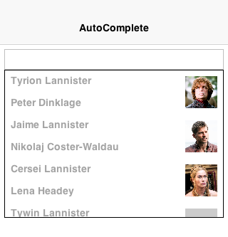
Picker
Picker occupies the limbo between native widget and lightweight widget. Picker is more like TextField/TextArea in the sense that it’s a Codename One widget that calls the native code during editing.
The reasoning for this is the highly native UX and functionality related to this widget type which should be obvious from the screenshots below.
At this time there are 4 types of pickers:
Time
Date & Time
Date
Strings
If a platform doesn’t support native pickers an internal fallback implementation is used. This is the implementation you always use in the simulator so assume different behavior when building for the device.
The sample below includes al picker types:
Form hi = new Form("Picker", new BoxLayout(BoxLayout.Y_AXIS));
Picker datePicker = new Picker();
datePicker.setType(Display.PICKER_TYPE_DATE);
Picker dateTimePicker = new Picker();
dateTimePicker.setType(Display.PICKER_TYPE_DATE_AND_TIME);
Picker timePicker = new Picker();
timePicker.setType(Display.PICKER_TYPE_TIME);
Picker stringPicker = new Picker();
stringPicker.setType(Display.PICKER_TYPE_STRINGS);
Picker durationPicker = new Picker();
durationPicker.setType(Display.PICKER_TYPE_DURATION);
Picker minuteDurationPicker = new Picker();
minuteDurationPicker.setType(Display.PICKER_TYPE_DURATION_MINUTES);
Picker hourDurationPicker = new Picker();
hourDurationPicker.setType(Display.PICKER_TYPE_DURATION_HOURS);

datePicker.setDate(new Date());
dateTimePicker.setDate(new Date());
timePicker.setTime(10 * 60); // 10:00AM = Minutes since midnight
stringPicker.setStrings("A Game of Thrones", "A Clash Of Kings", "A Storm Of Swords", "A Feast For Crows",
        "A Dance With Dragons", "The Winds of Winter", "A Dream of Spring");
stringPicker.setSelectedString("A Game of Thrones");

hi.add(datePicker).add(dateTimePicker).add(timePicker)
  .add(stringPicker).add(durationPicker)
  .add(minuteDurationPicker).add(hourDurationPicker);
hi.show();
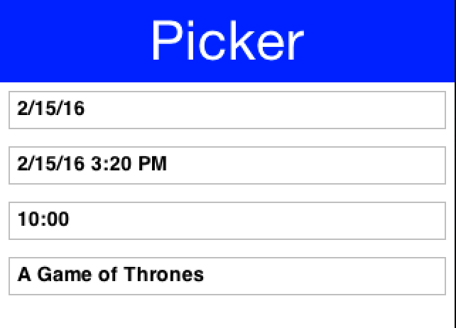
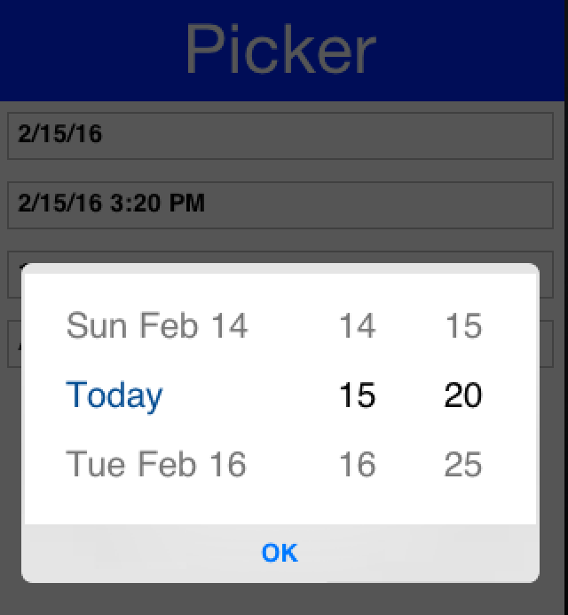
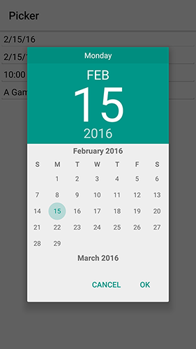
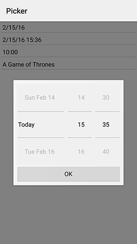
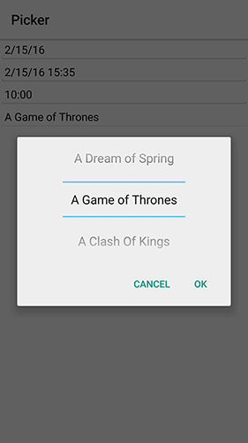
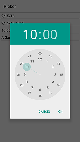
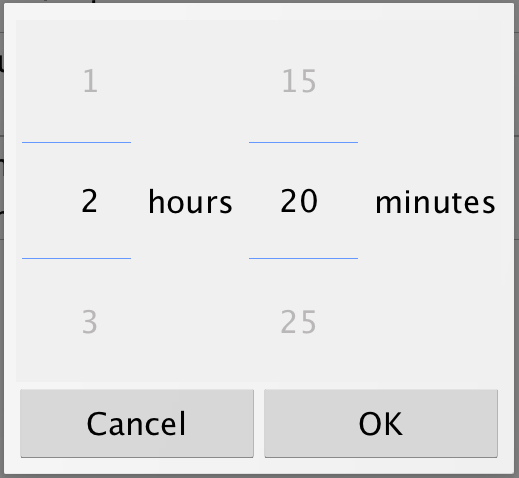
The text displayed by the picker on selection is generated automatically by the updateValue() method. You can override it to display a custom formatted value and call setText(String) with the correct display string.
A common use case is to format date values based on a specific appearance and Picker has built-in support for a custom display formatter. Just use the setFormatter(SimpleDateFormat) method and set the appearance for the field.
When using lightweight picker mode (setUseLightweightPopup(true)), you can add custom quick-action buttons to the popup. This is useful for actions like setting the date to "Today" or "+7 Days" without scrolling the wheels manually:
Picker picker = new Picker();
picker.setType(Display.PICKER_TYPE_DATE);
picker.setUseLightweightPopup(true);
picker.setDate(new Date());

picker.addLightweightPopupButton("Today", () -> picker.setDate(new Date()));

picker.addLightweightPopupButton("+7 Days", () -> {
    Calendar cal = Calendar.getInstance();
    cal.add(Calendar.DAY_OF_MONTH, 7);
    picker.setDate(cal.getTime());
}, Picker.LightweightPopupButtonPlacement.BELOW_SPINNER);
Form hi = new Form("Picker", new BoxLayout(BoxLayout.Y_AXIS));
hi.add(picker);
hi.show();
Button placement options are:
Picker.LightweightPopupButtonPlacement.BETWEEN_CANCEL_AND_DONE(default)Picker.LightweightPopupButtonPlacement.ABOVE_SPINNERPicker.LightweightPopupButtonPlacement.BELOW_SPINNER
SwipeableContainer
The SwipeableContainer allows you to place a component such as a MultiButton on top of more "options" that can be exposed by swiping the component to the side.
This swipe gesture is commonly used in touch interfaces to expose features such as delete, edit etc. It’s trivial to use this component by determining the components placed on top and bottom (the revealed component):
SwipeableContainer swip = new SwipeableContainer(bottom, top);
You can combine some demos above including the Slider stars demo to rank GRRM’s books in an interactive way:
Form hi = new Form("Swipe", new BoxLayout(BoxLayout.Y_AXIS));
hi.add(createRankWidget("A Game of Thrones", "1996")).
    add(createRankWidget("A Clash Of Kings", "1998")).
    add(createRankWidget("A Storm Of Swords", "2000")).
    add(createRankWidget("A Feast For Crows", "2005")).
    add(createRankWidget("A Dance With Dragons", "2011")).
    add(createRankWidget("The Winds of Winter", "TBD")).
    add(createRankWidget("A Dream of Spring", "TBD"));
hi.show();
public SwipeableContainer createRankWidget(String title, String year) {
    MultiButton button = new MultiButton(title);
    button.setTextLine2(year);
    return new SwipeableContainer(FlowLayout.encloseCenterMiddle(createStarRankSlider()),
            button);
}
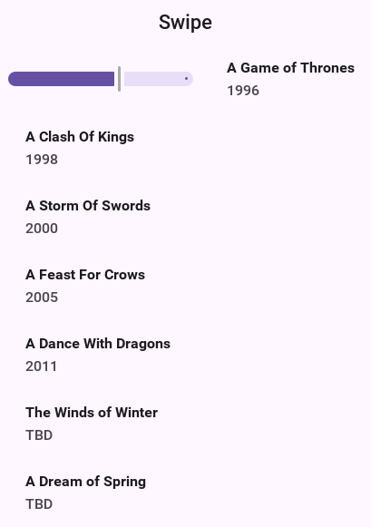
EmbeddedContainer
EmbeddedContainer solves a problem that exists within the GUI builder and the class makes no sense outside of the context of the GUI builder.
The necessity for EmbeddedContainer came about due to iPhone inspired designs that relied on tabs (iPhone style tabs at the bottom of the screen) where different features of the application are within a different tab.
This didn’t mesh well with the GUI builder navigation logic and so it needed a rethink. The aim was to reuse GUI as much as possible while still enjoying the advantage of navigation being managed for you.
Android does this with Activities and the iPhone itself has a view controller, both approaches are problematic for Codename One. The problem is that you have what’s effectively two incompatible hierarchies to mix and match.
The Component/Container hierarchy is powerful enough to represent such a UI but you needed a "marker" to show to the UIBuilder where a "root" component exists so navigation occurs within the given "root." Here EmbeddedContainer comes into play, its a simple container that can contain another GUI from the GUI builder. Nothing else. You can place it in any form of UI and effectively have the UI change appropriately and navigation would default to "sensible values."
Navigation replaces the content of the embedded container; it finds the embedded container based on the component that broadcast the event. If you want to navigate manually use the showContainer() method which accepts a component, you can give any component that’s under the EmbeddedContainer you want to replace and Codename One will be smart enough to replace that component.
The nice part about using the EmbeddedContainer is that the resulting UI can be refactored to provide a more traditional form based UI without duplicating effort and can be adapted to a more tablet oriented UI (with a sidebar) again without much effort.
MapComponent
The MapComponent uses the OpenStreetMap webservice by default to display a navigatable map.
The code was contributed by Roman Kamyk and was originally used for a LWUIT application.
The screenshot above was produced using the following code:
Form map = new Form("Map");
map.setLayout(new BorderLayout());
map.setScrollable(false);
final MapComponent mc = new MapComponent();

try {
   //get the current location from the Location API
   Location loc = LocationManager.getLocationManager().getCurrentLocation();

   // null until the device has a fix, so the map opens without the marker
   if(loc != null) {
       Coord lastLocation = new Coord(loc.getLatitude(), loc.getLongtitude());
       // a material icon rather than an asset you would have to add
       Image i = FontImage.createMaterial(FontImage.MATERIAL_PLACE, "Label", 4.0f);
       PointsLayer pl = new PointsLayer();
       pl.setPointIcon(i);
       PointLayer p = new PointLayer(lastLocation, "You Are Here", i);
       p.setDisplayName(true);
       mc.addLayer(pl);
       pl.addPoint(p);
   }
} catch (IOException ex) {
   ex.printStackTrace();
}
mc.zoomToLayers();

map.addComponent(BorderLayout.CENTER, mc);
map.show();
The example below shows how to integrate the MapComponent with the Google Location API. Make sure to get your secret API key from the Google Location data API at: https://developers.google.com/maps/documentation/places/
Chart Component
The charts package enables Codename One developers to add charts and visualizations to their apps without
having to include external libraries or embedding web views. You also wanted to harness the new features in the
graphics pipeline to maximize performance.
Device support
Since the charts package makes use of 2D transformations and shapes, it requires some graphics features that aren’t yet available on all platforms. The following platforms are supported:
Simulator
Android
iOS
Features
Built-in support for many common types of charts including bar charts, line charts, stacked charts, scatter charts, pie charts and more.
Pinch Zoom - The ChartComponent class includes optional pinch zoom support.
Panning Support - The ChartComponent class includes optional support for panning.
Chart types
The com.codename1.charts package includes models and renderers for many different types of charts. It’s also
extensible so that you can add your own chart types if required. The following screenshots show a small
sampling of the types of charts that can be created.
How to create a chart
Adding a chart to your app involves four steps:
Build the model. You can construct a model (aka data set) for the chart using one of the existing model classes in the
com.codename1.charts.modelspackage. Essentially, this is where you add the data that you want to display.Set up a renderer. You can create a renderer for your chart using one of the existing renderer classes in the
com.codename1.charts.rendererspackage. The renderer allows you to specify how the chart should look. For example: the colors, fonts, styles, to use.Create the Chart View. Use one of the existing view classes in the
com.codename1.charts.viewspackage.Create a ChartComponent. To add your chart to the UI, you need to wrap it in a ChartComponent object.
You can check out the ChartsDemo app for specific examples, but here is a high-level view of some code that creates a Pie Chart:
/**
 * Creates a renderer for the specified colors.
 */
private DefaultRenderer buildCategoryRenderer(int[] colors) {
    DefaultRenderer renderer = new DefaultRenderer();
    renderer.setLabelsTextSize(15);
    renderer.setLegendTextSize(15);
    renderer.setMargins(new int[]{20, 30, 15, 0});
    for (int color : colors) {
        SimpleSeriesRenderer r = new SimpleSeriesRenderer();
        r.setColor(color);
        renderer.addSeriesRenderer(r);
    }
    return renderer;
}

/**
 * Builds a category series using the provided values.
 *
 * @param titles the series titles
 * @param values the values
 * @return the category series
 */
protected CategorySeries buildCategoryDataset(String title, double[] values) {
    CategorySeries series = new CategorySeries(title);
    int k = 0;
    for (double value : values) {
        series.add("Project " + ++k, value);
    }

    return series;
}

public Form createPieChartForm() {

    // Generate the values
    double[] values = new double[]{12, 14, 11, 10, 19};

    // Set up the renderer
    int[] colors = new int[]{ColorUtil.BLUE, ColorUtil.GREEN, ColorUtil.MAGENTA, ColorUtil.YELLOW, ColorUtil.CYAN};
    DefaultRenderer renderer = buildCategoryRenderer(colors);
    renderer.setZoomButtonsVisible(true);
    renderer.setZoomEnabled(true);
    renderer.setChartTitleTextSize(20);
    renderer.setDisplayValues(true);
    renderer.setShowLabels(true);
    SimpleSeriesRenderer r = renderer.getSeriesRendererAt(0);
    r.setGradientEnabled(true);
    r.setGradientStart(0, ColorUtil.BLUE);
    r.setGradientStop(0, ColorUtil.GREEN);
    r.setHighlighted(true);

    // Create the chart ... pass the values and renderer to the chart object.
    PieChart chart = new PieChart(buildCategoryDataset("Project budget", values), renderer);

    // Wrap the chart in a Component so we can add it to a form
    ChartComponent c = new ChartComponent(chart);

    // Create a form and show it.
    Form f = new Form("Budget");
    f.setLayout(new BorderLayout());
    f.addComponent(BorderLayout.CENTER, c);
    return f;

}
Animating a change in the data
Replacing a series' numbers and repainting redraws the chart in one jump. The
com.codename1.charts.transitions package tweens the change instead: pick the
transition that matches the model — XYSeriesTransition for one XYSeries,
XYMultiSeriesTransition for a whole XYMultipleSeriesDataset,
XYValueSeriesTransition for an XYValueSeries — and write the new numbers
into its buffer rather than into the series itself.
XYSeriesTransition transition = new XYSeriesTransition(chart, readings);
transition.setEasing(SeriesTransition.EASING_IN_OUT);
transition.setDuration(600);

// The buffer starts out empty. Write the NEW shape of the series into
// it -- every point, not only the ones that changed -- because the
// buffer is what the series is tweened towards.
XYSeries next = transition.getBuffer();
next.add(0, 12);
next.add(1, 19);
next.add(2, 7);

transition.animateChart();
The buffer holds the shape you want to end up with, so put every point in it
and not only the ones that moved: a point the buffer doesn’t mention keeps
whatever the series already had, while a point the series doesn’t have yet
grows in from zero. animateChart() registers the transition with the chart’s
top-level container and drives it to that shape over setDuration(…)
milliseconds, easing as setEasing(…) says — EASING_LINEAR, EASING_IN,
EASING_OUT or EASING_IN_OUT. The buffer is drained when the animation
finishes, so the same transition can be used again for the next update.
updateChart() applies the buffer the same way and repaints at once, with no
animation, which is what you want for a change the user didn’t trigger.
XYSeriesTransition transition = new XYSeriesTransition(chart, readings);
transition.getBuffer().add(3, 22);
transition.updateChart();
Calendar
The Calendar class allows you to display a traditional calendar picker and optionally highlight days in various ways.
Simple usage of the Calendar class looks something like this:
Form hi = new Form("Calendar", new BorderLayout());
Calendar cld = new Calendar();
cld.addActionListener((e) -> Log.p("You picked: " + new Date(cld.getSelectedDay())));
hi.add(BorderLayout.CENTER, cld);
hi.show();
ToastBar
The ToastBar class allows you to display none-obtrusive status messages to the user at the bottom of the screen. This is useful for such things as informing the user of a long-running task (like downloading a file in the background), or popping up an error message that doesn’t require a response from the user.
Simple usage of the ToastBar class looks something like this:
Status status = ToastBar.getInstance().createStatus();
status.setMessage("Downloading your file...");
status.show();

//  ... Later on when download completes
status.clear();
You can show a progress indicator in the ToastBar like this:
Status status = ToastBar.getInstance().createStatus();
status.setMessage("Hello world");
status.setShowProgressIndicator(true);
status.show();
You can automatically clear a status message/progress after a timeout using the setExpires method as such:
Status status = ToastBar.getInstance().createStatus();
status.setMessage("Hello world");
status.setExpires(3000);  // only show the status for 3 seconds, then have it automatically clear
status.show();
You can also delay the showing of the status message using showDelayed as such:
Status status = ToastBar.getInstance().createStatus();
status.setMessage("Hello world");
status.showDelayed(300); // Wait 300 ms to show the status

// ... Some time later, clear the status... This may be before it shows at all
status.clear();
Actions in ToastBar
Probably the best usage example for actions in toast is in the gmail style undo. If you aren’t a gmail user then the gmail app essentially never prompts for confirmation!
It does whatever you ask and pops a "toast message" with an option to undo. If you clicked by mistake you have 3-4 seconds to take that back.
This simple example shows you how you can undo any addition to the UI in a similar way to gmail:
Form hi = new Form("Undo", BoxLayout.y());
Button add = new Button("Add");

add.addActionListener(e -> {
    Label l = new Label("Added this");
    hi.add(l);
    hi.revalidate();
    ToastBar.showMessage("Added, click here to undo...", FontImage.MATERIAL_UNDO,
            ee -> {
                l.remove();
                hi.revalidate();
            });
});
hi.add(add);
hi.show();
SignatureComponent
The SignatureComponent provides a widget that allows users to draw their signature in the app.
Simple usage of the SignatureComponent class looks like:
Form hi = new Form("Signature Component");
hi.setLayout(new BoxLayout(BoxLayout.Y_AXIS));
hi.add("Enter Your Name:");
hi.add(new TextField());
hi.add("Signature:");
SignatureComponent sig = new SignatureComponent();
sig.addActionListener((evt)-> {
    System.out.println("The signature was changed");
    Image img = sig.getSignatureImage();
    // Now we can do whatever we want with the image of this signature.
});
hi.addComponent(sig);
hi.show();
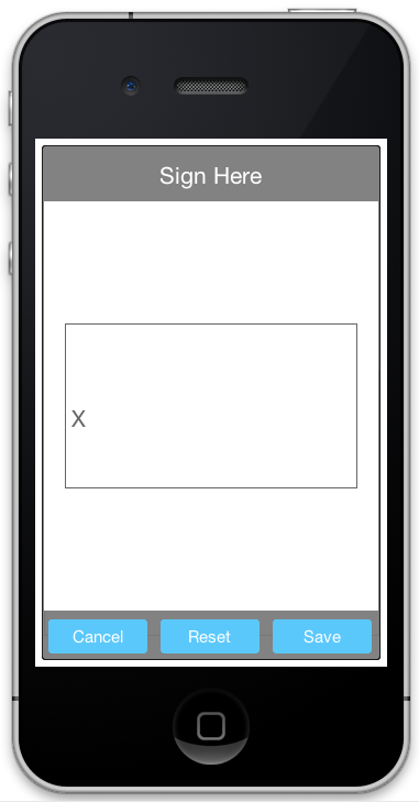
Accordion
The Accordion displays collapsible content panels.
Simple usage of the Accordion class looks like:
Form f = new Form("Accordion", new BoxLayout(BoxLayout.Y_AXIS));
f.setScrollableY(true);
Accordion accr = new Accordion();
accr.addContent("Item1", new SpanLabel("The quick brown fox jumps over the lazy dog\n"
        + "The quick brown fox jumps over the lazy dog"));
accr.addContent("Item2", new SpanLabel("The quick brown fox jumps over the lazy dog\n"
        + "The quick brown fox jumps over the lazy dog\n "
        + "The quick brown fox jumps over the lazy dog\n "
        + "The quick brown fox jumps over the lazy dog\n "
        + ""));

accr.addContent("Item3", BoxLayout.encloseY(new Label("Label"), new TextField(), new Button("Button"), new CheckBox("CheckBox")));

f.add(accr);
f.show();
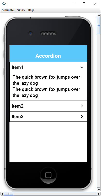
Floating hint
FloatingHint wraps a text component with a special container that can animate the hint label into a title label when the text component is edited or has content within it:
Form hi = new Form("Floating Hint", BoxLayout.y());
TextField first = new TextField("", "First Field");
TextField second = new TextField("", "Second Field");
hi.add(new FloatingHint(first)).
        add(new FloatingHint(second)).
        add(new Button("Go"));
hi.show();
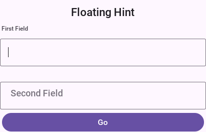
Floating Button
The material design floating action button is a powerful tool for promoting an action within your application.
FloatingActionButton is a round button that resides on top of the UI typically in the bottom right-hand side.
It has a drop shadow to distinguish it from the UI underneath and it can hide two or more actions under the surface. For example: you can create a simple single click button such as this:
FloatingActionButton fab = FloatingActionButton.createFAB(FontImage.MATERIAL_ADD);
fab.addActionListener(e -> ToastBar.showErrorMessage("Not implemented yet..."));
fab.bindFabToContainer(form.getContentPane());
Which will place a + sign button that will perform the action. Or you can create a nested action
where a click on the button will produce a submenu for users to pick from for example:
FloatingActionButton fab = FloatingActionButton.createFAB(FontImage.MATERIAL_ADD);
fab.createSubFAB(FontImage.MATERIAL_PEOPLE, "");
fab.createSubFAB(FontImage.MATERIAL_IMPORT_CONTACTS, "");
fab.bindFabToContainer(form.getContentPane());
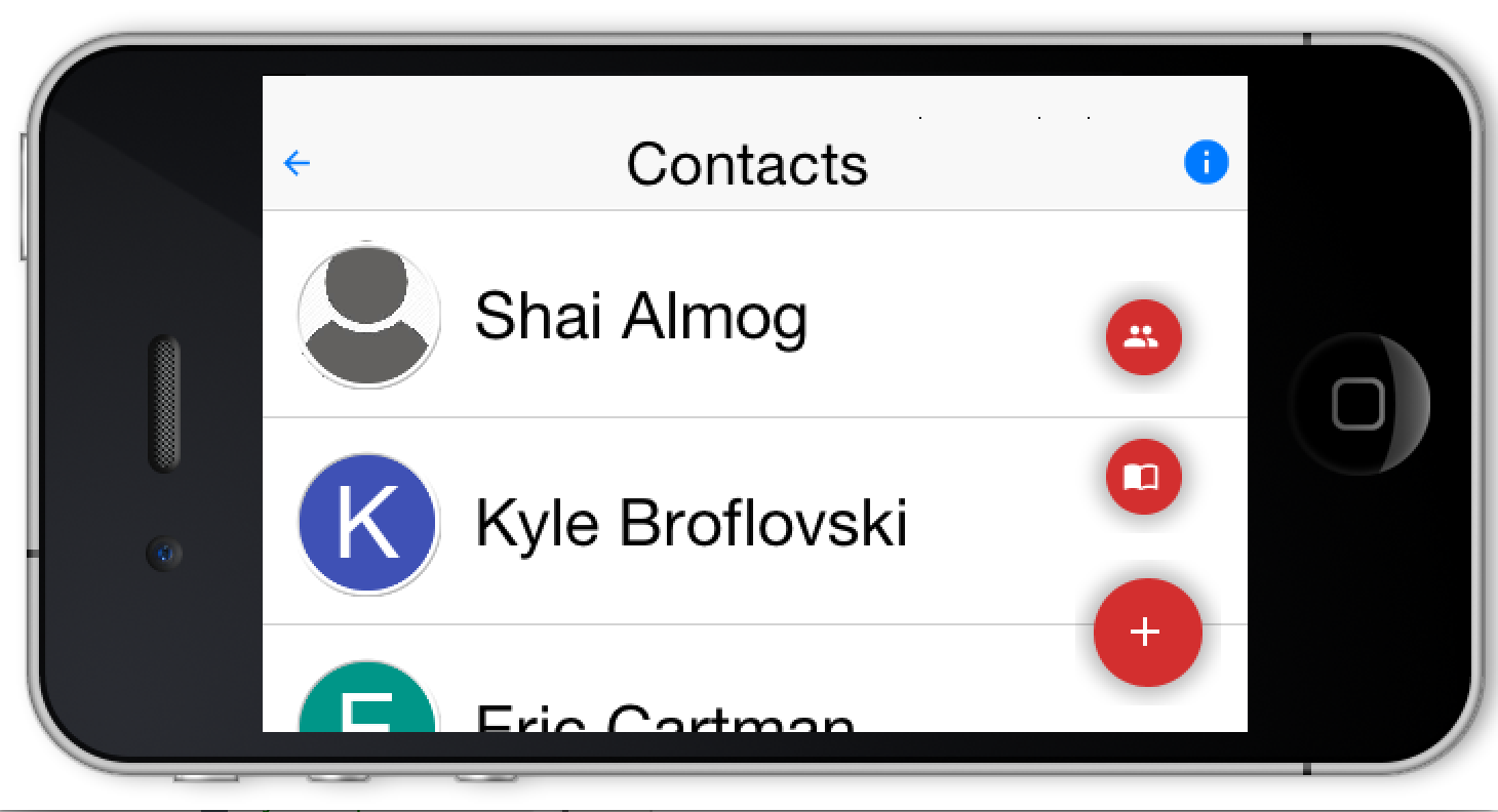
Those familiar with this widget know that there are many nuances to this UI that may be implemented/exposed in the future. The current API is intentionally simple and minimal for the common use cases, with the plan to refine it based on feedback.
Using floating Button as a badge
Floating buttons can also be used to badge an arbitrary component in the style popularized by iOS/macOS. A badge appears in the top right corner and includes special numeric details such as unread count..
The code below adds a simple badge to a chat button:
Form hi = new Form("Badge");

Button chat = new Button("Chat");
FontImage.setMaterialIcon(chat, FontImage.MATERIAL_CHAT, 7);

FloatingActionButton badge = FloatingActionButton.createBadge("33");
hi.add(badge.bindFabToContainer(chat, Component.RIGHT, Component.TOP));

TextField changeBadgeValue = new TextField("33");
changeBadgeValue.addDataChangedListener((i, ii) -> {
badge.setText(changeBadgeValue.getText());
badge.getParent().revalidate();
});
hi.add(changeBadgeValue);

hi.show();
The code above results in this, notice you can type into the text field to change the badge value:
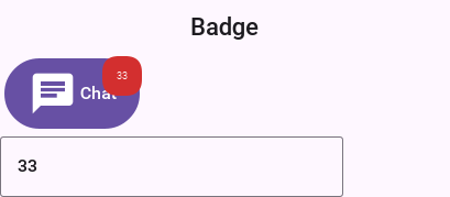
SplitPane
The split pane component is a bit desktop specific but works reasonably well on devices. To get the image below you changed SalesDemo.java in the kitchen sink by changing this:
private Container encloseInMaximizableGrid(Component cmp1, Component cmp2) {
    GridLayout gl = new GridLayout(2, 1);
    Container grid = new Container(gl);
    gl.setHideZeroSized(true);

    grid.add(encloseInMaximize(grid, cmp1)).
            add(encloseInMaximize(grid, cmp2));
    return grid;
}
To:
private Container encloseInMaximizableGrid(Component cmp1, Component cmp2) {
    return new SplitPane(SplitPane.VERTICAL_SPLIT, cmp1, cmp2, "25%", "50%", "75%");
}
This is self-explanatory but "mostly." you have 5 arguments the first 3 make sense:
Split orientation
Components to split
The last 3 arguments seem weird but they also make sense once you understand them, they’re:
The least position of the split - 1/4 of available space
The default position of the split - middle of the screen
The most position of the split - 3/4 of available space
The units don’t have to be percentages they can be mm (millimeters) or px (pixels).